Batman Logo
Batman is one of the most beloved superheroes. First appearing in 1939, he quickly evolved from simply a nocturnal vigilante to a dark and brooding mastermind. This version of him as of gloomy yet brilliant hero who always has a plan appealed to the general audience like little other heroes. And he naturally had a brand all along.
Meaning and History
![]()
A symbol of a bat was the main emblem associated with Batman right from the start. After all, his whole aesthetic is a man who dresses up as bat to beat up thugs or solve difficult cases. Throughout the years, the bat emblem changed regularly, but not too significantly.
1939 – 1939
![]()
It was the first logo, and it only featured a pair of bat wings with membranes – no head or stylistic extremities.
1939 – 1940
![]()
This was the first version that featured a head – a small bump with tiny horn-like ears. In addition, the amount of membranes doubled, so the bat became way more detailed.
1940 – 1941
![]()
This was a lot more different attempt, although the writers returned to the previous emblem soon after. This one featured a much thicker bat-like shape that was in essence a cloak. Where a bat’s head was supposed to be, the Batman’s own face was located instead.
1941 – 1964
![]()
For the longest time, the Batman’s emblem was pretty much the same. In 1941, they reverted to the stylistic bat shape. It was a much taller and aggressive shape, but the general trend was the same. They barely eve changed the head part.
Certainly, the symbol changed slightly with each issue, but they didn’t differ all this much from this version. What did change was only stuff like the parameters, the amount of membranes and angular shapes. That’s pretty much it.
1964 – 1966
![]()
It was the first yellow-and-black logo. They basically put the yellow oval behind the black bat symbol and also outlined it. It was presumably the first year where the bat-signal appeared, hence the logo.
1966 – 1970
![]()
The bat became much thicker and tightly grouped – especially in the middle. It was basically a precursor to many following emblems.
1970 – 1977
![]()
For some time, the logo was basically a black rectangle with a massive depression on top and several smaller ones down under. Where the head would be, you could once again see the hero’s own face – small in comparison to the rest of the ‘body’.
1977 – 1983
![]()
For some time, the usual thick bat design was in use, although the head was much smaller this time, and the wings were curved forwards.
1983 – 1986
![]()
Once again, Batman himself was shown on an emblem, although this one was an epitome of minimalism. It was really just a trapezoid curved slightly on top and in the bottom. The usual face was in its place, although it looked more like a bat’s own head with two small white dots for eyes.
1986 – 1992
![]()
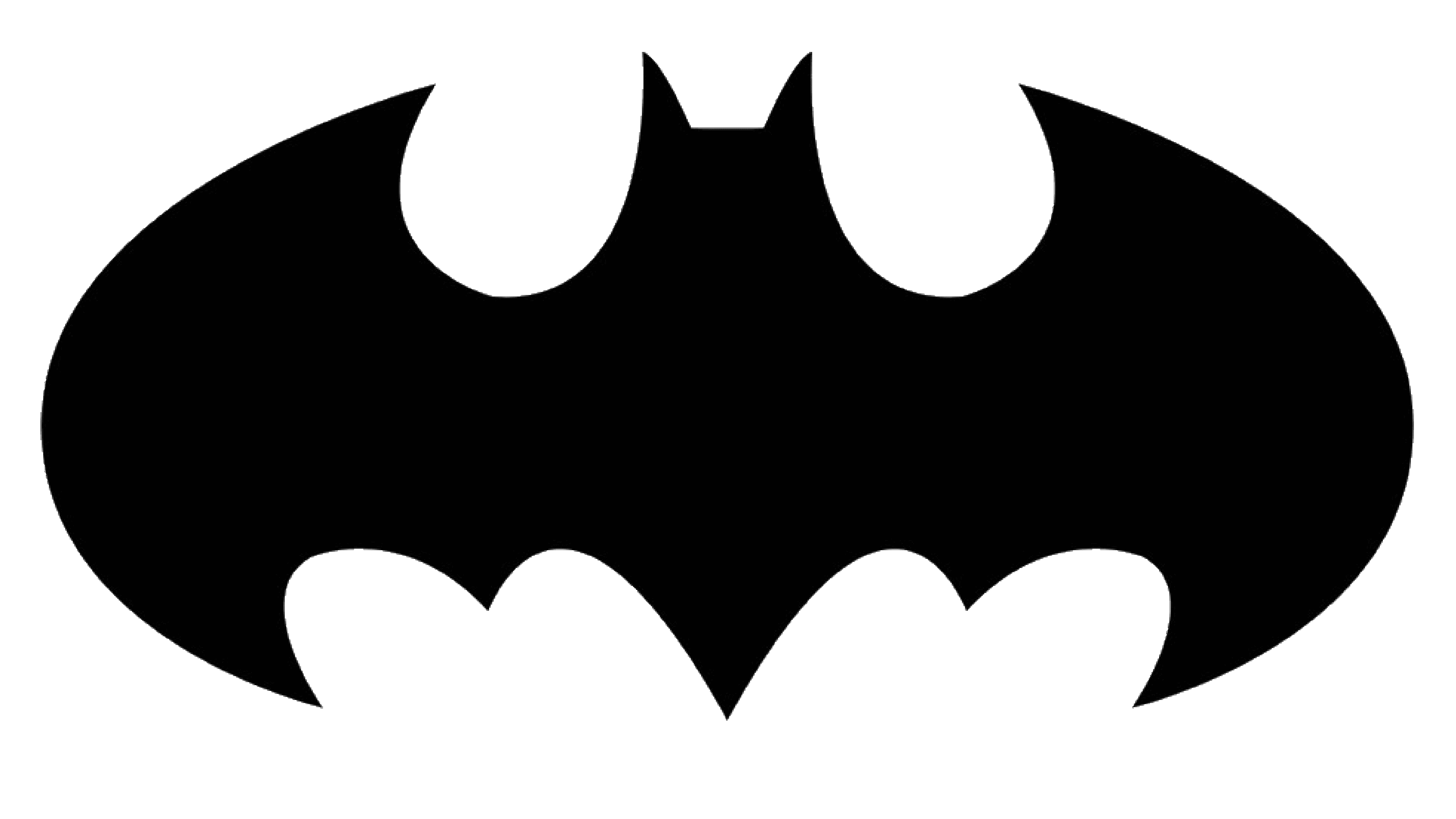
This one is actually amongst the most classic logos. It’s just a basic bat with wide wings stuck inside a yellow oval.
1992 – 1993
![]()
For this one, they took the previous bat, removed the oval and made the wings thinner. Plus, they also lengthened the tail. The most interesting fact here is that it was essentially a precursor to the two next symbol versions.
1993 – 1995
![]()
This one is amongst the most unique. It was basically the middle – a thin head with a short tail – with two bars across it and the thin curves for the wings on the end of each bar.
1995 – 1997
![]()
Nothing particularly new here – they simply took the 1992 variant and made the wings longer and more imposing.
1997 – 2003
![]()
This emblem was meant for ‘Batman and Robin’ (1997) – the one where the suit had nipples, notoriously. It was just a usual black bat with a much slimmer yet stretched red bird (for Robin). The bird was just like the bat, but no ears and membranes beneath the wings.
2003 – 2005
![]()
This one was an interlude comic book version. The angles were less pointy, and the general design was much smoother. Also – no head.
2005 – 2008
![]()
This emblem was used by Batman in the ‘Batman Begins’ (2005) movie. It was much like the 1977 version, if you remember it – the wings are much more prominent and forward-inclined, and the general shape is rather aggressive.
2008 – 2017
![]()
This, and the similar design was used in ‘Dark Knight’ (2008) and ‘Dark Knight Rises’ (2012) movies. The shape is supposed to look more metallic, and this time the wings are placed horizontally, while the tips looked much sharper than before.
In the 2012 movie, they also used a lot of ‘broken glass’ effects around this emblem, when they could.
2016 – today
![]()
This one is used by Ben Affleck’s Batman. This version is way thicker than before – the head is only represented by a short stud and two ears. In addition, the wings are outlined by the two edge tips on top and several in the bottom – meant to represent the membranes.
It was used in ‘Batman v Superman’ (2016) and ‘Justice League’ (2017), although it may soon be replaced by Robert Pattinson’s new emblem.
Emblem and Symbol
There have been many other small-time emblems that belonged to Batmans from minor comic books, but these are the most prominent out of the bunch.
And the reason why they came up with this symbol and this superhero in particular back in the 1930s was simple – DC simply wanted someone to fly around the NYC (later – Gotham City) dressed as a terrifying bat.