Nebraska Cornhuskers Logo
The University of Nebraska-Lincoln’s Nebraska Cornhuskers symbolize the university’s dynamic athletic culture, boasting a rich heritage and a wide array of sporting successes. Their celebrated football squad stands as a pillar of their athletic identity, having achieved numerous national titles and drawing unparalleled crowds to the Memorial Stadium. Although not as prominent as the football team, the men’s and women’s basketball squads have demonstrated steady progress and tenacity, with the women’s team notably advancing to the NCAA Sweet Sixteen. The baseball team is recognized for its consistently strong showings and significant national fanbase. Additionally, since its establishment as an official sport in 1996, the university’s bowling team has garnered several national championships, further evidencing Nebraska’s comprehensive athletic expertise. These teams collectively represent a tradition of athletic distinction and a spirited commitment to competition.
Meaning and history
The Nebraska Cornhuskers, the pride of the University of Nebraska-Lincoln, have a storied past steeped in athletic triumphs and traditions, evolving significantly over the decades.
In the realm of football, the Cornhuskers’ journey is marked by early successes and groundbreaking streaks. The team’s ascent to prominence took a quantum leap with Bob Devaney’s leadership starting in the 1960s, leading to a golden period of national titles and conference triumphs. The legacy was magnificently carried forward by Tom Osborne, who, during his tenure from 1973 to 1997, not only clinched three national championships but also revolutionized the game with his strategic insights.
Turning to basketball, while the Cornhuskers’ men’s team has had a more modest history, it’s a narrative of steady progress and resilience, marked by multiple NCAA tournament appearances. The women’s basketball team, evolving from a club sport to a varsity team in the 1970s, has rapidly grown into a formidable competitor, achieving significant milestones, including a Sweet Sixteen appearance in 2010.
In baseball, the Cornhuskers have carved out a niche for themselves with consistent performances, high national attendance rankings, and several conference championships. The bowling team, an official varsity sport since 1996, boasts an impressive record with multiple national titles. Moreover, the men’s and women’s cross country teams have contributed to Nebraska’s rich athletic tapestry with their own conference championships and NCAA appearances.
This brief glimpse into the Cornhuskers’ history reflects a journey of growth, challenge, and triumph, creating an enduring legacy of athletic excellence and a vibrant culture of sportsmanship and team spirit.
What is Nebraska Cornhuskers?
The Nebraska Cornhuskers represent the athletic teams of the University of Nebraska-Lincoln, known for their rich tradition in collegiate sports, particularly football. They are a symbol of athletic excellence and competitiveness, with a history of significant achievements across various sports including football, basketball, baseball, and bowling.
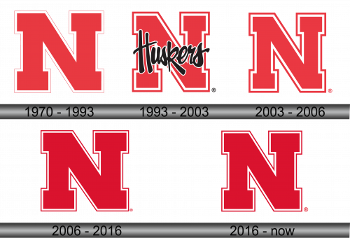
1970 – 1993
The logo, distinct in its simplicity and boldness, features the letter ‘N’ rendered in a scarlet hue, set against a clear background. The character, constructed with sharp angles and blocky serifs, conveys a sense of solidity and tradition. The scarlet color is vibrant, symbolizing energy and passion, traits synonymous with the spirit of sports. Its design is minimalist, eschewing unnecessary embellishments to focus on the essential identity it represents. This logo is not just a letter; it’s an emblem of the Nebraska Cornhuskers’ heritage, resonating with fans and athletes alike as a symbol of pride and excellence in athletics. The use of a single letter in sports logos is often intended to create a strong brand identity that is easily recognizable and memorable, and this logo achieves that with its stark and uncomplicated contrast.
1993 – 2003
In the revised design, an external crimson boundary, meticulously traced around the characters, expanded in breadth. Emblazoned across the emblem, the term “Huskers” manifested in a rugged, uneven script resembling hastily scribbled graffiti. The letters “H” and “k”, purposefully positioned a notch below the baseline, imparted a dynamic, almost leaping effect to the text. This artistic choice imbued the insignia with a sense of movement and energy, as if the letters themselves were in mid-jump. The stark contrast between the deep red perimeter and the jet-black typography accentuated the boldness of the design. The uneven thickness of the red outline, coupled with the irregularity of the lettering, gave the impression of a handcrafted, personalized touch. This stylistic approach suggested a blend of traditional craftsmanship and modern, edgy aesthetics, creating a visual representation that was both striking and memorable.
2003 – 2006
The image features a bold, block-style letter “N” depicted in a vibrant crimson hue, outlined by a stark white border which gives it a striking contrast against the red background. This particular shade of red is deep and vivid, suggesting a sense of passion and vigor. The letter’s form is characterized by strong, straight vertical lines and sharp, right-angled corners at the top and bottom, which conveys a sense of solidity and stability. The serifs at the beginning and end of the letter are thick and pronounced, adding a classical touch to the modern design. The white outline not only serves to accentuate the letter’s shape but also provides a clear separation from the red backdrop, ensuring the symbol stands out with maximum visibility. The overall design is simple yet powerful, with a symmetrical balance that is pleasing to the eye. This logo is indicative of a brand or institution that values tradition, strength, and boldness. The registered trademark symbol (®) positioned at the bottom right corner indicates that this logo is legally protected and officially represents the entity it is associated with.
2006 – 2016
The logo consist of the letter “N” in a bold, sans-serif typeface with a thick, white border framing the deep red interior. The letter stands out prominently against a white background. The red of the “N” is rich and saturated, conveying a sense of depth and intensity. Its shape is structured and angular, with strong vertical lines that create a feeling of upward movement and stability. The white outline is consistent in width, highlighting the letter’s form and ensuring it is distinctly visible from afar.
Comparing this to the previous description, the logo maintains its use of a singular bold letter “N” with a white border, signifying continuity in design. The registered trademark symbol is still present, located at the lower right of the “N”, indicating its protected status. The color palette remains unchanged, with the same vibrant crimson and white, which may represent the consistent brand identity the logo is meant to embody. The sharp angles, the symmetry, and the clear, unambiguous lines speak to a classic aesthetic that is both timeless and assertive.
2016 – Today
The logo composed of a singular, uppercase “N” with a robust, scarlet red fill and a crisp, white outline. The “N” is designed with thick, block-like serifs that reinforce its authoritative presence. The use of red is particularly striking, symbolizing energy and action, while the white border sharply defines the letter’s shape, enhancing its visibility.
Comparing this logo to the previous one, it appears consistent in its fundamental design elements—the color scheme, the prominent serif font, and the overall shape remain the same. This consistency suggests a deliberate effort to maintain brand recognition and visual impact. The registered trademark symbol, denoting legal protection, is subtly placed at the bottom right, affirming the logo’s authenticity.
