New Mexico State Aggies Logo
There is probably no university in the US without its own sports teams. New Mexico State University is proud to have over fifteen varsity sports teams. The Pistol Pete, which is also seen on the university’s logo, is a cowboy in a red jacket with a hat and a pistol in his hand. The New Mexico State Aggies logo shows that the sports players were tough and not afraid of hard work to achieve the best results. The successful games year after year prove that nothing can stop the Aggies.
Meaning and History
The New Mexico State University originally had a strong focus on agriculture. “Aggies” is a common nickname for “agriculturalists”. It was natural for the sports teams of the university to be also called the Aggies. The first team to receive this nickname were football players back in 1929. Being part of the oldest public higher education institution in the state, the team achieved great results. Currently, there are over 400 athletes in the university who play different sports professionally.
What is New Mexico State Aggies?
The New Mexico State Aggies is the name of players from close to twenty different varsity ports at the NMSU. They are known for their strength and determination. A cowboy in red with a pistol has been representing the students since the early 1960s.
1983 – 1995
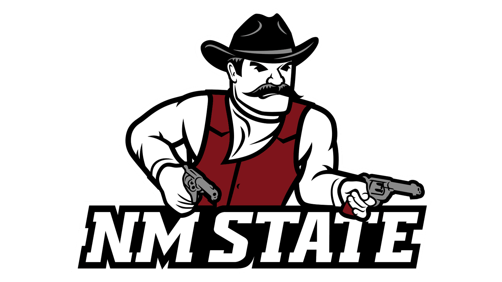
The mascot of the athletic teams is a Pistol Pete, who was first drawn in the 1960s. It did not catch on right away but in the early 1970s, the first live appearance of Pistol Pete was made. This particular version is a caricature drawing of the Pistol Pete that is done in white and crimson colors. He is holding one pistol in his right hand and pulling out the other one with his left hand. He wears everything a typical cowboy would have, including boots, flared pants, a neckerchief, and a hat. The look on his face says that this cowboy has seen life and you will not surprise him. Pistol Pete is surely ready to face anything that life throws his way.
1995 – 2005
A square with a zigzag line is not just a random shape for the base but a map of the New Mexico state. Actually, the logo has “NM” printed in large black letters with slab serifs and a white outline. The word “State” is added in all caps in white at the bottom of the logo. Although there is no Pistol Pete, a contrasting color palette and bold strokes give the logo a confident and daring appearance.
2005 – 2006
There was one year when this character was replaced by a cowboy with a lasso. He was called accordingly, Lasso Larry, and had a very realistic look compared to the original version. In fact, the logo does not have the full body, and the cowboy is pictured behind an inscription. The latter has “Aggies” printed in white, large letters with a black outline. The second line had “New Mexico State” in smaller font. However, the public did not approve of the new logo, so this version did not last very long.
2006 – 2016
The true and only Pistol Pete was brought back. He had a new look, but the same determined, daring, and independent character. Compared to the earlier version, he has both pistols ready. The hat color was changed from red to black, which added a nice detail and created a more balanced look. The athlete himself looks slimmer and more trained and prepared for the game.
2016 – Today
Another update to the logo was rolled out in 2016. It might seem that there are no changes. The most noticeable one, though, is the shortened name. There is only one line and it has “NM Aggies” in all caps using the same font as in the earlier logos. The designer also removed the “NM State” inscription on the cowboy’s jacket. Pistol Pete is surely an extraordinary character in the logo of a university that is hard to forget.
Font and Color
The university used the same color palette for the logo throughout its existence. It is white, black, and crimson colors. The main crimson color is not only associated with danger, but also looks powerful, daring, and youthful. The color palette was able to reflect the excitement of the games and the players’ determination to destroy their opponents and win the game.
Most logos share the same geometric font with slab serifs and three-dimensional effect. The letters are italicized, creating a feeling of movement and reflecting the game dynamics. At the same time, the bold strokes and shadows that create an impression of volume go well with the courageous and tough Pete character and the students he represents. The main font is very similar to Ciribiribin Oblique JNL by Jeff Levine, while the second line uses a font that resembles Lab Slab Pro Black Italic by Vanarchiv.


