New York Knicks Logo
The New York Knickerbockers basketball club, or, as fans and journalists more commonly call it, the New York Knicks, has existed since 1946. This is one of the few NBA teams that has not moved or been renamed once. According to Forbes Magazine, the Knicks are the most valuable basketball team in the United States, estimated by experts at approximately $608 million. The home arena of the New York Knicks, Madison Square Garden, is arguably the most famous indoor sports ground in the world.
Meaning and History
The team was founded in 1946. Such a name was borrowed from Washington Irving, the author of the book “History of New York”. After the release of his book, the word “Knickerbockers” was used to call all the inhabitants of the city. In the first two decades of its existence in the NBA, the team was not distinguished by special achievements. In the late 60s and until the mid-70s, the team won many victories, including winning the NBA championship twice – in 1970 and 1973. The Knickerbockers won their first division title in the 2012–13 season, led by Carmelo Anthony and Amar’e Stoudemire.
What is New York Knicks?
New York Knicks is the famous New York basketball team. It is a two-time NBA champion. The Knicks played their first game in 1946 against the Toronto Huskies. Their first head coach was Neil Cohelan.
1946 – 1964
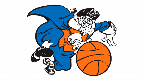
The first logo of the Knicks was very bright and energetic. It pictured a caricature drawing of a basketball player running with a bright orange large ball in front of him. The player is done in blue, black, white, and orange, with blue being a dominant color used to draw trousers and camisole. There is plenty of details and motion, which is quite appropriate for a sports team.
1964 – 1979
A more reserved emblem was introduced almost twenty years after the team’s foundation. It simply stated a short version of the name positioned above a realistic picture of a basketball. The ball was orange, but due to a dark, almost black, shadow that gave it volume, it looked quite dark. The accent was on a bright orange word “Knicks” done in capital letters. They had a dark blue outline and a 3D look, with the bottoms of the letters fading into the background. The word was slightly arched above the ball.
1979 – 1983
The basic idea of the previous design was kept the same, but there were a lot of changes to the color palette. First of all, the ball no longer looked as realistic and was a solid orange color with black lines inside and a blue outline. Although the shape of the letters was barely changed, they were now a crimson color and had a white followed by a blue outline. The 3D effect and arch were preserved, but the bottoms of the letters now had defined lines that went behind the ball. Overall, the logo had a lighter and brighter feel.
1983 – 1989
There was another update, which also primarily focused on the colors of the emblem. The ball was once again made to look less eye-catching as it was a light brown color with a darker shade of the same color being used to draw all the lines and outline. The name caught attention with its bright orange color that beautifully popped against a blue outline. The font and 3D effect were preserved. The only difference was that the letters were slightly thicker.
1989 – 1992
The color palette was changed again and now had orange and blue as two main colors. The ball was done in the same orange color as the lettering, which has not changed at all. A blue color used for outlining the letters was applied to the lines inside the ball and around it. This change gave the emblem a more cohesive and professional look.
1992 – 1995
This year brought a more radical change. The letters acquired a more defined 3D shape and were tilted and stretched in such a way that it seemed that they were somewhere up high. They were still an orange color and had shades of blue for an outline and a 3D effect. The ball has also changed. Although it also remained orange with blue outlines, it was drawn smaller and at a different angle. The most noticeable change was an addition of a light blue triangle in the background with a thin darker blue outline. It brought all the elements together.
1995 – 2011
The next update did not change any parts or colors of the previous logo. Instead, it was an addition of “New York” above the word “Knicks” the letters were all uppercase and much smaller compared to the main word. They were done in blue color to preserve the color palette.
2011 – 2022
As with previous updates, the changes went only as far as the color scheme. The bright orange color was changed to a more faded orange, while the dark shadows under the letters were changed to a light blue, which was also used for the triangle. All the other elements of the emblem were unaffected.
2022 – 2023
For the 2022-23 season, the New York Knicks chose a deeper hue of blue and a richer silver for their logo, which once more showcased “KNICKS” in a curved format above a basketball, all resting on a silver triangle. However, post-season, the team decided to experiment with their color palette once again. This time, they opted for a more vibrant and lighter shade of orange for the 2023-24 season, breathing fresh life into their iconic emblem.
The continual evolution of the Knicks’ logo mirrors the team’s dedication to staying modern and dynamic, reflecting their readiness to embrace change while still holding on to their core identity. The basketball and triangle elements pay homage to the sport and the team’s heritage, while the adjustments in color shades symbolize the Knicks’ ongoing journey and adaptability in the ever-changing world of professional basketball.
The New York Knicks’ logo is more than just a visual identifier; it’s a symbol of the team’s rich history, its connection to New York City, and its commitment to excellence on and off the basketball court. Through subtle changes and careful consideration, the team ensures that their emblem remains a powerful and relevant representation of their values, their community, and their aspirations for the future.
2023 – Today
The emblem of the New York Knicks proudly features the term “KNICKS,” painted in vibrant shades of orange and blue, gracefully arching above a basketball that shares the same orange and blue color palette, all of which is set against a gleaming silver triangular backdrop. Above this ensemble, the words “NEW YORK” are inscribed in a deep blue hue, forming an arch that perfectly mirrors that of the word “KNICKS.”
Ahead of the 2023-24 NBA season, the Knicks opted for a subtle yet impactful modification, adjusting the shade of orange utilized in their previous logos. This transition to a lighter, more dynamic shade of orange was a strategic move that not only invigorated the logo but also symbolized a fresh start and a renewed energy for the upcoming season.
This emblem is not just a visual representation of the team; it is a carefully crafted symbol that encapsulates the essence of the New York Knicks. The use of blue and orange, which are the team’s official colors, pays homage to the Knicks’ rich history and legacy. The basketball element is a nod to the sport that lies at the heart of the team’s identity, while the silver triangle adds a touch of modernity and elegance. Together, these elements combine to create a logo that is not only visually appealing but also steeped in symbolism and meaning, representing the team’s past, present, and future.
