Obama Logo
Barack Obama was one of the most renowned American presidents, serving from 2009 to 2017. He was a prominent figure in Democratic Party for years prior to that, and he heavily influenced the healthcare system, as well as committed several more questionable acts while serving as a President.
Meaning and History
Obama ran two presidential campaigns – one in 2008 and the other in 2012. Each had its own logo, although the main element persisted. In the center, there was always circle that featured a sun in the blue sky that rose over the white-and-red striped hill. Obviously, it was a combination of American symbols and the letter ‘O’ that associated so heavily with former president.
2007 – 2008
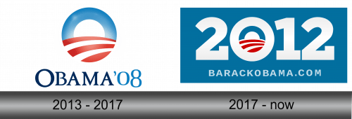
In 2007, Obama election managers chose this one as a logo for the upcoming presidential campaign. It featured the renowned ‘sunrise’ logo with excessive lighting coming out of the sun in the center.
Below the symbol was the writing in two layers. The first was ‘Obama ‘08’ written in big uppercase letters – text in darker blue, and numbers a paler shade. Right below, there was also a smaller writing right below that featured the candidate’s website. It was written in the same paler blue.
2011 – 2012
Because the 2007 logo succeeded, they recycled the main elements for the 2012 campaign. The whole logo was put inside a blue rectangle this time. One of the main parts was the ‘2012’ writing as well as the smaller website right below it – both rather thick and written in white.
The ‘sunrise’ symbol was much cleaner – there was no illumination, and it was conveniently placed inside the ‘0’ in ‘2012’. Because zero was shaped more like ‘O’, it also reminded people of the candidate’s name, which was a neat design choice.
Emblem and Symbol
The reason why they chose such elements for the ‘sunrise’ logo was simple. They had to use the traditional American symbols, and the rising sun clearly relayed ideas President shared – clear future, opportunity, peace. And, well, there weren’t many candidates whose name started with ‘O’.
