UPS Logo
United Parcel Service, Inc (UPS) is a world-known American brand, specialized in the express delivery of goods and logistics. The company was founded in 1907 in Seattle, Washington. Founders Claude Ryan and Jim Casey borrowed $ 100 and set up a basement firm called the American Messenger Company.
Meaning and history
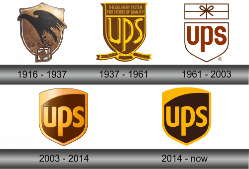
Founded at the beginning of the 20th century, the company has a very rich history, during which its logo has been changed several times. Throughout its history, UPS has been faithful to the symbol of the shield – the epitome of confidence and reliability. The company even informally calls the logo a shield. This image is enhanced by the golden-brown color scheme associated with stability and security. It also helps to stand out from competitors who rarely use these colors in their logos.
1916 – 1937
Despite the fact that the company was founded in 1907, its first logo was approved only in 1916. Prior to that, the company used trucks of different colors to deliver parcels. The founders wanted everyone to know that more than one car moves around the city, but several.
Came up with the original logo by James Casey. The logo consists of the shadow of a black eagle against a bronze shield. In its claws, the bird carries a parcel with the inscription “Fast, safe and reliable.”
1937 – 1961
In 1937, the logo was changed to reflect the growth of the company. Since UPS was actively cooperating with retailers by that time, the new slogan on the logo was the phrase addressed to the target audience: “Delivery system for quality suppliers.” Eagle was replaced with the name of the brand, and at the bottom they wrote “Since 1907”, which added solidity.
1961 – 2003
The third logo, introduced in 1961, was radically different from the previous ones. The brand entered the world market, so it used universal and understandable symbols. The design became minimalistic – the shield was drawn in the form of a black outline on a white background with a bold UPS inscription. A parcel tied with a rope was placed on top.
2003 – 2014
A new version of the logo was presented on March 25, 2003. The logo has been modified but still retained its original features. In particular, the gift box at the top of the icon disappeared. Also, the designers made it colored and added volume. The caps letters “UPS” have taken on a rich golden hue, and the background has taken on the signature dark brown color.
2014 – present
The logo adopted in 2014 is the revised 2003 logo. The designers just removed the 3D effect and made the colors darker.


