Orlando Magic Logo
Orlando Magic is a professional basketball team based in Orlando, Florida. Businessman Jim Hewitt envisioned the team, seeking to bring an NBA franchise to the city. He collaborated with Pat Williams, a sports executive, to make this dream a reality. The NBA awarded the franchise to Orlando in 1987. The team’s creation aimed to enrich the local sports scene and provide entertainment. As members of the Eastern Conference Southeast Division, they play their home games at the Amway Center.
Meaning and history
Orlando Magic officially became an NBA franchise on April 22, 1987. Their journey began with a vision to introduce professional basketball to Orlando. The team’s name, “Magic”, reflects the magical experience of the nearby Disney World, aiming to capture the enchantment of Orlando. They played their inaugural season in 1989, marking their entry into the league. Over the years, the Magic have seen significant moments, including reaching the NBA Finals in 1995 and again in 2009. These milestones highlight the team’s growth and its place in NBA history.
What is Orlando Magic?
Orlando Magic is an NBA basketball team representing Orlando, Florida. They compete in the league’s Eastern Conference Southeast Division. Known for their dynamic gameplay and community involvement, the Magic have become a cornerstone of Orlando’s sports culture.
1989 – 2000
The logo features a bold, stylized depiction of the words “Orlando Magic”. A prominent star substitutes for the letter ‘A’ in “Magic”, signifying excellence and aspirations. Surrounding the typography, numerous smaller stars create a dynamic aura, suggesting a universe of possibilities. A basketball in motion forms part of the background, representing the sport itself and the movement towards victory. The color scheme, a striking contrast of blue and silver, conveys professionalism and a futuristic vibe. This emblem captures the spirit of the team and the city’s magical allure.
2000 – 2010
This logo iteration of the Orlando Magic features enhanced dynamism and a sleeker look. The word “Magic” is rendered in a more fluid, stylized font, giving a sense of motion and energy. The star in place of the letter ‘A’ remains prominent but gains a 3D effect, enhancing its visual impact. Additional stars are now integrated into the swoosh, which curves under the text, implying speed and the arc of a basketball in flight. The color palette remains consistent, with blue and black conveying a strong, assertive presence accented by the use of silver for a modern edge. The overall design captures a progressive spirit while staying true to the original theme.
2010 – Today
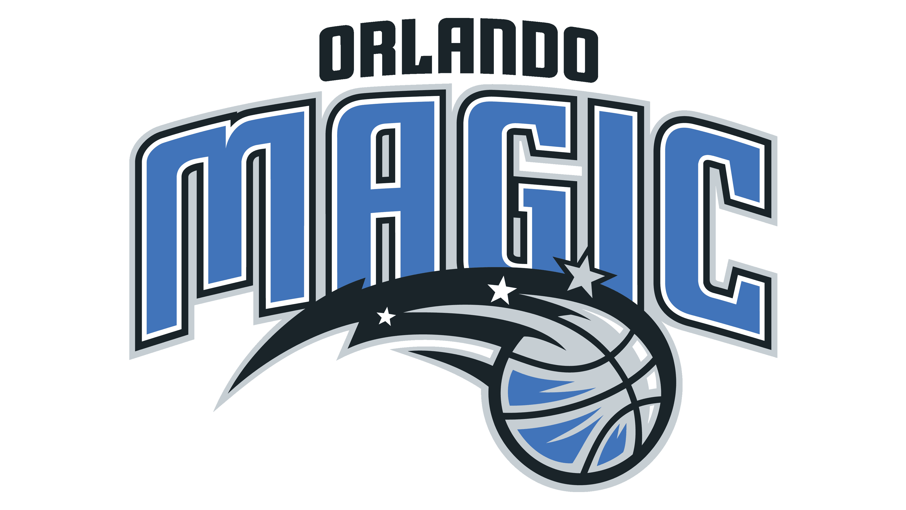
In this version of the Orlando Magic logo, the design takes on a more conventional and structured appearance. The solid, block-like font tightly embraces the word “Magic”, radiating strength and a timeless quality. A simpler, flat swoosh has ousted the earlier swirling motion and 3D effects, now hosting a basketball in its curve as a distinct tribute to the sport. Stars once scattered are now orderly within the swoosh, delivering a structured harmony. This design iteration reflects a return to basics, focusing on boldness and clarity while maintaining the iconic elements of the team’s brand identity.


