Penn State Nittany Lions Logo
Penn State Nittany Lions is an organization that encompasses many individual sports teams that compete on behalf of Pennsylvania State University (aka Penn State). All of these teams are called Nittany Lions, so it’s generally easy to distinguish them among the other teams this state has to offer.
Meaning and History
Various teams competed on behalf of Penn State for a very long time, even if they weren’t called Nittany Lions back in the day. The brand itself was finalized when the organization was given a logo back in 1983. Since then, they are officially an athletic branch of Penn State Uni.
1983 – 2001
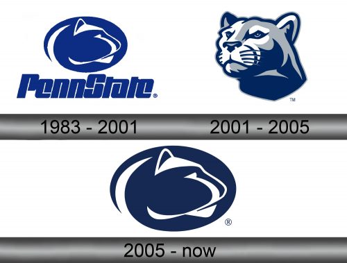
The first logo featured a dark blue oval with distinctive features of a lion’s head (sans mane) drawn onto it in white. Below it was the writing that said ‘Penn State’ in thick tilted typeface. This style distinctly has little room between the letters and even inside the letters themselves. It’s just a very dense mass of letters that spell the uni’s name.
They naturally used the emblem on its own, without the writing part, but the full logo is an integral combination of two.
2001 – 2005
In 2001, the logo became rather more realistic and complex. It was now a lion’s head depicted in mostly the shades of blue and white (the usual colors of Penn State teams). It was more realistic, not just a silhouette anymore, but a full-on painting of a lion’s head.
Below it was a white ribbon that said ‘Penn State’ in white serif letters. And below that was the name of the teams – ‘Nittany Lions’ in plain small letters with big intervals between them.
2005 – now
In 2005, they simple returned to the 1983 logo, but without the writing part on it.
Emblem and Symbol
Penn State also has a logo that isn’t meant for athletic display, but for general use within the uni and where it’s involved into something. It’s a blue shield shape with a semi-realistic silhouette of a lion’s head with the writing ‘Penn State’ to the right. Nittany Lion is a mascot for the entirety of the uni, not just the sports teams.

