Petronas Logo
Petronas is an oil and gas company. It carries out a wide range of activities in the oil and gas sector. These include gas processing and sale, oil refining, and sales of petroleum products. Along with sustainable energy research and development, it is also active in petrochemical manufacturing and marketing, automobile technologies, and even real estate and investments. The business actively collaborates with several engine and automobile manufacturers, which enables it to design unique solutions that satisfy the needs of companies like IVECO, Mercedes, BMW, Renault, and Fiat.
Meaning and History
![]()
The full name of the Petronas company is Petroliam Nasional Berhad. It was founded on August 17, 1974 by the government. The oil and gas reserves of the country now belonged to Petronas. However, Royal Dutch Shell and ESSO continued to operate and received 30% of the products, with the remaining 70% going to Petronas. A contract for production sharing was signed in 1976. The business established its own oil production subsidiary, Petronas Carigali, in 1978. Five years later, Petronas began processing and selling petroleum products. The main region of activity is Malaysia, but oil and gas production is carried out in more than thirty countries.
What is Petronas?
Petronas is a Malaysian oil and gas company. Today, Petronas is one of the world leaders in the production of gas and oil products for all types of vehicles and machinery from passenger cars to powerful marine engines. Its activities also involve research and development of renewable energy.
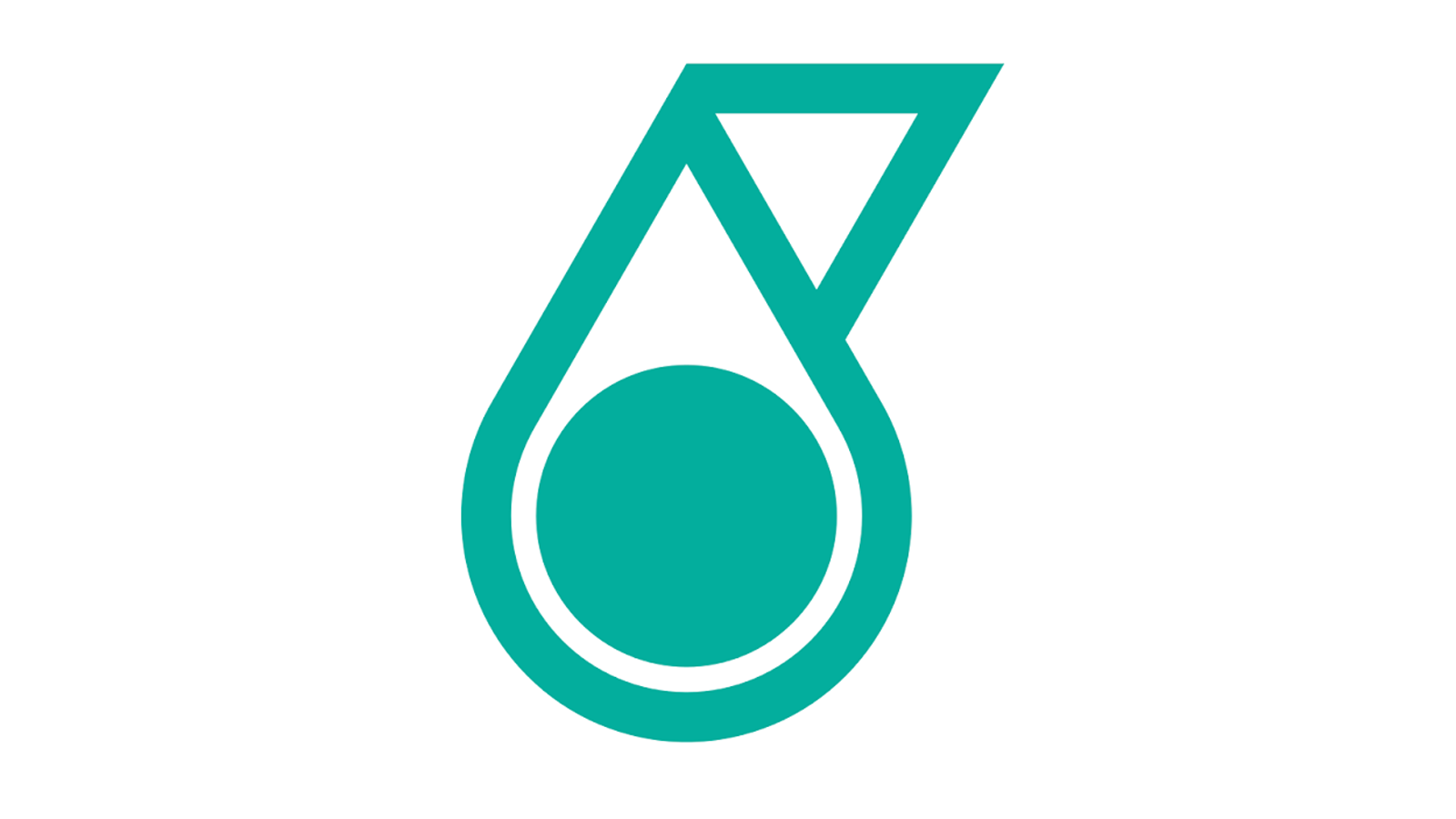
1974 – 1990
![]()
The original logo has a lot of symbolism and meaning behind it. it features a green and black color palette. At the top of the logo, there is an outline of an oil drop. It has a black circle in the center and a triangle in the upper right corner. The latter symbolizes the dynamics of the company as well as the movement that its activities provide, which is also supported by the circle that supposedly stands for a wheel. The outline is a thick black line while the inside portion is done in grassy green color. Under this element, there is a full name of the company done in thin basic, sans-serif font of green color. Right under, the shortened version is written in bold black letters. Both lines have the same length.
1990 – 2013
![]()
The company played with the original logo. It set the oil drop element on the right, while the black, shorted name was to the left of it. The full name was removed. In addition, all the black elements in the oil drop were now turquoise, while the inside was white. It was simplified but less put together compared to the original version.
2013 – 2019
![]()
The emblem of the company was now positioned above the name, which created a more cohesive and professional appearance. It also acquired some depth to it thanks to varying shades of turquoise color. Some of the corners were curved, while the dot in the center got smaller. This gave it a more modern and brought more attention to this element of the logo. A different font was also used for the name, although it remained black.
2019 – Today
![]()
The various gradients added earlier were smoothed out. Its shape now looked more like the one designed originally. The company also brought back the original font, making it look very similar to what it looked like initially.
Font and Color
With an exception of a relatively short period of time when the font looked something like Organetto Ultra Bold, the company used the same font in all of its logos. It resembles the Kabel Black typeface designed by Rudolf Koch, but features a slightly different letter “S”. The green color used in the logo stands for the natural origins of the oil and gas products, while the black gives the logo a more sophisticated and sleek appearance.