Purdue Boilermakers Logo
The Purdue Boilermakers is the collegiate athletics program of Purdue University in West Lafayette. Founded in 1887, the athletic teams have a rich history and compete in the Big Ten Conference. The nickname ‘Boilermakers’ was adopted in the 1890s after a newspaper used the term to describe the football team’s physical and tough playing style, likening them to the men who built and maintained steam engines. This nickname has become an enduring symbol of Purdue’s spirit and work ethic.
Meaning and History
![]()
Throughout its history, the Purdue Boilermakers have achieved significant success in various sports. The football program, which started in the late 19th century, has produced numerous All-Americans and NFL players. Basketball, another cornerstone of Purdue athletics, boasts a strong tradition with multiple Big Ten titles and NCAA tournament appearances.
The men’s basketball team, in particular, has been a powerhouse under the leadership of legendary coaches like Ward ‘Piggy’ Lambert and Gene Keady, and more recently, Matt Painter. The university’s commitment to athletics is evident in its investment in facilities and support for student-athletes, fostering a competitive environment across all sports.
Purdue’s athletic accomplishments extend beyond football and basketball. The Boilermakers have excelled in volleyball, wrestling, and track and field, among other sports. Student-athletes benefit from the university’s focus on both athletic and academic excellence, with many achieving high honors in their respective fields.
Purdue’s emphasis on innovation and engineering also permeates its athletic programs, contributing to advanced training techniques and facilities. This combination of tradition, excellence, and innovation has solidified the Purdue Boilermakers’ reputation as a formidable force in collegiate athletics.
What is Perdue Boilermakers?
The Purdue Boilermakers represent the athletic division of Purdue University, located in West Lafayette. Since their establishment in 1887, these teams have built a storied tradition and compete in the Big Ten Conference. The moniker ‘Boilermakers’ originated in the 1890s when a newspaper coined the term to highlight the football team’s robust and gritty playing style, drawing a comparison to the laborers who constructed and maintained steam engines. This nickname has since become a lasting emblem of Purdue’s tenacity and dedication.
1950 – 1970
![]()
The logo from this period features a robust Boilermaker character, depicted with a muscular build and wearing a hard hat. The character is holding a hammer, symbolizing the industrial heritage and strength of the Purdue Boilermakers. The letter ‘P’ is prominently displayed on the character’s chest, emphasizing the school’s initial and creating a bold, recognizable emblem.
1970 – 1980
![]()
The subsequent logo iteration continues highlighting the Boilermaker character with a more dynamic pose. This time, the character is shown in action, holding a hammer over his shoulder and standing confidently. The mustard yellow background adds vibrancy, while the character’s details are simplified, making the logo visually impactful and easy to identify.
1980 – 1994
![]()
The logo transitions to a more abstract representation, featuring a steam locomotive. The train symbolizes the engineering prowess and forward momentum of Purdue. The design is minimalist, rendered in black and white, with the letter ‘P’ clearly visible on the locomotive’s body, tying the imagery back to the university.
1994 – 1996
![]()
In this version, the locomotive becomes more detailed and stylized, incorporating more intricate lines and a sense of movement. The logo includes the words ‘Purdue Boilermakers’ below the train, reinforcing the team’s identity. The addition of yellow stripes in the background suggests speed and progress, reflecting the dynamic spirit of the university.
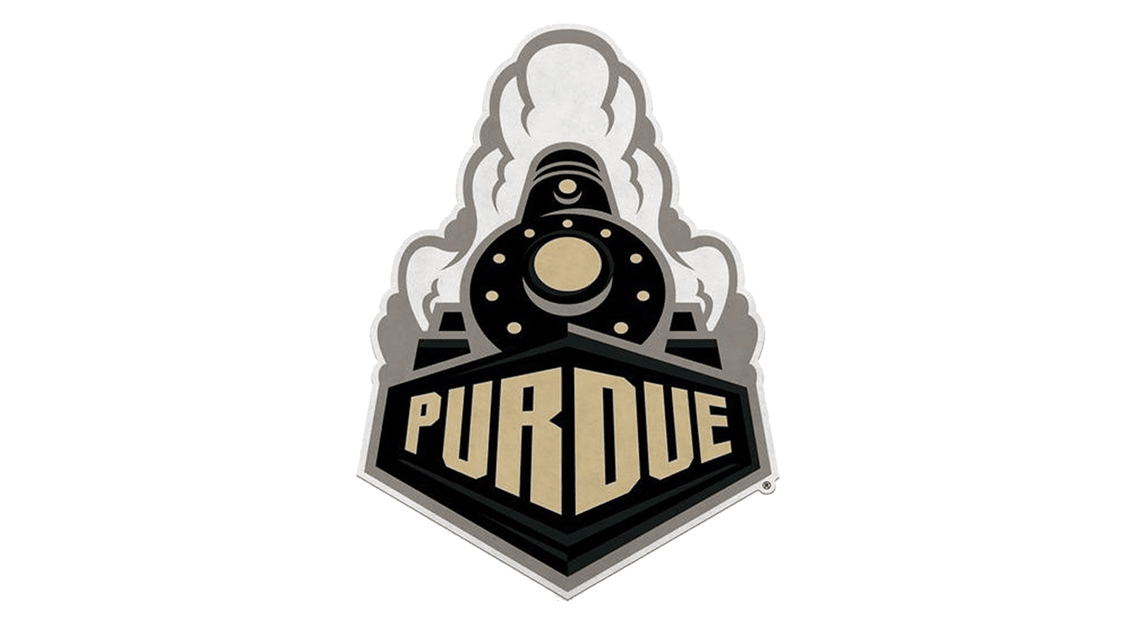
1996 – 2012
![]()
This logo introduces a more modern and aggressive look, featuring a powerful steam locomotive emerging from a cloud of steam. The train is set against a shield-like background with the word ‘Purdue’ prominently placed in the foreground. Black, gold, and white colors adds depth and richness to the design, creating a bold and striking emblem.
2012 – Today
![]()
The current logo simplifies the design to focus on the iconic ‘P’. The letter is rendered in a bold, blocky font with a slight bevel effect, giving it a modern and polished appearance. The beige color of the ‘P’ set against a black outline ensures that the logo is distinctive and versatile, suitable for various applications from sports uniforms to promotional materials.
Font
The fonts used in the Purdue Boilermakers logos over the years exhibit a variety of styles that reflect the changing design trends and the evolving identity of the university. The early logos (1950-1970) employ a serif font that conveys a traditional and authoritative tone, complementing the strong, industrial imagery of the Boilermaker character.
From 1994-1996, the logo features a sans-serif typeface that is clean and modern, adding a sense of forward momentum to the locomotive imagery. The font used for ‘Purdue Boilermakers’ is straightforward, enhancing readability and emphasizing the team’s name.
The 1996-2012 logo incorporates a more stylized and bold typeface, with the word ‘Purdue’ presented in a three-dimensional style that adds depth and dynamism to the logo. The current logo (2012-present) simplifies the typeface to a bold, blocky, sans-serif font for the letter ‘P’, maintaining a modern and polished look that is both versatile and impactful.
Color
The colors used in the Purdue Boilermakers logos are black, gold, and white, reflecting the school’s traditional color scheme. In the earliest logos, black and white are dominant, underscoring a classic and timeless aesthetic. The introduction of gold in the 1970-1980 logo adds vibrancy and ties into the university’s official colors, representing excellence and prestige. From 1994-1996, the logos integrate a combination of black, white, and gold, with the addition of yellow stripes to suggest speed and energy.
The 1996-2012 logo uses a rich gold and black palette, adding depth and contrast to the design, and reinforcing the brand’s bold and dynamic identity. The most recent logo continues to utilize a beige or gold ‘P’ against a black outline, providing a clean and modern appearance that remains consistent with Purdue’s iconic colors. This color scheme not only ensures strong brand recognition but also conveys the university’s tradition, strength, and forward-looking spirit.