Uber Logo
Uber is an international company that allows you to order cheap taxis in major cities around the world at prices far below market rates. To book a taxi, Uber uses its own mobile application, in which the client can track the movement of the taxi on the map. Uber fares are paid using a bank card, the number of which the customer enters in the app. For drivers, Uber is a modern way of earning money with the help of the latest advances in technology and communication.
Meaning and History
Back in 2008, during a snowfall in Paris, Travis Kalanick and Garrett Camp were unable to hail a taxi. This is when they came up with a simple idea – to be able to press a button and go wherever your heart desires. Initially, drivers participating in the Uber system could only use executive cars, in 2012 the list of available cars was expanded towards economy class and the company began expanding internationally. Today, Uber operates in about 500 cities in over 60 countries.
What is Uber?
Uber is an application for a mobile phone, which is used both to find a taxi nearby and to transport people for money. The conditions and the way Uber taxis operate are the same all over the world: the client orders a car using the Uber application installed on their phone, and the system sends a call to the nearest taxi registered in it that is ready to take an order.
2009 – 2010
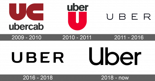
The original logo was done in a crimson and black color palette. Bold capital letters “U” and “C” were placed next to each other to stand for the “Uber Cab”, which was actually written in lowercase letters right under. The acronym was designed in such a way that “C” was actually the same as the letter “U”, except that it was turned right 90 degrees. It was a minimalistic logo that was easy to remember and recognize.
2010 – 2011
Shortly, the new company had to change its name due to some claims. The “Cab” part was removed from the name of the company. The logo had to be adjusted accordingly. They kept the big “U” to maintain recognition and wrote “Uber” in the same font only above instead of below the letter. The letter also had a brighter red look.
2011 – 2016
In 2011, the company introduced an even more minimalistic version of its logo. It was the word “Uber” typed in uppercase letters widely spaced apart. They had delicate straight lines with gentle curves on one of the ends of “U” as well as “R”. Overall, the logo had a timeless feel, and the typeface being used reminded of classical fonts. Bold and bright colors and lines have been foregone.
2016 – 2018
The updated version of Uber’s logo has undergone minimal design adjustments. The most noticeable change is the transformation of thin, delicate lines into much bolder. The wordmark used almost the same black font with few exceptions and definitely made a statement. There were no more curved elements on “U” and “R”, although the ends of “E” cut at a diagonal added an interesting detail.
2018 – Today
It was not long before Uber renewed its logo again. It left only the first letter capitalized, while the rest were printed in lower case using a traditional, yet unique, sans-serif font. The letters were still bold, but this time they were printed much closer together and stretched vertically. The logo had a contemporary feel.

