Vicks Logo
Vicks is a brand known for its over-the-counter medications. Lunsford Richardson, a pharmacist, created it. He developed it in Greensboro, North Carolina. The brand initially aimed to provide relief from cold and flu symptoms.
Meaning and history
Vicks originated in 1890 when Lunsford Richardson invented the Vicks Croup and Pneumonia Salve. Over time, this product evolved into Vicks VapoRub. Key milestones include the 1918 flu pandemic boosting its popularity due to its use in treating chest congestion. The brand expanded globally in the following decades, introducing a variety of products aimed at cold and flu relief, such as cough syrups and nasal sprays. The evolution of Vicks reflects advancements in over-the-counter healthcare, providing accessible remedies for everyday ailments.
What is Vicks?
Vicks primarily refers to Vicks VapoRub, a topical ointment used to relieve cough, congestion, and cold symptoms. The product is applied to the chest and throat for cough suppression or to the muscles for minor aches and pains. Its distinctive menthol aroma is instantly recognizable.
1890 – 1916
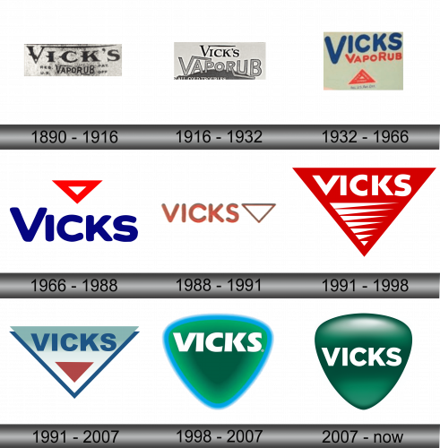
The logo presents a vintage look with bold, capitalized letters spelling “VICK’S”. Below, “VAPORUB” features prominently, suggesting its key product. The design carries a classic aura, with its font hinting at an early 20th-century style. It bears the mark “REG. U.S. PAT. OFF.”, indicating registered trademark and patent recognition.
1916 – 1932
The updated logo maintains the bold, all-caps “VICK’S”, yet introduces a more modern font. “VAPORUB” now overlaps, adding depth. The phrase “FOR ALL COLD TROUBLES” is new, set beneath in an inviting, italicized typeface. This tagline promises relief, enhancing the logo’s appeal. The entire composition feels less austere, more accessible, aiming to connect with a broader audience. The wear on the backdrop is less pronounced, indicating a transition towards a cleaner presentation.
1932 – 1966
This rendition of the logo features a significant shift towards simplicity and color contrast. “VICKS” and “VAPORUB” now share a vibrant blue hue, symbolizing trust and cleanliness. The design excludes the previous tagline, opting for a clutter-free approach. A singular red triangle with “TRADE MARK” inscribed serves as a focal point, reinforcing the brand’s identity. The text “REG. U.S. PAT. OFF.” remains, subtly repositioned to the bottom, maintaining legal claim while allowing the brand’s name to dominate. The overall look is more cheerful and less medicinal, likely aiming to be more consumer-friendly.
1966 – 1988
The evolution continues with a pared-down, more contemporary design. The “VICKS” lettering is now sans-serif, which enhances readability and modernity. A striking red triangle sits above, replacing the previous ‘trade mark’ text, symbolizing stability and attention. The color scheme, a crisp blue against white, conveys cleanliness and efficiency. This logo is straightforward, ditching all superfluous elements, reflecting a modern and more focused brand identity. It’s a leap towards minimalism, aligning with mid-20th-century design trends.
1988 – 1991
The logo takes a soft turn, adopting a warmer, copper-like color. “VICKS” is now in lowercase, with friendly, rounded letters suggesting approachability. The stark triangle, previously red, assumes the same hue as the text, creating a harmonious look. This design choice signifies a unified brand image, inviting trust and comfort. The removal of the hard edges in the typography implies a more gentle, caring brand persona. The background is clean, the focus is solely on the brand name and the triangle, signifying a modern and minimalist branding approach.
1991 – 1998
The logo undergoes a bold transformation, embracing a dynamic red inverted triangle. Inside, “VICKS” stands out in stark white, capitalized letters, embodying strength and vigor. This design abandons the previous logo’s softness for a striking, high-contrast look. The triangle’s edges feature progressive white lines, adding motion and implying swift relief. This visual pivot symbolizes action and energy, aligning with the brand’s promise of effective relief. The clean lines and sharp colors represent a modern and powerful brand identity.
1991 – 2007
The logo opts for a cooler palette with a soothing teal and white triangle, embodying a sense of calm and relief. “VICKS” is inscribed in a darker shade of blue, promoting a feeling of trust and care. The design introduces a red inverted triangle at the core, drawing the eye and signifying importance. This minimalist design strips away previous complexities, favoring a straightforward and clean aesthetic. It signifies a modern and approachable brand, evoking a fresh and hygienic image. The use of gradient in the triangles adds depth and a contemporary touch to the overall design.
1998 – 2007
The logo transitions to a vibrant green, embodying vitality and well-being. The triangle morphs into a shield-like shape, suggesting protection and defense against ailments. “VICKS” is displayed in white, ensuring high visibility and contrast against the green gradient background, which symbolizes freshness. The addition of the ® symbol next to “VICKS” denotes a registered trademark, indicating a strong brand identity. The overall effect is one of freshness, health, and a more pronounced corporate presence, with the shield shape reinforcing the brand’s commitment to safeguarding health.
2007 – Today
The logo has been refined to a deeper, monochromatic green, exuding a sense of wellness and natural essence. The word “VICKS” sits prominently in the center in a bold, clean font, communicating stability and reliability. The background shield shape is smoother, its gradients subtler, evoking a sense of safety and care. The design is streamlined, confident, and devoid of any additional elements, focusing solely on the brand name. This minimalist approach suggests a modern and straightforward solution to cold care, emphasizing the brand’s focus on essential wellness.


