CVS Pharmacy Logo
CVS Health is an American healthcare company with a network of about 10,000 pharmacies and stores. The company’s business includes the CVS Pharmacy pharmacy chain, CVS Caremark’s drug benefit management division, and Aetna’s health insurance division. As part of the pharmacy division, the company sells prescription drugs and consumer goods, including health products, and manages drug benefits for citizens.
Meaning and History
A long-running division of the Melville Corporation was CVS Pharmacy. The latter’s history began in 1892, when shoe trader Frank Melville turned several New York shops into a modest but successful chain. In 1969, Melville purchased the network of retail pharmacies known as the Consumer Value Stores. It was acquired six years after the firm was established by three partners. Before adding pharmacies a few years later, the company was origianlly a network of health and beauty shops. Later, the business changed the name of its most successful division to CVS Corporation and decided to concentrate on it. The official founding of CVS Pharmacy dates back to 1996, CVS Corporation spun off from Melville.
What is CVS Pharmacy?
Although CVS Corporation lags behind its competitor Walgreen Co. by total revenue, by the number of pharmacies and prescriptions filled, it is the largest drugstore chain in the US. CVS runs more than 4,000 locations, which are spread across country.
1963 – 1967
The initials of the Consumer Value Stores chain were placed on a black shield. The initials were white and placed on a diagonal, going from the upper right corner. Besides pointed serifs, the logo did not have any other fancy details.
1967 – 1969
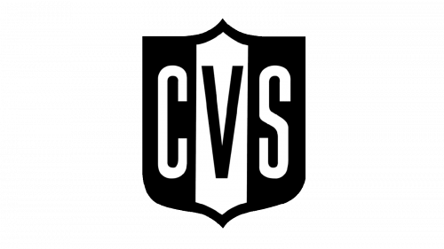
The shield has changed its shape, so the upper center and lower pointed ends were mirrored. The other two at the top got removed, creating a straight angle instead. The initials no longer had serifs and were written horizontally across the base. The letter “V” had an accent in the form of a white rectangle that was going vertically. The new logo looked very symmetrical and balanced.
March – April 1969
After changing ownership, the company tried a different logo. It did not have anything in the background. Instead, the initials were done in large, black sans-serif letters that were placed very closely together. Underneath, the full name was done in smaller, basic font to fit the length of the initials.
April – July 1969
A little later, the company also tried a version where the full name was written in line with the initials. The Fonts and sizes were kept the same as in the previous version.
1969 – 1971
After trials and errors, the company decided to go with just the initials of its name. They were done using a similar font. This time, though, a bright red color made an otherwise simple logo look bold and capture one’s attention.
1971 – 1978
1978 – 1984
1984 – 1996
1973 – 1975
1974 – 1994
1977 – 1994
1994 – 2016
When the company became independent, it gave its pharmacy division a different logo. It was not anything drastically new. The designers simply added “pharmacy” to the logo. It was done using the same font, only lowercase letters, and color. A slash sign served as a separation element.
2016 – Today
The company used the previous logo as a base. The most noticeable change was an addition of a heart shape to the left of the wordmark. It had squarish tops instead of typical round ones. In addition, the font used for the word “pharmacy” has changed. There was no slash sign either. The new logo had a little more meaning behind it and looked more modern.
Font and Color
Helvetica Black, a grotesque typeface without serifs created by Eduard Hoffmann and Max Miedinger, is the font used in the logo of the pharmacy. Initially, the black and white color palette reflected the origins of the company when such colors were predominant. In 1969, it was replaced by a bright red, which not only looked eye-catching but also reflected the power of the company and its passion to bring something valuable to its consumers.


