Durex Logo
The Durex brand produces contraceptives and a wide range of other intimate products (sex toys, lubricants, etc.). The range of products is very wide. Employees conduct research not only with different materials, but also experiment with the shapes, tastes, and smells of products. About a billion Durex condoms are produced every year. Thanks to high-quality advertising, the brand quickly gained popularity and became a leader in the global market. Its advertising is distinguished by its eccentricity and originality while staying appropriate.
Meaning and History
![]()
The Durex trademark was registered later, in 1929, although the production of condoms and goods for hairdressers by London Rubber Company was started in 1915.). Durex has been shipped from Germany for several years before they launched production in the UK. In the 1950s, condoms became state-owned for some period. This allowed London Rubber Company to develop and become the first company in the world to automate the production of condoms and pay more attention to product quality. In the 60s, the company reached the US market. The name is based on 3 words: Durability, Reliability, and Excellence.
What is Durex?
Nearly 100 years after the first condom was released, the brand has become the most popular brand in the UK and the world. Durex has a wide range of products and occupies 30% of the global market for such products.
1960s – 1980s
![]()
This logo set the basis for future versions of Durex logos. It featured the name in all lowercase letters. The letters were light brown in color with a golden shade and had a thin line repeating their shape to create some interest. It typically had a white or light gray background.
1980s – 1990
![]()
The updated logo did not look much different. The major change was the new orange background. In addition, the letters were compressed and one of the lines of the “x” was stretched out lower and connected to a line going under the whole name. It definitely grabbed the attention.
1990 – 2006
![]()
The blue color was first introduced in 1990. It was used for the background, which acquired rounded corners. It was also framed by a thin blue border that was repeating the shape of the emblem. The word now had only one line and was done in white. The line underlining the word was now making almost a full circle around it, creating an appearance of a double border. The font was kept the same, only bolder.
2006 – 2013
![]()
The new version looks more modern thanks to a darker shade of blue used for the background that was getting lighter towards the bottom. The frame also got thicker for a bolder look. The ends of the letters at the top were rounded. Such a small detail made the font look more unique.
2013 – 2020
![]()
An oval shape was now used for the emblem, which now had a background that appeared to have some volume thanks to shadows and highlights. The frame around the whole emblem was much thinner. Although the font was kept the same as in the previous version, the letters “d” was shorter.
2020 – Today
![]()
The new logo was minimalistic and modern. The emblem now only had a thick blue border, while the background was white. Instead of white, the name featured a blue. The designers did not make any modifications to the font.
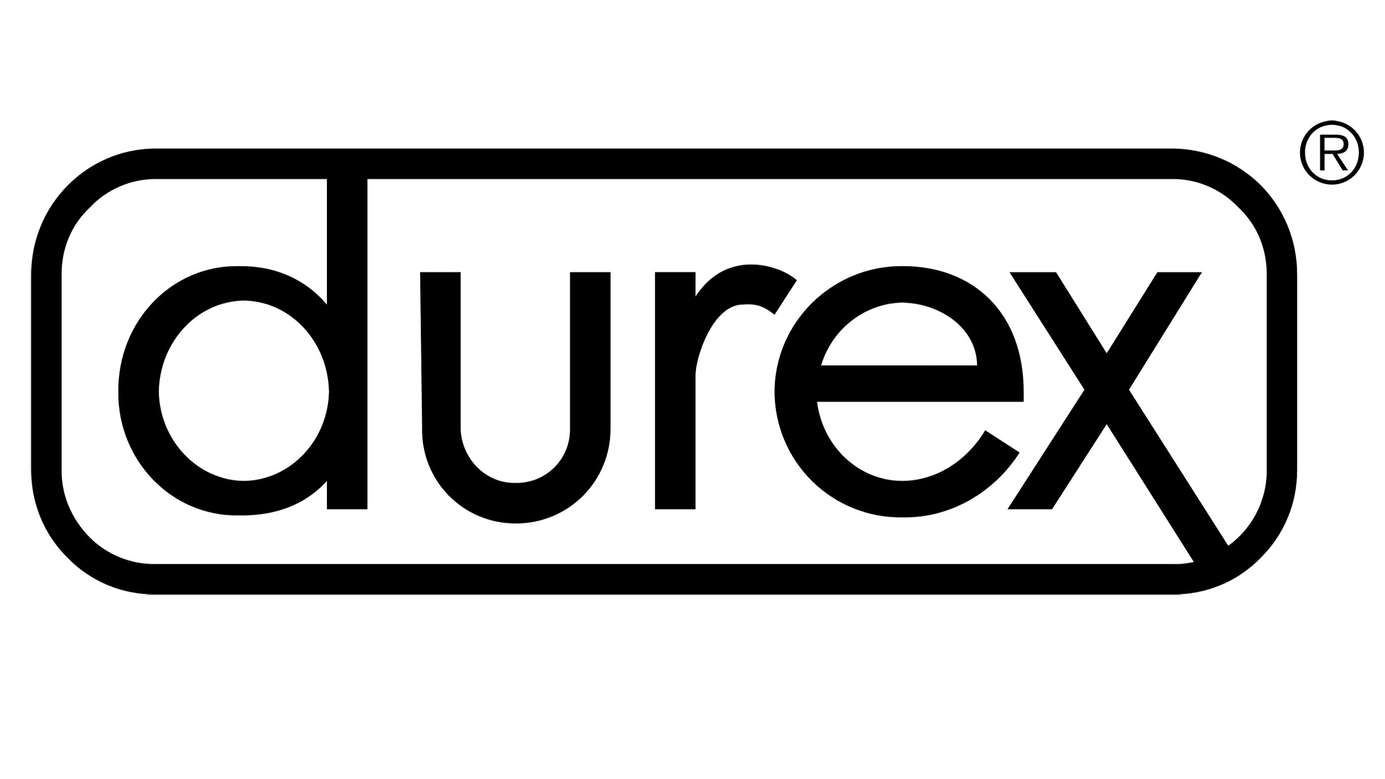
2022 – now
![]()
The redesign of 2022 has introduced a modernized version of the recognizable Durex logo, which became more minimalistic and progressive. The custom lowercase logotype has kept its designer sans-serif typeface and calm shade of blue, although the rounded blue frame was removed from the composition, and the letter “X” got accompanied by thin blue lines, coming out of the diagonal bars of the character, and featuring different lengths.
Font and Color
The brand kept the same sans-serif font with a few minor modifications in all the logos. Initially, it looked more like Century Gothic typeface, but in 2006, the designers added more smooth curves to the top ends of the letters similar to Shadeerah Regular font.