Adobe Logo
Adobe Systems Inc. started as a printer manufacturer and has become one of the most famous software makers in the world. It has played an important role in modernizing the publishing industry. To date, the list of programs from the company has four dozen applications. The most popular software is Photoshop, which accounts for almost a third of all its sales. Despite the fact that it had to endure several crises, the company was able to maintain its strong market position.
Meaning and History
Adobe Systems was founded by John Warnock and Charles Geschke, who originally worked in the research group Xerox PARC, in 1982. For the name, John Warnock suggested the word Adobe, part of the name of the stream near his home. To indicate the company’s specialization, the founders added a second part to the name – Systems. In 1985, Apple ordered software from Adobe. The release of the Illustrator program was a revolution in the field of design. The company began to be perceived as an engine of innovation. In 1998, Adobe barely escaped being bought out by its main competitor, the leading desktop publishing company Quark Inc. At the moment, Adobe Systems is one of the leaders in the software market.
What is Adobe?
Adobe is a major software manufacturer, without which it is difficult to imagine the modern design industry. Thanks to its own quality software and the ability to acquire the right companies, whose technologies allow Adobe to maintain a competitive advantage, it is able to survive any changes in the market.
1982 – 1990
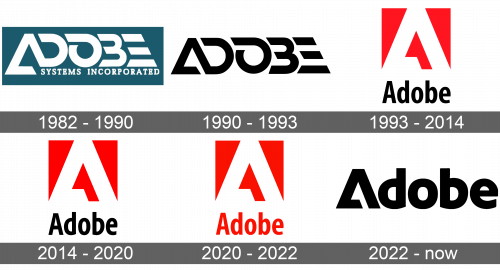
The original logo looked just as innovative and futuristic The letters were overlapping each other, so the letters “D”, “B”, and “E” did not have vertical lines. Letter “A” also did not look like a typical “A” and rather resembled a triangle with an open end. Under “Adobe”, it said “Systems Incorporated” in plain, uppercase letters of a smaller size. The base was a gray triangle.
1990 – 1993
The company created a more simple version of the original emblem. It removed everything from the logo except for “Adobe” the name was written in the same style and the only difference was the printing of “A” on the same level as all the other letters. It was done in black, which created an impression of a powerful, confident, and strong company.
1993 – 2014
A completely new spin was given to the logo in 1993 as the corporation added a red square with a white “A” that was drawn in the same style as it was done in the previous version. Underneath, it said “Adobe” in a black, bold, sans-serif font.
2014 – 2020
This version did not look much different from the previous one. The emblem was moved to the left of the wordmark, while the wordmark itself was written using a slightly different font. It had smooth curves and no serifs.
2020 – 2022
The only difference between the updated logo and the one introduced in 2017 is the color of the wordmark. It also looks slightly bolder, enhancing the powerful representation of the company that the red was standing for.
2022 – Today
This version resembles the minimalistic style of the logo introduced back in 1990. It also uses the same triangular letter “A”, only bold. The other letters are written using the same font as the brand used in 2014, but featuring bolder and vertically compressed letters. The logo turned out classy and powerful.
Font and Color
The version introduced in 1993 featured a Myriad sans-serif typeface. It was Adobe Systems’ custom typeface that was drawn by Robert Slimbach and Carol Twombly. In 2017, they introduced a new custom font (Adobe Clean), which resembles FF Pastoral Bold and Diodrum SemiBold. With an exception of the original logo, which was white and gray, the corporation stuck to red and black as its main colors. There was also white, which contrasted well with the red.

