Intel Logo
The Intel company has a dominant position in the PC microprocessor market. It makes motherboard chipsets, graphics cards, flash memory, hard drives, SSDs, embedded processors, and other communications and computing devices. Its products, which are not only innovative but also extremely reliable, have flooded the high-tech market. The company is a supplier of processors for companies: Apple, Dell, HP, and Lenovo.
Meaning and History
Intel was founded in 1968 by Robert Noyce, the inventor of the microcircuit, and Gordon Moore, who discovered Moore’s law. The talented inventors left Fairchild Semiconductor, and an entrepreneur Andrew Grove soon joined them. The name of the company did not appear immediately. The original options were Moore Noyce, NM Electronics, and a little later, Integral Electronics, which was shortened to the abbreviation known today, Intel.
What is Intel?
Intel is the largest known manufacturer of microprocessors. As the size of its microprocessors gets smaller, their performance only gets better. This allows Intel to significantly outperform all competitors.
1968 – 2005
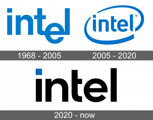
The brand name was the only element of this emblem. All the letters were lowercase and had square cuts. A unique feature of this logo was the letter “e”, the horizontal line of which was matched with the bottom tail of the “t”. The logo was executed in blue color.
2006 – 2020
The word “Intel” was placed into an oval, diagonal frame that was formed by two curved lines of varying thickness. All the letters were now on the same level and acquired more smoothness to them as many of the ends were curved. The color palette was preserved the same.
2020 – Today
This logo blended the first and the second version of the Intel logos in terms of the font. As the first two letters and the last one looked like the ones in the first version, while the “t” and “e” were taken from the second logo. The company used black for a bolder look, while the original blue was used only for the dot above the “i”. The frame around the name got removed.
Font and Color
The brand has worked hard to make sure the font used for its logo not only looks good but is also clear and speaks to different people across the globe. Thanks to elements from various languages, the logo turned out to be relatable to everyone. The blue color used by the brand is meant to instill a feeling of trust, security, and loyalty. The black in the latest version adds a formal touch.


