Roblox Logo
Roblox is one of the most prominent sandbox games. The release happened in 2006, although the game has been in development for much longer, which makes it one of the pioneers of this gaming genre. Because the structure of everything in Roblox is very simple, you can create or be anything. There are no limits and rules.
Meaning and History
![]()
Roblox is called so because many elements inside the game are made up by blocky architecture, most notably the characters. Because of its colorful appearance and creative streak, Roblox is aimed at the child audience more than anyone. This is also reflected on their logo.
1989 – 2007
![]()
The iconic online game’s history has started in 1989, with the Interactive Physics project, hence the first logo in ROBLOX history was the badge of the original project, and it stayed active until 2007. That was two-leveled lettering with the bold cursive “Physics” in dark red overlapping the bottom part of the uppercase black characters of the “Interactive”, executed in a fancy and sleek and-serif typeface.
2003
![]()
In 2003 another logo for the online game was created. This time it was for the project under the name GoBlocks. The badge of its alpha version was set in dark blue and green, with the clean smooth sans-serif type written in a simple and modest sans-serif typeface against a white background. The bold enlarged “GoBlocks” was accompanied by the small lowercase “Alpha”, executed in the same typeface, but using a lighter shade of blue for its lines.
2003 – 2004
![]()
At the start of the game’s development cycle, it was called DynaBlocks. It was basically a beta of the contemporary gameplay, although they didn’t change the name until later.
The logo looks like they wanted a light-hearted, mostly childish game, which would be the concept of being put in a world that is basically a blank canvas. To double down on this feel of being in a sandbox, they designed this logo – a collection of basic thick letters that spelled ‘DynaBlocks.Beta’.
Each character in the writing had its own color (except for the ‘.Beta’ part – it was completely pink).
2004
![]()
In 2004, the devs changed the name of the game to Roblox. They pretty much used the same design concept as with previous logo. The font and the multi-colored stile stayed, although the letters also cast shadows now.
This stage simply signifies the time when they changed the name, although the more prominent design choices followed afterwards.
2004 – 2005
![]()
In 2004, they finalized the logo that would eventually be a source of inspiration for most other logo evolutions the game would suffer over the years.
The letters changed to a silvery shade with some semblance of gradient and lighting inside. Notably, each of them had a very thick and bright red outline. The font was what attracted the most attention – mostly because it lacked system and looked ridiculous, all to draw the younger players in.
The design choices seem to imply they initially wanted to set up a robot-like aesthetic (like the Transformers franchise had). The name implies the same thing, although the developers quickly dropped the idea.
2005 – 2006
![]()
This is the same concept, although the letters became much less grouped together and more spread-out. Each of them looked like a smudge on purpose, and this design choice would be carried on almost unchangeably into the later years.
2006 – 2009
![]()
The game released in 2006, and that’s also when the Roblox team decided to make up their mind and not change the logo too often. They made it simpler, got rid of the silver innards in favor of plan whiteness. The outline was thinned out significantly, and the shapes of the letters themselves became more like the blots than ever.
2007 – 2010
![]()
This interim version saw just a few changes – namely, the color was changed to a much paler shade, and the shape of some characters was slightly shifted.
2010 – 2015
![]()
This evolution was only given some cosmetic modifications. The red outline became much thicker and darker, although the gradient has also been added to it. As a result, the logo enjoyed more volume and became suddenly more prominent.
2015 – 2017
![]()
By 2015, the gradients started to fall out of fashion, and the developers got rid of it. They basically reverted to the 2009 design, but with several minor artistic changes and a slightly paler color choice.
2017 – 2018
![]()
2017 came, and Roblox team decided to honor their name and reimagined their logo completely. All the letters have suddenly been squared – especially the ‘O’s.
The letters in general are much better pronounced and are finally uniform. Each has roughly the same proportions and stands an equal distance from one another. True, there are still tons of fluid and smooth elements, which allow the logo to retain its childish nature.
All the letters are violently scarlet, which references the previous logo evolutions.
2018 – today
![]()
In 2018, the text was painted black, for some reason. It’s really the only change, and they do seem to use it as their primary. It’s likely, they realized that not all of their players are kids, and they don’t need bright colors as much anymore.
2022 – now
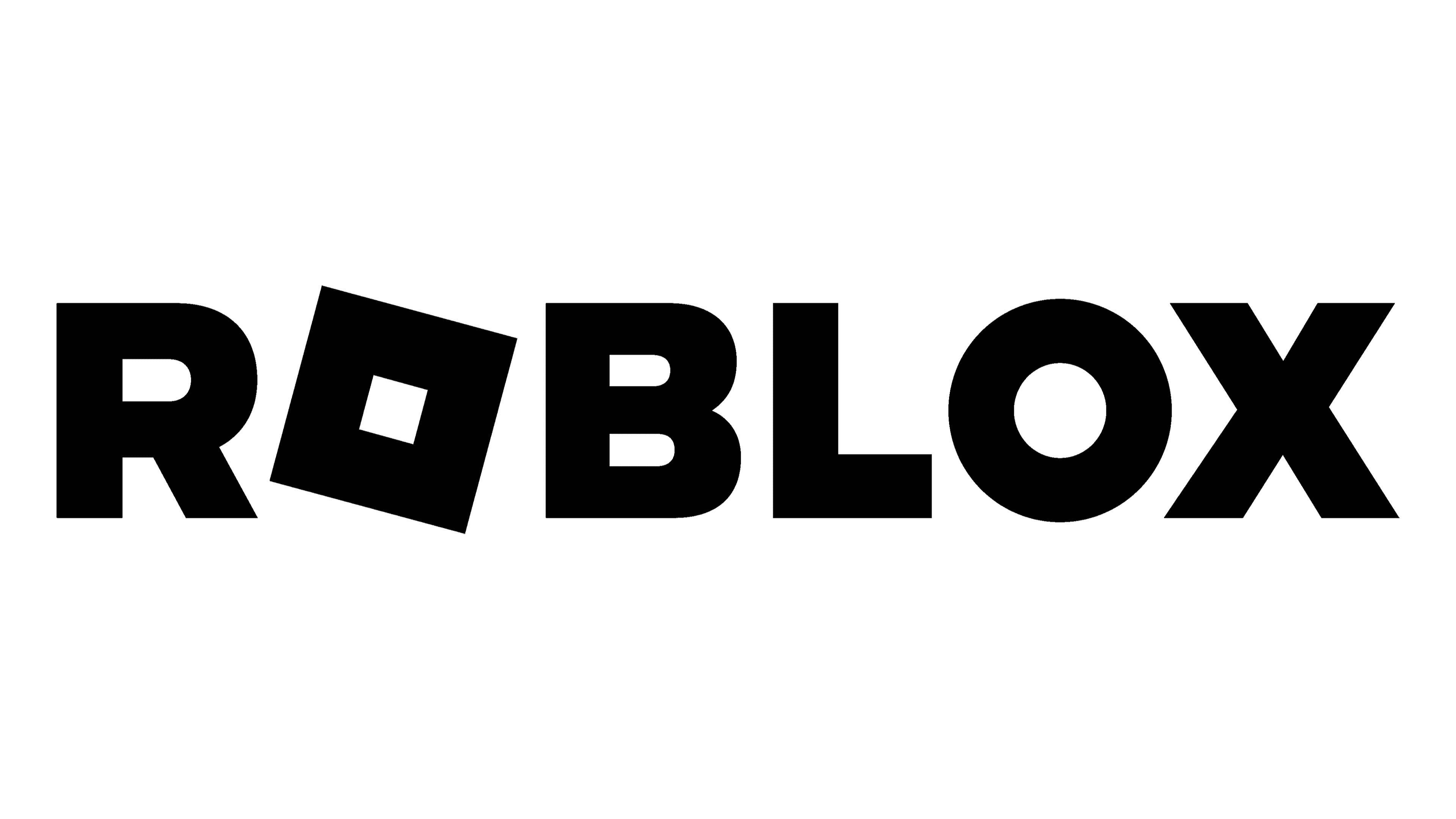
The redesign of 2022 has introduced a refreshed and strengthened version of the ROBLOX logo, which is fully based on the previous badge. The bold black uppercase lettering with the “O” stylized as a solid black square set diagonally, was rewritten in a cleaner and more geometric typeface, so now the straight lines of the bars balance the look of the “O” block and make the whole badge look harmonious and powerful.
Emblem and Symbol
There are other symbols associated with Roblox. The game is often represented by the symbol of its inner currency (‘Robux’) – a rounded golden hexagon with a white outline inside, another golden hexagon in the middle, and a white square in the very middle. Relays the nature of the game very well.


