Apple Logo
Apple is one of the most iconic names in computer industry. They are largely considered responsible for constructing the first portable and commercially available PC, but people certainly know them rather as creators of iPhones. The company started off back in 1976, and they are still going strong.
Meaning and History
![]()
The founders took the name from the popular idea surrounding Isaac Newton and an apple that inspired them into formulating the laws of gravitation. Now, this story is probably not accurate, but it is a popular way to imagine a ‘Eureka Effect’ – certainly what Apple was going for with this name and logo.
1976 – 1977
![]()
The very first Apple logo depicted no other than Newton himself, reading under an apple-tree, while a highlighted fruit is about to drop down and knock him over the head. It’s a rather detailed image, and it’s obvious why they scrapped it the year later – there’s no way they could use it if they aimed at mass-produced computers.
The whole thing is styled as an engraving, although the whole drawing is made with pencil. There are also two ribbons over and below the logo. The writing on them says ‘APPLE’ (top) ‘COMPUTER CO’ (bottom). Back then, this is what the company as called.
1977 – 1998
![]()
This design was largely carried through the entire history of the brand. A bitten apple with a single leaf on top is used even in the modern logotypes. The only distinction was that they used a multi-colored appearance. It looks like a rainbow, although the colors are in the wrong order. Except for recognition, it doesn’t bear any deeper meaning.
1998 – 2001
![]()
In 1998, Apple slightly changed their logo. This period was the time of change for Apple, and of unprecedented growth. It was when they formed the company image and reputation Apply enjoys even now. From practical side, the only change was the black color they introduced instead of the multi-colored design.
2001 – 2007
![]()
In 2001, the logo was changed to a design Apple used since then, with just a few minor changes.
It was now a metallic texture, a mix of white color and grey shades to add volume to the logotype. What they also introduced is excessive lighting, amongst the first to do so in the world of logotypes. This new logo certainly reminded people of electronics, computers and technology.
2007 – 2014
![]()
Nothing much changed this time. The illumination effect and shading shifted a bit, and they also added a sort of fracture – a black streak that separated the top left third of the logo from the rest of it. Supposedly, it was to bring even more volume to the design, which certainly was according to trends of the time.
2014 – today
![]()
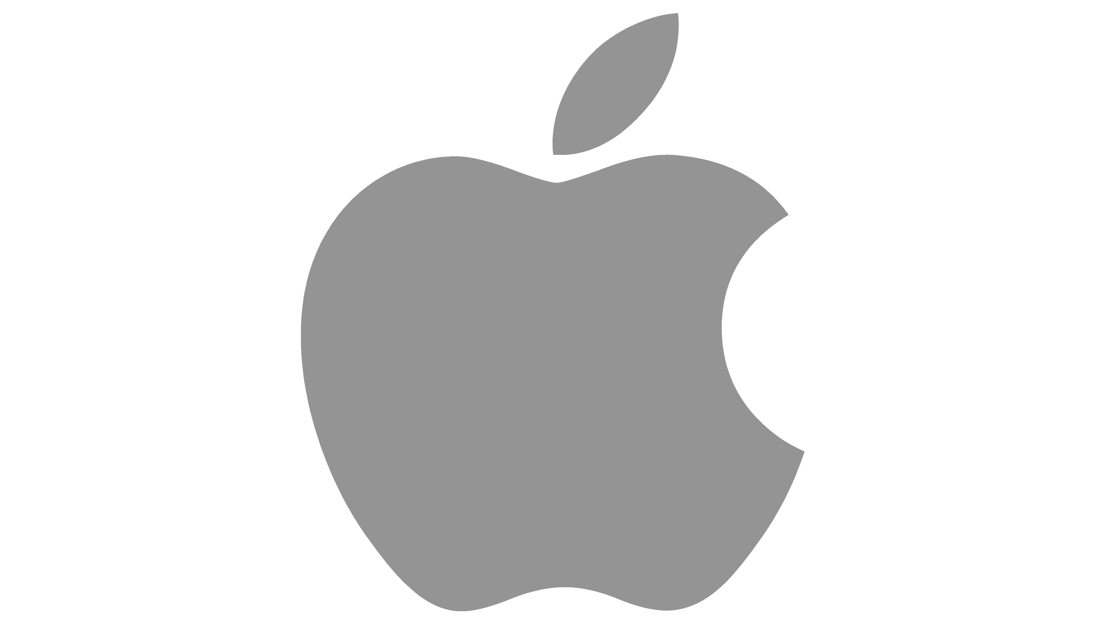
In 2014, the company pretty much returned to the design they used back in 1998 – just a black apple with of the same shape, size and layout. That’s the main official emblem, although Apple also uses a completely grey variation at times.
Emblem and Symbol
Since 1977, the design of an apple emblem barely changed. Apart from the main stages, there were minor designs with colors such as red or blue for the secondary products and one-offs. It works surprisingly well, and they a virtually never used text on their logotypes – the image alone says it all.


