Wipro Logo
Azim Premji turned his father’s vegetable oil company in India into an IT corporation with a $29.83 billion market capitalization as of 2022. Wipro Limited is a top provider of business process outsourcing, consulting, and information technology services. IT Services, IT Products, and Indian Government Enterprise Services make up its three operating segments. Wipro is a top choice for system solutions for large businesses. For instance, the Canadian energy firm ATCO collaborated with Wipro for ten years. Worth $1.2 billion, it is considered one of the biggest contracts ever negotiated in this industry.
Meaning and History
Azim Premji’s father, Muhammad Hasham Premji, was one of the leading rice merchants in Bombay, India. In 1945, he created Western India Vegetable Products Ltd., which was engaged in the production of vegetable oils and laundry soap. In the 1970s and 1980s, it made the transition into the computer sector. Premji was able to take advantage of the surge in demand for programmers in the 2000s. He turned Wipro into a market leader in outsourcing and software development. In addition, Wipro owns several furniture factories and develops medical and hydraulic equipment.
What is Wipro?
Wipro is an information technology company that offers consulting services in addition to solutions that improve business productivity. The FullStride Cloud Services cloud platform is the business’s main product. It comprises the whole spectrum of cloud solutions that enable users to complete tasks efficiently and effectively.
1998 – 2017
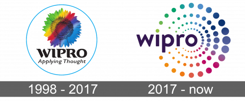
The first logo was presented in 1998 and was very colorful and bright. The business name along with the slogan “Applying Thought” were accompanied by a sunflower. The flower was quite realistic, but it had a rainbow coloring going diagonally. The name was done in large, all uppercase letters that featured serifs and rounded corners. The slogan was written on the second line using simpler lettering without serifs. The whole emblem was framed by a thin round blue frame. The black color was used for the wordmark to balance out the colorful image above it.
2017 – Today
The logo acquired a more modern, fresh, and clean look but kept the colorful appearance and round elements of the original logo. Many, though, believe it lost its uniqueness. The name of the company, which was done using a different font, was decorated by four circles enclosing it on the right. The circles got bigger as they were going outwards. Each circle was made up of multiple circles that were done in different colors and created a rainbow gradient. The rainbow circles also got smaller as they got closer to the wordmark. Such an approach created a feeling of growth and infinite possibilities as well as an impression that the positivity of Wipro was spreading.
Font and Color
Both logos used by the Wipro company feature a rainbow color palette. Besides evoking positive emotions, the usage of multiple colors can represent the variety of services and products the company is famous for. Initially, a serif font with rounded elements and all uppercase letters in black were used for the name. The slogan, which was seen only in the original version, was done using a cursive font with thin lines and only the first letters being capitalized. The second version used a bolder sans-serif Arial font and all lowercase letters.


