AECOM Logo
AECOM is a global network of experts in the engineering and construction sectors, offering services from planning to design and management. It was created through a merger of five entities, with roots tracing back to Ashland Oil & Refining Company. Founded in the United States, AECOM was established to provide a wide range of services, aiming to build a safer, better, and more sustainable world by addressing complex infrastructure challenges with innovative solutions.
Meaning and history
AECOM’s journey began in 1990, born from a merger aimed at unifying diverse engineering services. Initially, it operated within Ashland Oil, evolving independently by 1990. Growth was strategic, absorbing Fredric R. Harris, Inc. by 1994. The 2000s saw rapid expansion; AECOM acquired Earth Tech from Tyco International in 2008, broadening its environmental services. URS Corporation joined AECOM in 2014, a major move that doubled its size and outreach. The firm ventured into management services, spinning off this segment into a separate public entity, Amentum, in 2020.
Throughout, AECOM adapted, focusing on sustainability and innovation, becoming a leader in delivering complex infrastructure solutions globally.
What is AECOM?
AECOM stands as a titan in the realm of design and engineering, crafting the blueprint for tomorrow’s world through innovative infrastructure solutions. It’s a beacon of ingenuity and sustainability, propelling projects that range from towering skyscrapers to transformative transportation systems across the globe.
Before 2009
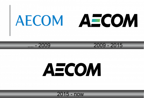
The logo presents itself with a crisp, minimalist design, featuring the word ‘AECOM’ in a bold, sans-serif typeface. Its simplicity is punctuated by a solid vertical bar, anchoring the composition to the left, symbolizing strength and stability. The royal blue hue echoes professionalism and depth, while the starkness of the layout conveys a modern, forward-thinking approach, characteristic of the company’s ethos in infrastructure and design.
2009 – 2015
The refreshed AECOM logo adopts a bolder stance, with the ‘E’ now sporting a gradient of green squares, signaling a dynamic shift. The squares introduce a subtle element of color, representing growth and a commitment to environmental consciousness. The rest of the text remains a stark black, asserting confidence and solidity. This evolution reflects a company in step with modernity, yet steadfast in its foundational identity.
2015 – Today
In this iteration of the AECOM logo, the design strips away color, returning to a stark monochromatic palette. The omission of the green gradient squares from the ‘E’ suggests a pivot back to basics, emphasizing a classic, timeless quality. The black color choice projects authority and simplicity, ensuring the logo’s adaptability across various platforms while maintaining a strong corporate identity. This design speaks to the essence of AECOM: straightforward, professional, and focused.


