Santa Cruz Skateboards Logo
Santa Cruz, rooted in the Californian surf scene, has evolved into a prominent skateboarding and lifestyle brand known for its iconic “Screaming Hand” logo. Pioneering in producing skateboards and apparel, it’s prevalent among both hardcore skaters and those embracing the surf-skate lifestyle. Operating primarily in North America and Europe, its reach is expanding globally. Currently, Santa Cruz operates under the umbrella of NHS, Inc., maintaining its legacy while innovating to meet modern skate culture demands. With a dedication to quality and style, Santa Cruz remains a go-to brand for many seeking authenticity in the skateboarding world.
Meaning and history
Santa Cruz Skateboards, fondly known as Santa Cruz, began its journey in 1973 in the sun-soaked realm of Santa Cruz, California. Founded by Rich Novak, Doug Haut, and Jay Shuirman, the brand originally ventured into producing skateboard decks. Riding the wave of skateboarding’s golden era, Santa Cruz rapidly became a household name among enthusiasts.
Distinctive from its onset, the company’s emblematic “Screaming Hand” logo, crafted by artist Jim Phillips in 1985, became a hallmark of skate culture. This striking design, featuring a hand with a screaming face, resonated with skaters, amplifying the brand’s street credibility.
Throughout the years, Santa Cruz pushed boundaries both in skateboard design and its accompanying culture. They ventured into innovative skateboard tech, introducing features enhancing durability and performance.
Ownership has seen consistency, with the brand operating under NHS, Inc. This stable managerial oversight allowed the brand to grow while retaining its foundational ethos.
Over time, Santa Cruz adapted to the fluctuating skateboarding landscape. They diversified their product line, delving into apparel, thereby transforming from a mere skateboard manufacturer to a comprehensive lifestyle brand.
Despite the shifts in the skateboarding industry and competition intensifying, Santa Cruz remained resilient, staying relevant through strategic collaborations and continuously evolving their designs to echo the spirit of contemporary skate culture.
Today, Santa Cruz Skateboards holds its ground as a skateboarding titan, weaving together its rich heritage with a forward-looking vision, cementing its legacy as an enduring emblem of skate culture.
1973 – Today
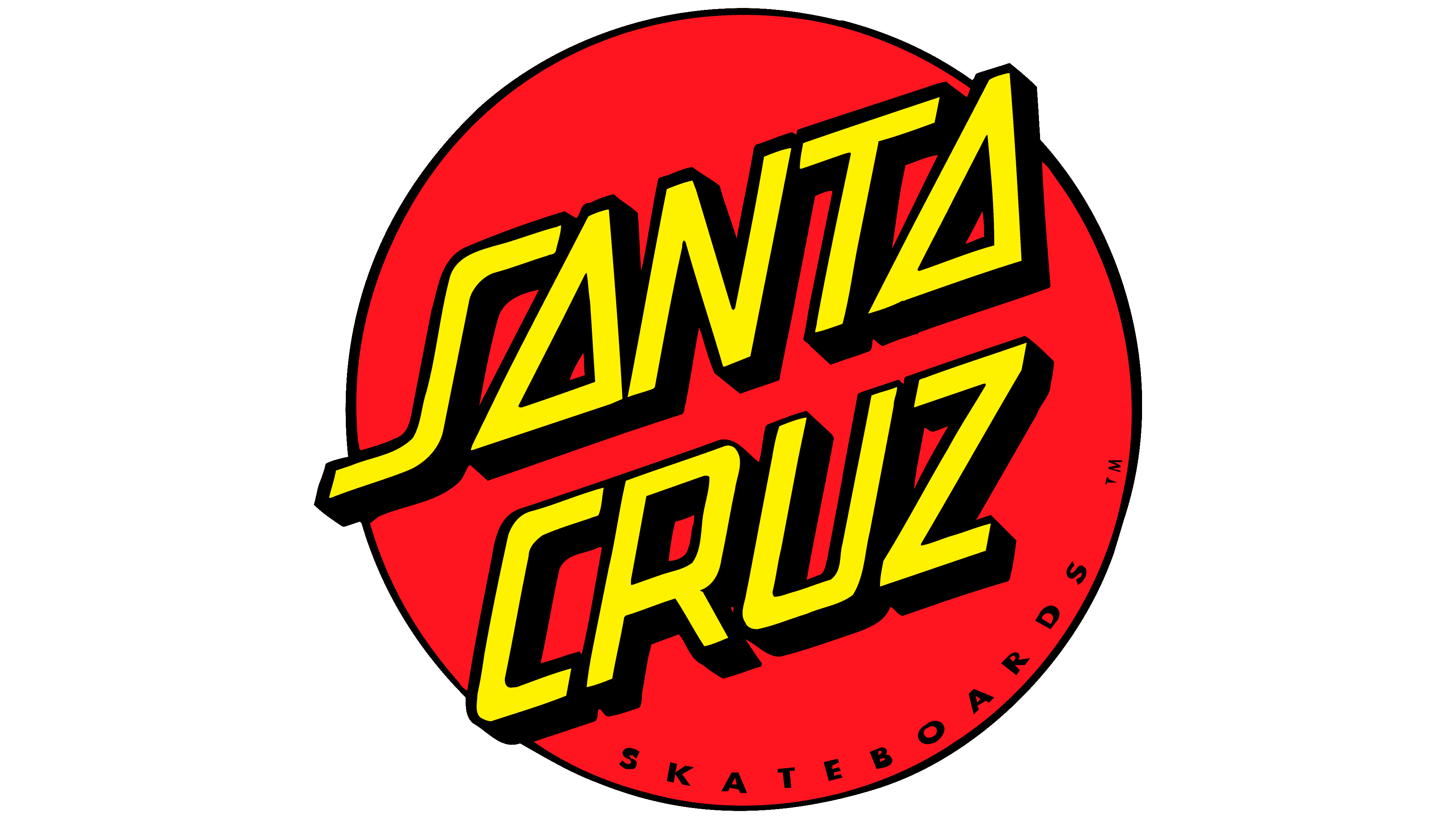
The tilted imprint bearing “Santa Cruz” stands as a hallmark of the brand, directly connecting to the city where their skateboarding journey commenced. This emblem showcases a crimson disk, bordered by a jet-black stripe. Dominating its center is the brand’s name, presented slantingly in sun-kissed letters, possessing a subtle italic flair. Every letter is capitalized and boasts a shade, lending a three-dimensional appearance to the name. The “S”, with its extended, ribbon-esque design, and both instances of “A”, sculpted pyramid-like, are distinctively crafted. Anchoring the lower segment of this fiery circle, “Skateboards” is inscribed, reinforcing the brand’s core identity.


