Amazon Kindle Logo
Amazon Kindle is the most popular e-reader in the world. One of the reasons is its low price because Amazon earns primarily from the sale of the Kindle books and not from the sale of the devices themselves. The company has also introduced an app with the same name. The Kindle device and app do not require much setup other than connecting to your wireless network and choosing font size. Of course, the features are not limited by the font options.
Meaning and History
For many, Amazon needs no introduction. The company was founded in 1994, and a year later a website of the same name was launched, which initially sold only books. Since 1998, the online store began to increase the range of products sold, among which players, films, video games, furniture, toys, and clothes began to appear. One of such products is its e-reader, known as Amazon Kindle. It was released in 2007. Initially, the device was sold only in the United States, but this did not prevent it from gaining popularity around the world, because starting from the second generation it began to be sold everywhere. The word kindle is a great metaphor for the excitement readers get when reading books as it can be interpreted as “ to light a fire”.
What is Amazon Kindle?
This is a reader from a well-known company Amazon. Amazon Kindle is also a convenient program for reading books from a mobile device. Given the popularity of the Kindle, there are no problems with books in the right format.
2007 – Today
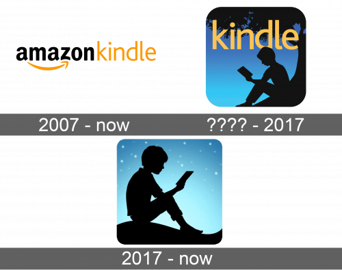
As with many of its services and products, Amazon simply added the name of the new product to an already recognizable combination of the “Amazon” word done in black with yellow smile-arrow underneath. The “Kindle” is added to the right of “Amazon”. It uses a very simple font that is noticeably thinner than the company’s name and has the same yellow color as the smile. The “Kindle” part was also used separately in some cases with the only difference being that it was done in black with slightly thicker letters.
???? – 2017
An extended version of the logo was accompanied by a very realistic silhouette of a boy sitting under a big tree on a hill. The silhouette is done in black against a blue sky, which makes it look like it is evening time. The whole image is done in a square with rounded corners. The word “Kindle” is written in yellow in the upper half of the square against the black background of the tree crown. It was done using the same font as the main logo, only in bold.
2017 – Today
An alternate version of an emblem that was used along with the main logo was introduced in 2017. It carried the same idea of a boy sitting on a hill and reading a book. However, there was no more tree and the silhouette of the boy took the whole space. He was also facing right instead. The sky in the background was a lighter blue and was done as a gradient. White tiny stars were added to the sky. The emblem did not have anything written on it, but by this time, the image was easily associated with Amazon Kindle.


