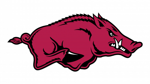
Arkansas Razorbacks Logo
Razorbacks are a team of football players that play as part of the NCAA. They have been representing the University of Arkansas for over a century. The program has many championships and other achievements. During its long history, the team had a little over thirty head coaches. Besides its famous football team, the Arkansas University has other sports teams that play baseball, golf, basketball, soccer, softballs, and several other women’s and men’s teams.
Meaning and History
The history of the football program at the university dates back to 1894 when the first team of football players was formed. There are two national championships with the most memorable one being awarded in 1964. From the mid-1930s to the late 1980s, the team has added over 10 conference championships to its achievements with most of them being during the time they had Boyles as their coach. The name has stuck with the team since the early 19th century when the team’s coach called them a herd of razorback hogs after seeing them win a big game. Before that, they were the Cardinals.
What is Arkansas Razorbacks?
This is a team of football players who are playing for the University of Arkansas. The fans often call the Arkansas Razorbacks a different name – the Hogs.
1931 – 1937
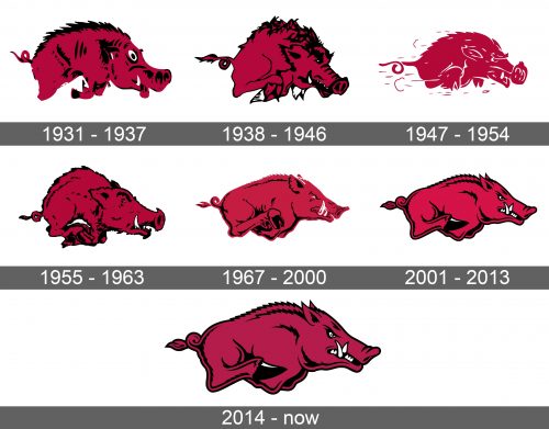
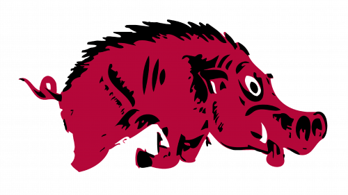
A side view of running hog was representing the team from the early 1930s. It had a maroon red body with some black that created an accent on top of its back and other parts of the body. A little white was added in the form of an eye, fang, and small accent on the ear. Its head was enlarged, while a tiny curved tail completed the look. Despite the fact that the hog looked like it was attacking and had a visible fang, it did not look aggressive.
1938 – 1946
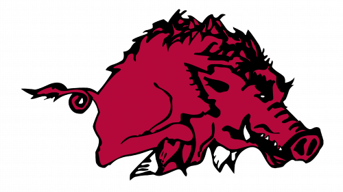
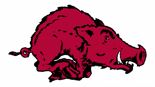
The new hog was also in motion, but it was jumping. An addition of bolder black outlines and details along with more visible teeth and much smaller eyes made it look feisty and competitive. Other changes included white hooves instead of black and a different, fluffier tail end.
1947 – 1954
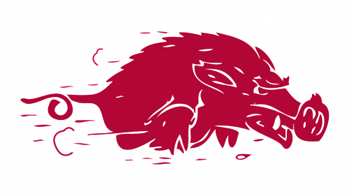
There was a lot of speed added to the logo thanks to horizontal lines and puffs. The animal was also more elongated, which further enhanced the speed at which it was running. Another detail that made this logo different was the lack of black. Instead, white color was used for outlines and details. There was only one fang visible and the nose looked enlarged.
1955 – 1963
A redesigned logo looked more like the version introduced in the late 1930s, but with fewer black lines. The hooves were a maroon like the rest of the body, while the fang was elongated and the eyes looked even smaller. The animal had an open mouth and looked strong and full of energy.
1967 – 2000
There was more aggressiveness and determination in the look of a hog. The black outlines and hooves returned, but it was done in a more minimalistic way. The squinted and elongated eyes along with two white fangs and a sleeker body made it look more serious. Overall, the team stayed true to its color palette and the image that represented them.
2001 – 2013
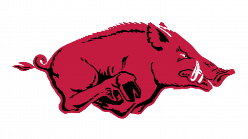
Thicker and more defined outlines added some character. In addition to two long fangs, there was a line of more white teeth. The spikes on the back and ears looked sharper and more defined. The eye got more realistic and had a bit of red in it that added to the furious look of the animal. It was more put together and ready to fight and win.
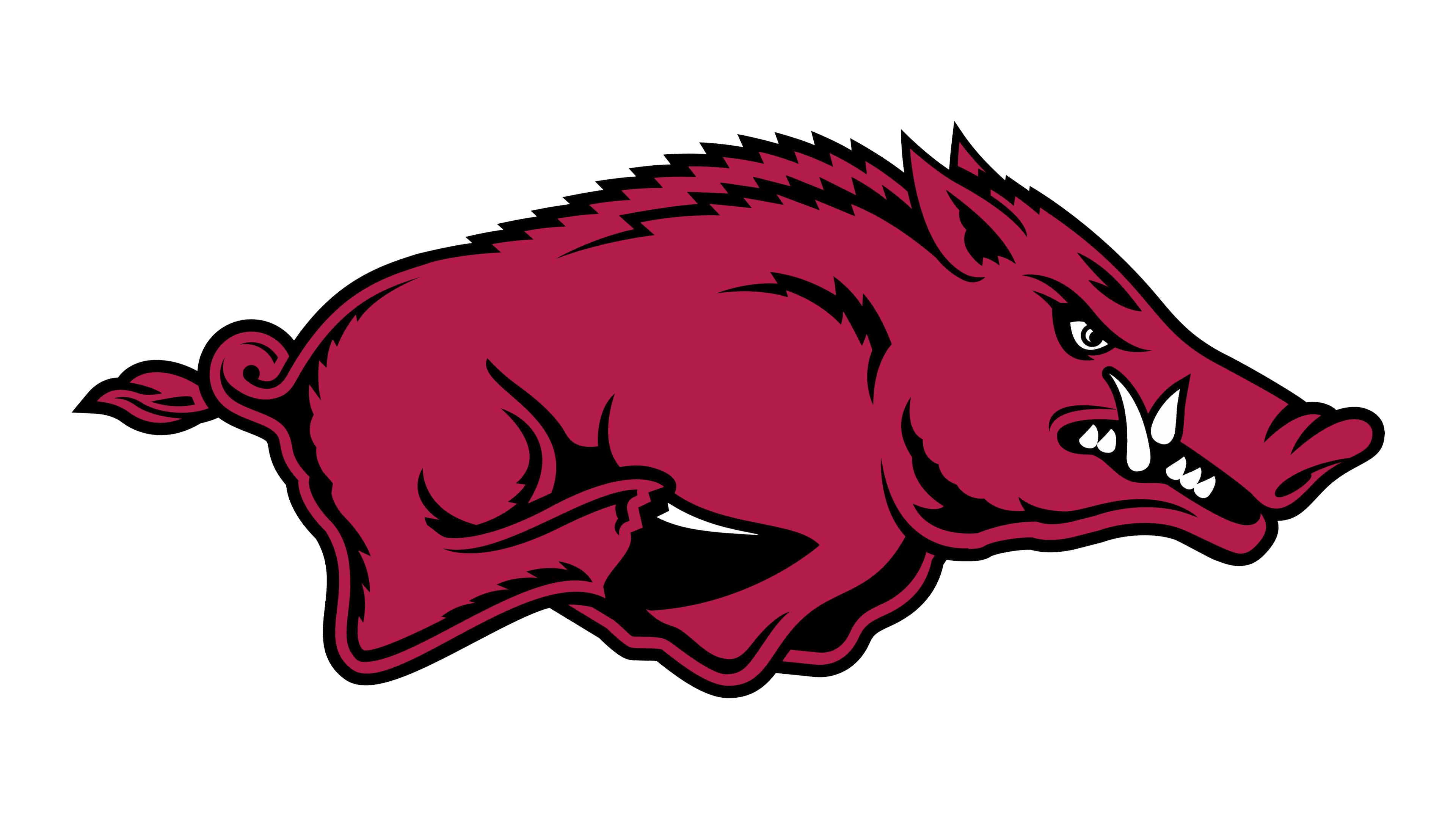
2014 – Today
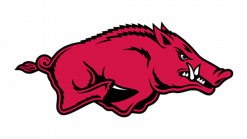
The changes done in 2014 were very minimal. In fact, all the team has done was use a different shade of red. Otherwise, the hog looked exactly the same as it did since the early 2000s.
