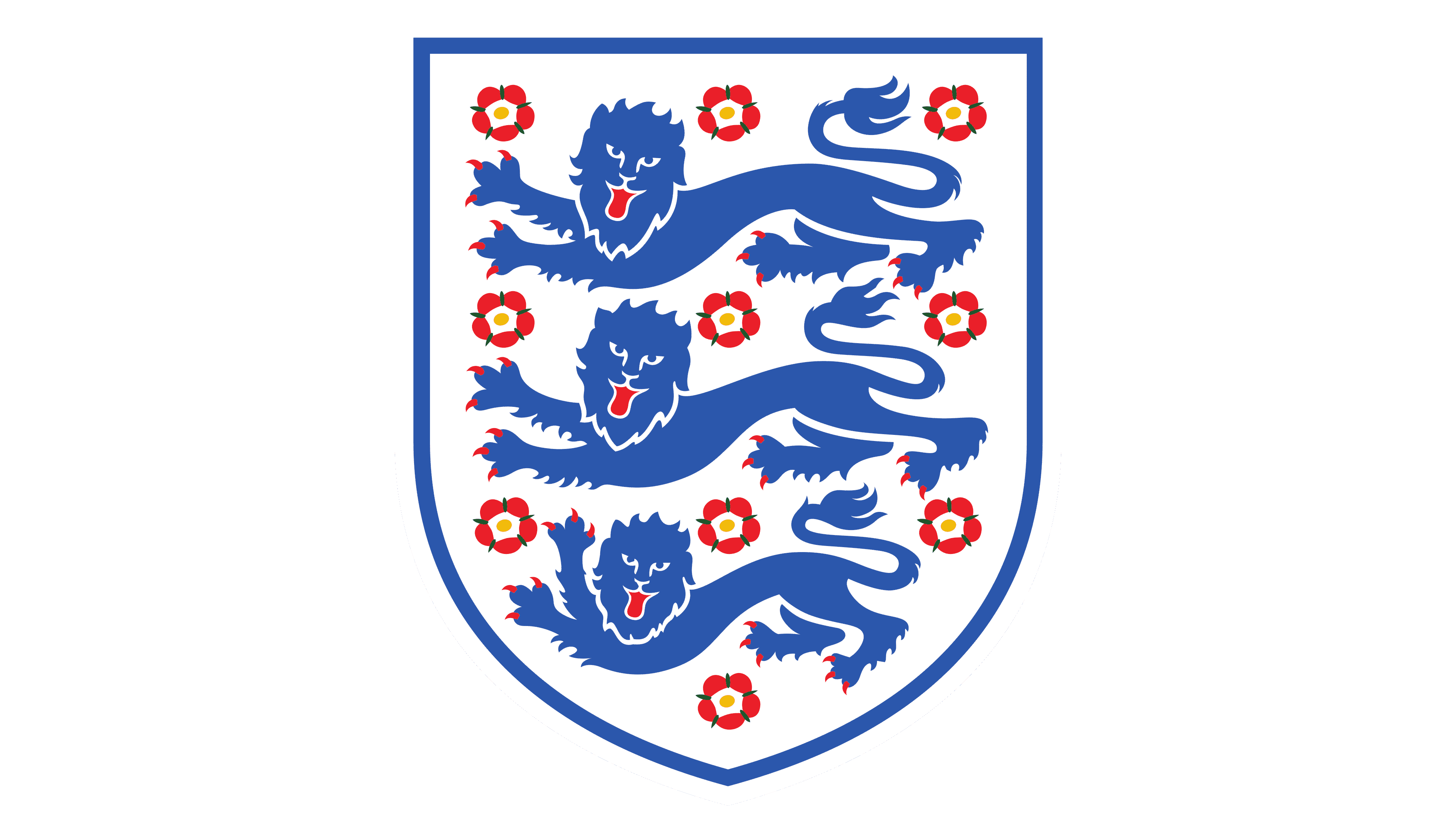
England National Football Team Logo
The England National Football Team represents England in international soccer. Founded in 1863, it’s one of the oldest national teams. Operated by The Football Association (FA), England boasts a rich history. They clinched their only World Cup in 1966, hosting the event. Wembley Stadium, an iconic venue in London, serves as their primary home ground. The Three Lions, as they’re affectionately known, have produced legendary players and remain a force in global football. Regularly competing in the UEFA European Championship and FIFA World Cup, they continually showcase their talent and aim for glory on the world stage.
Meaning and history
The England National Football Team, emblematic in the football world, initiated its journey in 1863. Managed by The Football Association (FA), this team is among the earliest national sides. Their narrative is peppered with both highs and lows. One pinnacle moment was in 1966 when England, playing as hosts, lifted the FIFA World Cup trophy, their sole victory in the competition. Legends like Bobby Moore and Geoff Hurst emerged as national heroes.
Throughout the years, Wembley Stadium in London has been their fortress, witnessing countless matches and memories. The team’s emblem, the “Three Lions”, symbolizes their enduring spirit. In continental competitions, they’ve actively participated in the UEFA European Championship, experiencing varying success rates.
The late 20th and early 21st centuries saw the team navigating through challenging phases. Though they boasted talents like David Beckham, Michael Owen, and Wayne Rooney, major tournament victories remained elusive. However, their mettle was never in question.
Under the leadership of Gareth Southgate in recent years, a rejuvenated English side, blending youth and experience, reached the 2018 World Cup semi-finals and the 2021 UEFA Euro final, signalling a promising era ahead.
As with all teams, England has faced criticism and endured setbacks. But their legacy in football remains untarnished. With passionate fans and a rich history, the England National Football Team remains a formidable presence on the global stage.
1879 – 1950
Triple twin lions, illustrated in a simplified manner with crowns adorning their heads, are arranged in a straight vertical line. Every lion, striking an identical stance, lifts one paw. Surrounding these majestic creatures is a shield-like emblem, pentagon in form, with its bottom edges gently curved. Over this setup, there’s a grander kingly crown, enriched with deep red cushioning and azure detailing. The uniform portrayal of the lions, combined with the prominence of crowns, exudes a noble and commanding vibe. Moreover, the use of geometric contours infuses the depiction with a foundation of orderliness and harmony, reflecting a blend of tradition and precision.
1950 – 1993
In this modern epoch, lions are artistically framed by roses, with a trio of blooms hovering over each majestic beast. The design seamlessly integrates these elements, using roses to demarcate individual territories for each lion. Now, every one of these regal entities is showcased in the lavish Baroque artistry, adorned with voluptuous curves, intricate twirls, and pointed accents.
Their facial features and manes mirror crafted masks, while their poses ooze relaxation: front limbs stretched out and rear legs gently retracted. It’s as though these jungle monarchs are leisurely stretching, basking in their realm’s serenity.
The design’s hues lean heavily into deep navy and crimson shades, offering a vibrant and audacious visual allure. Anchoring this artwork is a triangular insignia, bestowing an air of age-old tradition and ceremoniousness to the tableau. The synthesis of the lions and roses exudes a refined grace, and the pronounced Baroque touches infuse an element of cultured elegance. The badge emanates a blend of might and serenity, merging both dominance and peace in its essence.
1993 – 1999
The sophisticated artwork meticulously attends to the proportionality of the blossoms, with the roses perceptibly shrinking as they cascade downward. The apex roses capture immediate attention, while those anchoring the design are more diminutive. This gradient bestows depth to the visual, weaving an entrancing narrative that captivates viewers.
A sentiment of dominance radiates from the images of these coat-of-arms lions. These creatures exude an aura of paramountcy, signaling their reigning status. Amplifying their majestic demeanor, the vibrant hues of red for their tongues and claws starkly juxtapose the cerulean backdrop. Such nuances invigorate the tableau, accentuating the creatures’ distinctive features.
Below this emblem, now showcasing a softened, curved base, the inscription “England” emerges. Every character stands tall in uppercase, graced with delicate serifs. This typographic choice bestows a gravitas, anchoring the symbol to its national roots.
The cohesive visual narrative – from the blossoms’ diminishing scale and the vivid chromatic contrasts, to the lions’ commanding presence and the emblematic naming of the nation – collectively crafts a badge echoing grandeur, sophistication, and an unwavering link to a storied past.
1999 – 2003
In a reimagined rendition, the illustrators have introduced distinct modifications to bolster the emblem’s visual resonance. They’ve consolidated the lions’ features, drawing components like paws and heads nearer to the core, enhancing their consolidated and commanding allure.
Subtly, the claws and tongues have grown in size, instilling a fiercer demeanor in the creatures. To heighten authenticity, thorns now grace the roses, intensifying their tactile and lifelike feel. These refinements further underscore the badge’s majestic and dominant aura.
The erstwhile broad knight’s shield has been slimmed, bestowing the motif with a contemporary, streamlined vibe. Yet, a standout revision is the inky blue slab crowning the crest. Embellished with “England” in a pristine hue, the typography echoes traces of a modernized Old English flair, paying homage to the nation’s lineage.
By elevating the nation’s moniker atop the coat-of-arms elements, the design radiates an elevated sense of dignity and nationalism. The deep blue canvas accentuates the naming, while the font choices weave a tapestry of heritage and legacy.
These artful transformations have cultivated a more polished and harmonized insignia, seamlessly melding elements from history’s annals with present-day aesthetics, reflecting a robust national spirit and vigor.
2003 – 2009
The emblem has undergone a metamorphosis, embracing a fresh, modern aesthetic, veering away from the intricate Baroque influences. Gone are the lavish twirls and prickly thorns, and the lions now adopt a more compact posture. These majestic creatures exude an aura of tranquil grace rather than intimidation.
Their updated look includes trimmed manes and milder facial expressions, offering a serene aspect. Intriguingly, the trio of lions isn’t uniform; the third, distinctively smaller, elegantly lifts one paw. This design tweak complements the tapering shape of the knight’s shield.
The floral elements have been rejuvenated, showcasing vibrant red blooms with sunny cores, set off by verdant highlights. This lively palette infuses a rejuvenated, organic flair to the motif, juxtaposing the lions’ artistic portrayal.
Above the shield, the chosen typeface is a sleek, sans-serif design, marking a shift from the archaic English script previously employed. This modern font choice imparts the emblem with a current, approachable aura, enhancing legibility yet preserving its stately character.
This refreshed emblem encapsulates a seamless fusion of age-old tradition and contemporary design principles. Retaining pivotal historical motifs, it incorporates refined, minimalist touches. The culmination is an emblem that appeals to diverse viewers, skillfully intertwining ancestral respect with modern sensibilities, weaving a narrative that bridges yesteryears with today’s world.
2009 – 2012
The football association made a strategic move to refine their logo by eliminating the text that hovered over the crest. This decision was executed by the design team while ensuring the integrity of the other design features remained untouched. Yet, an understated but significant tweak was made to the palette: the intense navy shade that once characterized the emblem underwent a transformation to a softer hue.
This delicate shift in color has imbued the logo with a distinct freshness, making it more inviting and contemporary. The act of transitioning to a milder blue breathes life into the design, lending it an air of rejuvenation. Concurrently, by doing away with the overhead text, the emblem adopts a crisper, more centralized visual appeal, directing attention to its core components. This intentional simplification amplifies the distinctiveness of the remaining design elements, granting them greater prominence and clarity. As a result, the logo now effortlessly communicates the essence of the organization, embodying a blend of tradition and modernity.
2012 – 2013
Moreover, red is a color that evokes a myriad of powerful emotions and reactions in the viewer. Historically, red has been associated with everything from love and passion to danger and urgency. This makes the choice of red for the logo a calculated move, likely intended to engage and captivate the audience.
The psychology of color has always played a pivotal role in branding and logo design. Colors have the innate ability to communicate without words, invoking feelings and memories within us. Red, in particular, has the capability to grab attention instantly. It’s no surprise that many big brands use red in their logos to stand out and leave an imprint on consumers’ minds.
In terms of design aesthetics, the uniform red palette streamlines the look. Without the variance of multiple colors, the viewer’s eye is drawn directly to the intricate details and silhouettes of the lions and roses. Their outlines become the focal point, making the intricacy of their design the star of the show. Such a monochromatic approach often evokes a sense of modernity and sophistication.
It would be interesting to see how this revamped logo is received by its intended audience. If the goal was to energize and reinvent the brand’s identity while staying true to its core symbols – the lions and roses – then this bold red rendition seems poised to achieve that.
2013 – Today
The England National Football Team has reintroduced their 2009 emblem, a sign that melds contemporary preferences with time-honored heraldic elements. This version showcases three lions, devoid of the intricate flourishes, twirls, or elongated points often seen in ancient designs.
Each of these lions exudes an aura of majesty and valor, yet comes across as sleek and contemporaneous, mirroring a forward-thinking ethos that resonates with the team’s evolving persona. The drive to declutter the design spotlights the core attributes of these lions, projecting an aura of strength, solidarity, and national pride.
Interspersed amongst these lions are floral motifs, marked by sun-hued cores surrounded by radiant red blooms. Glimpses of verdant sepals introduce an element of authenticity and elegance to the imagery. This fusion of shades injects a balanced and vibrant juxtaposition to the primary theme.
A deep shade of blue dominates the emblem’s palette, imparting richness while echoing sentiments of resolve and exceptionalism. This color not only bridges the gap between the team’s legacy and its nation’s tapestry but also symbolizes unwavering self-assuredness.
By reverting to the design from 2009, the England National Football Team has adopted an emblem encapsulating their core values and aspirations. Merging modern design sensibilities with time-honored facets crafts a visual narrative steeped in the annals of history while eagerly gazing towards what lies ahead. It is a testament that interweaves time-tested legacies with the present, exemplifying the team’s relentless pursuit of brilliance, cultural preservation, and avant-garde approaches.


