West Ham Logo
West Ham United, based in East London, is a prestigious football club competing in the English Premier League. Founded in 1895 as Thames Ironworks, they later rebranded in 1900. Known as “The Hammers” due to their historical ties with the iron industry, they boast claret and blue colors. Playing their home games at the London Stadium, they’ve secured several FA Cup titles over the years. The club maintains a passionate fanbase and is renowned for its “I’m Forever Blowing Bubbles” anthem, encapsulating the spirit of their loyal followers. Their rich history is dotted with memorable matches and iconic players.
Meaning and history
West Ham United, an iconic football club, traces its roots back to 1895 when it was established as Thames Ironworks FC by Arnold Hills, owner of the Thames Ironworks shipyard. The club’s deep connection to the iron industry influenced its nickname, “The Hammers.”
In 1900, due to internal disputes, the club underwent a transformation and was relaunched as West Ham United. The early 20th century saw them move between grounds until settling at the Boleyn Ground in 1904, where they played for over a century.
Ownership remained relatively stable until the late 20th century. In the 1980s, the Cearns family, long-standing custodians, sold their stake. Martin Cearns’ departure in 1992 marked the end of a 92-year association.
The 2000s introduced significant changes. In 2006, an Icelandic consortium led by Eggert Magnússon acquired the club. However, financial challenges due to Iceland’s banking collapse made the tenure short-lived.
By 2010, David Gold and David Sullivan, British businessmen, acquired a controlling interest. They spearheaded the club’s monumental move in 2016 to the London Stadium, a 60,000-seater venue, marking a new era.
Throughout its journey, West Ham has experienced highs and lows, including FA Cup victories and relegation battles. The ownership transitions have mirrored the club’s on-field fortunes, with periods of stability punctuated by change.
1895 – 1900
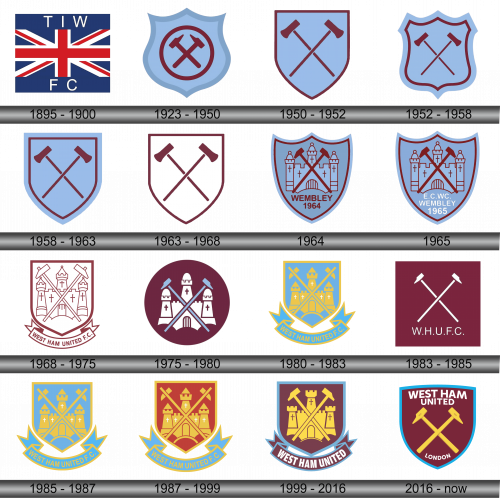
During its inaugural year, the team unveiled its first-ever badge: a representation of the UK flag accompanied by the initials “T I W” at the top and “F C” at the base. These letters are the short form for the club originally known as Thames Iron Works Football Club. The choice of the flag symbolized the team’s deep-rooted British identity, while the inscriptions highlighted its unique origin, linking the club’s footballing passion with the historic Thames Iron Works industry. It was a symbol of unity, heritage, and pride that showcased the club’s beginnings and its integral connection to the local community.
1923 – 1950
Upon updating the emblem, at its core lay intertwined rivet hammers reminiscent of those used in marine construction. These very hammers also bear a resemblance to the symbols in the coats of arms for both West Ham County and London’s Newham Borough.
These implements echo the club’s beginnings as a grassroots football group established by craftsmen from the Thames Iron Works. Encased within a rich wine-colored circle, these tools sit prominently at the heart of a uniquely designed shield, bordered by a striking blue. This imagery serves as a poignant reminder of the club’s deep roots in the shipbuilding community and its enduring connection to the region’s history and culture.
1950 – 1952
The updated logo omits the previous ring design. The hammers, now more prominent, dominate the available space within the emblem. The shield has transformed into a rectangular shape, framed by a rich wine-colored border. This modernized design places significant emphasis on the iconic hammers, signifying their importance in the club’s identity. The rich burgundy hue encapsulates the club’s traditional colors while the revamped shield shape offers a fresh yet respectful nod to the club’s storied past. As visuals go, this emblem captures the essence of transformation while staying rooted in tradition.
1952 – 1958
In the year 1952, the emblem’s shield underwent another transformation. It echoed the design from 1923, yet introduced a double stroke, creating a nuanced alteration in its visual appeal. This subtle change, while maintaining a semblance to its 1923 predecessor, introduced a layer of complexity and detail to the design, perhaps reflecting an evolution or maturity of the club at that time. The nuanced addition of the double stroke may have offered a fresh aesthetic while ensuring that the historical and visual continuity remained intact, cherishing the rich tradition the club has always been synonymous with. By doing this, the redesign delicately balanced between respecting the legacy and bringing forth a subtle, modern flair to the emblem.
1958 – 1963
The 1950 badge made a comeback. Currently, the symbol is encircled by an expansive azure border. This revamped design captures a sense of nostalgia while infusing a modern touch, showcasing a blend of past legacies with contemporary aesthetics. The bold blue perimeter not only emphasizes the central imagery but also adds depth and contrast to the overall look. By resurrecting the 1950 emblem, there’s an evident nod to the club’s storied past. However, with the introduction of the striking blue outline, it also demonstrates an adaptability to the evolving design landscapes, seamlessly merging history with the present. The juxtaposition of the old with the new is a testament to the club’s rich tradition and its forward-thinking approach.
1963 – 1968
The azure hue previously present in the emblem has now vanished entirely. Instead, a pristine white backdrop has taken its place. This transformation highlights a stark departure from earlier designs, suggesting a fresh chapter or a renewed identity. The shift to a white foundation might indicate a clean slate or a minimalist approach, emphasizing simplicity and clarity. Such a change, though seemingly subtle, carries potential implications about the brand’s direction, evolution, and values. By eschewing the blue, there’s a possible inclination towards refinement and modernity, demonstrating the ever-evolving nature of branding and its responsiveness to contemporary design aesthetics.
1964
In the grand finale of the F.A. Cup, the team sported an emblem that showcased the iconic hammers intertwined with the imagery of the Boleyn Castle fortress. As historical tales narrate, this fortress was once the dwelling of Anne Boleyn, the renowned second consort of King Henry VIII. The base of this emblematic shield carries the words “Wembley 1964”, indicating both the famed venue and the year in which this pivotal match took place. This unique insignia not only celebrated the team’s achievements but also subtly nodded to historical landmarks, fusing the past with the present and adding a layer of depth to the team’s identity during this significant event.
1965
The emblem crafted for the E.C.W.C. Final bears a striking resemblance to its predecessor. Yet, it stands distinct due to the specific marking: “E. C. W.C. Wembley 1965.” This unique annotation pays homage to the particular event and year, subtly setting it apart from the earlier version. While maintaining the core design elements, the addition of this detail chronicles a special chapter in the team’s history, capturing the essence of that particular year and the significance of their journey to the Wembley stage in 1965. This slight modification serves as a timestamp, forever cementing the team’s legacy in that specific era.
1968 – 1975
Within a geometric shield, pointed at its base, lie the distinct symbols of hammers and a lock. These emblems, representing the team’s rich history and identity, are gracefully ensconced inside. Beneath this protective enclosure flows a gracefully arched banner, inscribed with the team’s name. This design isn’t merely an emblem; it’s a reflection of the team’s legacy and spirit. Every element has been meticulously chosen to echo the club’s journey, its challenges, and its triumphs. The combination of classic heraldry with these unique symbols is a nod to both tradition and the distinct identity the team has carved out over the years.
1975 – 1980
The 1975 emblem prominently features a deep maroon circular background. Atop this rich hue stands a pristine white fortress, characterized by its uniquely curved turrets. At the heart of the design, two azure hammers intersect, symbolizing strength and unity. This composition not only reflects the club’s heritage but also emphasizes the fusion of traditional symbols with a modern aesthetic. The deep maroon sets a backdrop that brings out the vibrancy of the other elements, and the castle stands as a testament to the team’s fortitude. The intersecting hammers, bathed in a shade of blue, signify the core of the club’s identity, representing both history and ambition.
1980 – 1983
The 1968 emblem design made a reappearance, but with a fresh twist. The revamped graphic incorporates sharper angles and more pronounced linear elements. A vibrant blend of golden yellow and rich blue dominates the color palette, infusing the logo with energy and contrast. This iteration, while echoing its historical roots, introduces a contemporary feel. The bold yellow hues serve as a beacon, drawing attention, while the deep blue grounds the design, establishing a sense of reliability. By seamlessly merging the past with modern artistic elements, the logo stands as a testament to the club’s evolution while honoring its heritage.
1983 – 1985
Over a biennial period, West Ham United Football Club adopted a minimalist aesthetic for its symbols: a deep maroon square played backdrop to crisply white, intersecting hammers, accompanied by the succinct “W.H.U.F.C.” abbreviation. The emblem radiated a subtle, yet potent simplicity, allowing the emblematic hammers and the acronym to take central stage, unobstructed by additional details. This approach not only streamlined the logo’s appearance but also amplified its recognizability and impact. In a world often saturated with ornate designs, this unembellished, clear-cut iconography boldly communicated the club’s identity with understated power and a contemporary flair. Consequently, it signifies a chapter where the club’s visual representation leaned into a modern, reduced design ethos.
1985 – 1987
A precise replication of the 1980’s insignia emerged, transporting audiences back to an era marked by that distinct design. This emblem, reminiscent of a time gone by, not only encapsulates the spirit and essence of that period but also resonates with the nostalgia of fans who remembered it fondly. Drawing upon a rich history, this symbol served as a testament to the club’s heritage, showcasing its commitment to preserving the legacy while adapting to the times. The decision to resurrect this iconic design underscores the timeless nature of some symbols, demonstrating their enduring appeal even in contemporary contexts. By reverting to this imagery, the club is possibly emphasizing tradition, history, and a strong connection to its roots.
1987 – 1999
The visual identity of the emblem underwent a transformation. Within the confines of the shield, the hue transitioned to a vibrant shade of crimson. This bold choice seemed to breathe fresh life into the insignia, conveying passion, energy, and possibly the fiery spirit of the team or organization it represented. A color can speak volumes, and in this instance, the shift to red might have been an attempt to evoke stronger emotions or resonate deeply with the target audience. Embracing such a dynamic shade could also suggest a new chapter or direction, emphasizing rebirth, resurgence, or renewed determination. The decision to adapt and refine the logo’s palette highlights the evolving nature of brand identities and the importance of staying relevant while retaining core elements.
1999 – 2016
In 1997, the creative team at Springett Associates undertook the task of rejuvenating the emblem’s design. They magnified the castle’s presence, choosing to do away with the triangular peaks that once crowned its towers. Beneath the shield, a pristine white banner unfurled, bearing the words “West Ham United.” This redesign was not just about aesthetics; it was about ushering in a fresh perspective while honoring the club’s rich history. The revamped emblem seamlessly merged the old with the new, ensuring that while the club moved forward, it never forgot its roots. The modernized elements, combined with traditional motifs, aimed to resonate with both longtime supporters and newer generations of fans. The subtle but significant changes demonstrated how even the slightest design modifications could instill a renewed sense of identity and purpose.
2016 – Today
The latest emblem doesn’t feature the Boleyn Castle, reflecting the club’s transition from Boleyn Ground to the iconic London Olympic Arena. Dominating the design are the hammers, inscribed with the letters “T.I.W.”, a nod to the club’s origins at Thames Iron Works. The club’s moniker now sits proudly atop the shield, while the word “London” is emblazoned below. Legend has it that the shield’s shape mirrors the cross-section of the H.M.S. Warrior frigate. However, actual blueprints suggest a different story. This modern logo amalgamates the club’s storied past with its vibrant present, seamlessly bridging history with the contemporary era.

