Blackburn Rovers Logo
Blackburn Rovers is a football club in England. John Lewis and Arthur Constantine founded it. They established the club in Blackburn, Lancashire. Initially, the club aimed to create a team for local cricket players during the winter months. Their goal was to stay fit and active throughout the year.
Meaning and History
Blackburn Rovers emerged in 1875, formed by John Lewis and Arthur Constantine. They established the club in Blackburn, Lancashire. Initially, a winter pastime for cricketers, the club’s aspirations grew. By 1888, Blackburn Rovers became a founding member of the Football League. Their legacy includes an early dominance in the FA Cup, with victories in 1884, 1885, and 1886. The team has seen fluctuating fortunes, experiencing both relegations and promotions. A high point arrived in 1995 when they won the Premier League, with notable players making history. Rovers’ blue and white halved jerseys became iconic. Ewood Park has been their home since 1890, fostering a loyal fan base. “Arte et Labore”, their motto, translates to “By Skill and Hard Work”, reflecting the club’s ethos. The team continues to compete, embodying their rich history and community spirit.
What is Blackburn Rovers?
Blackburn Rovers is a professional football team based in Blackburn, Lancashire, England. Known for winning the Premier League once, they have a rich history in English football. The club plays in the EFL Championship, the second tier of English football.
1875 – 1878
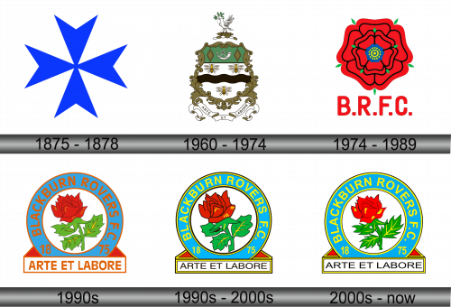
The image shows a symmetrical eight-pointed star with sharp angles. Dominantly blue, it radiates from a central point against a plain white backdrop. Each arm of the star is uniform, creating a balanced and dynamic visual effect. The design is bold and simple, likely aiming for instant recognition. The star’s vibrant blue hue stands out, suggesting a sense of energy and trustworthiness. The overall impression is modern and sleek, with the star motif possibly symbolizing direction, movement, or a guiding force.
1960 – 1974
This detailed emblem presents a classic shield, topped with a dove on a football. The shield is divided: the top section in green with diamonds, a central band hosts three bees, symbolizing industriousness and teamwork. Below, a scroll carries the club’s motto, “ARTE ET LABORE”, translating to “By Skill and Labor”. The inclusion of the bees and the motto strongly reflects the club’s ethos of hard work and dedication. The overall design ties the club’s identity to these virtues, while also acknowledging its historical roots.
1974 – 1989
This logo embraces a striking floral design, centered around a red rose, a symbol deeply tied to Lancashire, where the club hails from. The rose’s layers of petals unfurl in vibrant red, with a detailed blue core sporting yellow accents, perhaps nodding to a unifying theme of beauty and complexity. Surrounding green leaves add a natural touch. Below, “B.R.F.C.” appears in bold red letters, asserting the club’s identity. The design is clear, vivid, and denotes a proud regional connection.
1990s
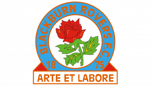
This logo evolves to include an encompassing circle with the club’s full name, “BLACKBURN ROVERS F.C.”, in bold brown lettering. Center stage, the red rose retains prominence, now detailed and lively against a crisp white background. The rose is more stylized, paired with green leaves that add a natural touch. Encircling this is a year band, “1875”, the club’s founding year, showcasing its heritage. Below, an ribbon proudly bears the motto “ARTE ET LABORE”, reaffirming the club’s values. The design is vibrant, encapsulating tradition and identity within a modern emblem.
1990s – 2000s
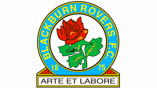
In this iteration, the rose is redesigned with a more abstract, artistic flair. Its petals curl with stylization, and the green leaves feature more pronounced veins. The background circle is now a solid blue, providing a striking contrast that enhances the rose’s red and the leaves’ green. The founding year, “1875”, remains encircled, but the color scheme shifts, offering a vibrant backdrop. The motto ribbon, “ARTE ET LABORE”, now rests on a sharper pentagon base, adding a sense of foundation and stability. The text and numbers adopt a bold and more prominent outline, ensuring legibility and impact.
2000s – Today
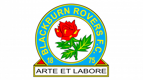
The latest logo presents a more refined rose with smoother, less stylized petals, conveying a classic look. The color of the circular background returns to a lighter blue, giving the logo a brighter appearance. Leaf detailing is now minimalistic, emphasizing a cleaner, more modern aesthetic. The year band retains its vibrancy with a blue and yellow pairing, yet the typeface appears more contemporary. The base ribbon holding “ARTE ET LABORE” transitions to a flat design, aligning with modern graphical trends. Overall, this design refresh embraces clarity, simplicity, and tradition.
