Crystal Palace Football Club Logo
Crystal Palace Football Club, based in London, UK, competes in the English football league system. Renowned for its passionate fan base and historic Selhurst Park stadium, the club plays primarily in the Premier League, England’s top football division. Owned by a consortium including Steve Parish, Joshua Harris, and David S. Blitzer, Crystal Palace maintains a strong local and international presence, focusing on competitive performance and youth development to secure its position in global football markets.
Meaning and history
Founded in 1905, Crystal Palace Football Club originated from the Crystal Palace Company. Initially, they played at the famous Crystal Palace Exhibition building site. The club joined the Football League in 1920, marking the start of its professional journey. Over the years, Palace experienced fluctuating fortunes, moving between divisions. The 1970s and 1980s saw notable success, including reaching the FA Cup final in 1990. Financial troubles in the late 1990s and early 2000s led to administration. However, under new ownership, Palace stabilized. The 2010s brought resurgence, culminating in Premier League promotion in 2013. The club has since remained in the top tier, establishing itself as a competitive side. Selhurst Park, their home ground, is renowned for its vibrant atmosphere. Palace’s identity is closely tied to its community and fan base, embodying resilience and spirit.
What is Crystal Palace Football Club?
Crystal Palace Football Club is a spirited entity in the heart of London, engaging in the high-octane world of English football. With its roots deeply entrenched in tradition since 1905, the club symbolizes resilience, community, and a fierce passion for the beautiful game, competing with distinction in the Premier League.
1935 – 1955
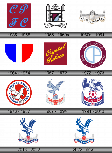
The emblem features bold, intertwined initials “C”, “P”, and “F”, “C” in a striking shade of blue against a deep red backdrop. The fluidity of the script evokes a sense of movement, reflecting the dynamic nature of the game. This minimalist yet elegant design combines tradition with modernity, symbolizing both the heritage and the forward momentum of the entity it represents.
1955 – 1960s
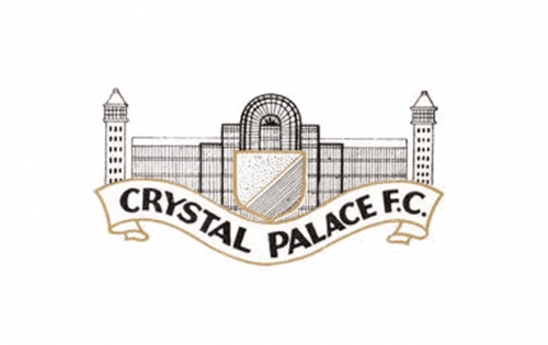
The updated emblem portrays architectural finesse, featuring an iconic, detailed illustration of the Crystal Palace, with twin towers and a central dome. The shield at the center is bisected diagonally, showcasing a deep maroon and sky blue, likely reflecting the club’s colors. Bold, black outlines give prominence to the structure, evoking grandeur and history. Below, a classic ribbon banner firmly states “CRYSTAL PALACE F.C.”, grounding the logo with a sense of identity and permanence. This emblem intricately fuses the club’s football essence with its historic namesake landmark.
1960s – 1964
This rendition of the emblem softens its palette, embracing a sepia-toned subtlety that hints at vintage origins. The central shield is simplified to a solitary, solid color, perhaps a nod to unity. The once vividly depicted Palace now bears a sketched quality, reflecting an elegant, bygone era. The banner, with the club’s name “CRYSTAL PALACE F.C.”, arches gracefully beneath, lending a classic, timeless feel to the logo. This design marries the grandeur of the club’s heritage with an understated, classic aesthetic.
1964 – 1974
This three-color shield logo is vertically divided into three parts: royal blue on the left, white and bright red on the right. The crisp division symbolizes a balance of passion and cool composure. The simplicity of the design strips away any complexity, focusing solely on the power of color and shape to represent identity. Its boldness is reminiscent of a team’s unity and the straightforward nature of their mission. This emblematic design communicates strength and distinctiveness without the need for embellishment.
1967 – 1972
This logo adopts a different approach, featuring “Crystal Palace” written in sweeping, cursive yellow lettering on a maroon background. The design is devoid of any symbolic imagery or motifs that reference the club’s history or the iconic Crystal Palace structure. This logo’s focus is purely typographic, presenting the club’s name in an elegant, free-flowing script that suggests movement and energy. It’s a departure towards simplicity and possibly aims to convey a sense of flair and individuality.
1972 – 1973
Transitioning from the previous design, this emblem returns to graphical elements, encapsulating “CP” within a blue outline, central in a maroon ring. The outer circle prominently features the text “THE GLAZIERS CRYSTAL PALACE F.C.”, connecting the club’s nickname to its identity. This design is a nod to the club’s origins, with the circular motif suggesting unity and continuity. The font is straightforward and legible, representing a shift towards modernity and a professional image. It’s a blend of textual and visual elements, unifying the club’s heritage with its aspirations.
1973 – 1987
In this evolution, a striking eagle clutching a ball is central, symbolizing agility and power. The background is a vivid red circle bordered by blue, with “CRYSTAL PALACE Football Club” in white, creating a sharp contrast. This design conveys a stronger sports theme, directly linking the club’s football identity with the eagle’s dynamic presence. The emblem radiates a bold, competitive spirit, a clear shift from the previous logo’s more understated style.
1987 – 1994
The eagle in this iteration is more stylized and detailed, set above a representation of the Crystal Palace. Below the eagle, a red banner reading “CRYSTAL PALACE F.C.” bridges the iconic towers. The color scheme is softer, with lighter shades of blue and red, offering a more refined aesthetic. This logo combines both the club’s name and its historical reference point, visually tying the team’s identity to its namesake structure and the emblematic eagle.
1994 – 2013
The latest logo evolution features a more commanding eagle perched atop a football, adding a pronounced sense of strength. The towers are now a deep blue with a lattice design, and the red banner with “CRYSTAL PALACE F.C.” is more pronounced. The design leans into a bolder contrast with sharper details, enhancing the emblem’s visual impact. It’s a robust representation of the club’s spirit and sporting prowess.
2013 – 2022
This logo brings a fierce, stylized eagle into sharp focus, soaring above a silhouette of the iconic Crystal Palace. Below, a bold, red banner highlights “CRYSTAL PALACE F.C.” and the club’s founding year, 1905. The eagle’s outstretched wings command attention, signifying ambition and flight. This design merges a striking modern graphic with historical acknowledgment, solidifying the club’s image in contemporary and classic elements.
2022 – Today
The logo retains the eagle’s dynamic presence but alters the year on the banner to 1861, reflecting the historical founding of the original Crystal Palace. The rest remains consistent, with the eagle dominating the space above the Crystal Palace silhouette and a football. The banner continues to bear the club’s name in a proud arc, maintaining the established color scheme of red, blue, and white, which encapsulates the team’s enduring spirit.
