Leeds United Logo
Leeds United football club is much younger than most other eminent English clubs. It was created by British standards quite late – in 1919. During more than a century of history, Leeds United has managed to make a lot of major rivals, and not only within the country. Its most significant success in the national cup came during the golden period in the club’s history in the 60s and the first half of the 70s when the team reached the finals four times.
Meaning and History
Leeds United was created in late 1919 after Leeds City was expelled from the league. The new player began their performances with regional competitions. The Leeds played their first match at the “Elland Road” stadium against the “Sunderland” club. A year later, the club was accepted into the second division of the Football League of England. In 1924, they won the right to try themselves among the best players in the country for the first time.
What is Leeds United?
This is an English football club with over a century of history. Despite poor seasons over the past decade, Leeds United remains in the top 10 most supported clubs in England.
1973 – 1976
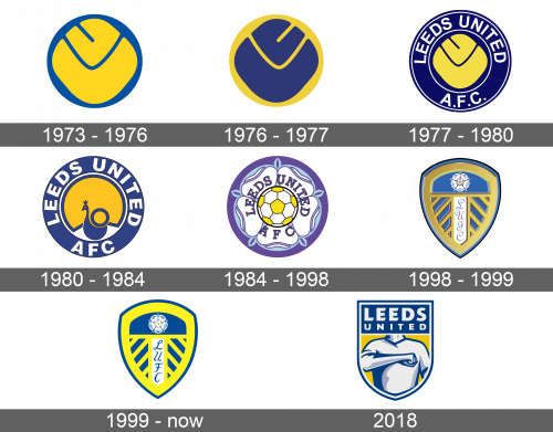
The first emblem of the new team was bright and memorable. It was an admiral blue circle serving as a base. It had a diamond square with rounded corners placed right over it. The square was a bright yellow color and had cuts and slits on it, which created even more shapes and interesting details.
1976 – 1977
The new logo had a completely different feel because the circle was now yellow, while the square element was a blue color. In addition, the image was flipped, so the slit was on a different side. Otherwise, it kept the same shapes and color palette.
1977 – 1980
The square element was now yellow again and flipped back to the original version. The background circle got significantly bigger and changed color to bluish-gray color. The yellow element had a thin white circle outline around it followed by the team’s name written around it. It said “Leeds United” going around in an arch and “AFC” written at the bottom. All the letters were white, uppercase, and had a very thin black outline for more contrast. The emblem was completed by a golden border that had thin black lines on both sides.
1980 – 1984
A new emblem was presented in 1980. The yellow element turned into an almost full circle that resembled a sunset/sunrise. In front of it, there was a blue peacock. The white circle around it got a little thicker, while the outside golden border was gone altogether. The letters also got bigger and thicker. Overall, the deep colors and clean lines made the logo professional.
1984 – 1998
The emblem was updated and looked much fancier. It had a new color scheme and had a purple circle serving as the base. Instead of a yellow diamond square, the logo had a soccer ball done in a yellow and white color palette with a light blue outline. The name was done in a dark purple using a different type of font that still looked classic. It was set on a white intricate flower with light purple details.
1998 – 1999
The new logo looked something more like a shield. It was a dark blue color and had a yellow design over it, which followed the outside outline of the shield and had a herringbone pattern in the bottom half. In the center of the herringbone pattern, there was a vertical rectangle that was white inside and had the team’s initials. The letters looked like a handwritten cursive typeface and were done in deep blue. At the top of the yellow pattern, the logo had the purple and white flower from the previous emblem.
1999 – Today
A little update was done to the color scheme of the logo. The deep blue turned into a sky blue and the yellow looked a little brighter. There was also a small yellow flower in the center of the bigger flower, which changed its shape and looks a bit. The shield also got a more pointy arch at the top. The yellow pattern got thicker lines, while the blue border around it got slightly thinner. These changes were not major, so the logo stayed very recognizable.
2018
For a very short time, the club had a different logo. It was also a blue shield that had a square top. It had a body of a man done in a blue and white color palette saluting with his hand. The man was placed on a yellow background. At the top, the emblem had its name done in white capital letters on a blue background.
