Bologna Logo
Bologna Football Club 1909 is an Italian professional football team. A group of young local athletes founded it. They established the club in Bologna. They aimed to promote football in the city and provide a structured competitive platform for local players. This team represents Bologna in Italy’s football hierarchy.
Meaning and history
Bologna Football Club 1909, founded on October 3, 1909, stands as one of Italy’s historic football clubs. Initially, local enthusiasts seeking to foster athletic activities, particularly football, within Bologna created the club. Over the years, Bologna FC has clinched seven Serie A titles, with their first coming in 1925 and the most recent in 1964. The club also boasts a rich European history, having won the UEFA Intertoto Cup in 1998. These achievements highlight Bologna FC’s significant role in Italian and European football.
What is Bologna Football Club 1909?
Bologna Football Club 1909 is a prominent football club based in Bologna, Italy. It competes in Serie A, the top tier of Italian football. The club has a storied history, including multiple Serie A championships. Bologna FC plays its home games at Stadio Renato Dall’Ara.
1946 – 1900s
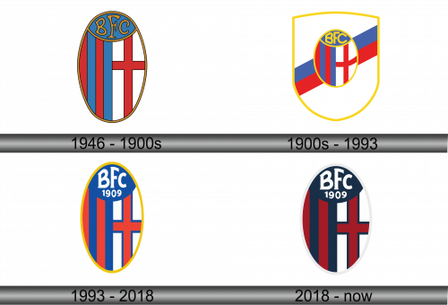
The logo displays a rich heraldic tradition with an oval shape. Its upper half features bold letters “BFC” on a blue field, suggesting an acronym for a football club. Below, vertical stripes alternate in red and blue, flanked by a white space. A cross of Saint George, a red cross on white, sits prominently to the right, hinting at a possible connection to the city of Bologna. The entire emblem is outlined in gold, which may symbolize prestige and a storied history in sports.
1900s – 1993
In this iteration of the emblem, the logo gains a shield backdrop, enhancing its prominence. The oval with the “BFC” inscription and the central cross remain. The stripes, in shades of red, blue, and white, give a dynamic feel. A yellow border, bright and eye-catching, encloses the shield. This design choice may suggest an expansion or evolution, symbolizing perhaps a broader ambition or a fresh chapter for the club.
1993 – 2018
The logo has now incorporated the year “1909”, establishing a clear founding date above the “BFC”, emphasizing heritage. This detail connects the team with a specific moment in history, inviting reflection on its long-standing traditions. The background maintains the striped pattern but now sports a more streamlined oval shape, bordered in yellow. The design shift to include the year denotes a nod to the club’s longevity and legacy, while the overall aesthetic maintains the logo’s classic and recognizable look.
2018 – Today
The colors present the most noticeable change, shifting to darker tones. The vibrant yellow border has been replaced by a more subdued white, offering a cleaner look. Inside, the blue and red stripes along with the white space are now deeper, creating a striking contrast. This alteration in hues gives the emblem a more contemporary and bold appearance, while still honoring the original design. The color update signifies a refreshed identity for the club.

