BP Logo
Since the mid-1970s, BP has been making pet food and consumer products. In 1986, the concern decides to acquire the American company Purina Mills, which allowed the BP Nutrition division to become one of the world’s largest suppliers of flour. Later, BP entered the mining industry with the acquisition of the British Mining Company.
Meaning and History
The history of BP began in 1908, when, after a long and exhausting search, oil was found in Persia thanks to the efforts of an Englishman named William D’Arcy. This is how the Anglo-Persian Oil Company, which eventually changed its name to BP, appeared. Burman Oil (97% of the shares) and Lord Strathcona got joint ownership of the oil company. Later, the business submitted a funding request to the British government, and a deal was eventually finalized in 1914. The business became a market leader for oil products by the end of the 1920s. Anglo-Iranian Oil Company was introduced as the new name eight years later. In 1954, it adopted the name British Petroleum Company. BP, though, no longer stands for British Petroleum. Now, BP is Beyond Petroleum, which reflects a wide range of its activities.
What is BP?
The British oil and gas company BP is ranked way at the TOP-500 largest companies in the world and is the second largest publicly traded oil and gas company. To date, BP is represented in the markets of more than a hundred world countries.
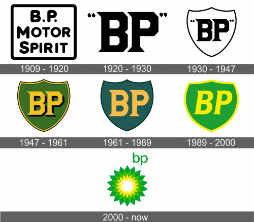
1909 – 1920
The first name of the future BP company was the center of the emblem. It stated “B.P. Motor Spirit” in all uppercase letters in three lines. The letters had rounded forms and the first letters were slightly bigger, going above and below the rest. The name was framed by a line that was the same thickness as the letters themselves and rounded corners. It was simple and all black and white, which gave it a confident look.
1920 – 1930
The new logo had a much bolder feel. The abbreviated version (BP) was done using a font that featured thick, geometric letters. The initials were complemented by quotation marks that had the same sharp ends and square corners. It was very appropriate for the industry leader BP has become by this time.
1930 – 1947
The previous version was given a new spin. The whole emblem was placed on a white shield with a thin border, which made sure all the attention was on the name. The emblem was still black and white, which was typical for that time period.
1947 – 1961
An already familiar logo looked completely different thanks to the introduction of a new color scheme. The letters were now bright yellow color with a black shadow on the right side for a 3D appearance. The shield also changed color to a grassy green, while a very thin yellow border indented inside added an interesting detail. The quotation marks were removed.
1961 – 1989
The new logo looked plain in comparison to the previous version, although it gave it a more professional look. It was designed the Raymond Loewy’s team, which also drew other famous logos. There were no outlines or shadows, and the shape of the shield stayed the same. The color palette had muted shades of green and yellow. After a long period of time, the font was updated. It still featured pointed ends, but the corners were rounded for a more classic look.
1989 – 2000
Many years later, the company decided to update its logo. The initials were italicized, while serifs got a smooth and sharp look. Bright green color was used for the base of a shield that acquired a rounded shape. It had a thick border of the same yellow color as the letters themselves. The idea was developed by the Siegel & Gale design studio.
2000 – Today
The new logo was quite unexpected as it presented a geometric flower done in the same green and yellow color palette with an addition of a white center. It was a good representation of a company that went far beyond the original oil business. Small, lowercase initials were placed in the upper right corner outside the flower.
Font and Color
For most of its history, the same font was seen in logos. It featured sharp, geometric shapes with straight lines and corners, which were later transformed into more round curves. The latest logo features a basic font without serifs. When it comes to the color palette, a traditional black and white one was replaced by a green and yellow color scheme that changed its shades over the years. While the yellow color is full of energy, the green typically represents growth and nature.
