British Gas Logo
British Gas is an enterprise engaged in the power industry, established in 1986 and based 26 km west of London. Owned by Centrica, it provides gas for twelve million houses in Great Britain, which makes it one of the nation’s most influential gas firms. Along with gas supply, their services include the establishment of boiling and heating systems, plumbing and drain maintenance, and other housing and communal assistance.
Meaning and history
British Gas traces back to the Natural Gas and Coke Corporation (NGCC), established in London in 1812 according to the Royal Charter signed by King George III. The business prospered throughout the century, distributing gas in the capital and incorporating various smaller gas businesses in the region.
In 1949, the British legislature approved the Gas Act, forming independent gas boards controlled and sustained by the state. The NGCC became a host of the North Thames Gas Board – a large system, encompassing London and its suburbs. It allowed the enterprise to expand and develop during the following years.
Another Gas act of 1973 unified the gas systems of the nation and founded the British Gas Corporation – a governmental entity, at first obeying to Secretary of State for Trade and Industry and a year later to the Secretary of State for Energy.
The final Gas Act of 1986 separated British Gas and the state, thereafter privatizing the enterprise. Its stakes were placed on London Stock Exchange under the British Gas plc trademark. Since this event, the company lists its modern history.
What is British Gas?
British Gas is a company, located in Staines-upon-Thames. They are the fuel distributor to twelve million British houses. In their product and services list, there are electricity laying, establishing of heating and boiling systems, and housing and housing and communal services.
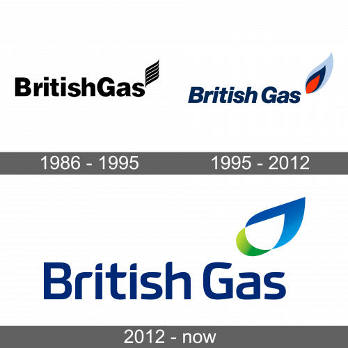
1986 – 1995
The British Gas’ initial logotype was a black inscription written in a classic sans-serif typeface with semibold lines. To the right of it, they placed four wavy lines, supposed to symbolize a flame.
1995 – 2012
The brand designers renewed the emblem and the inscription in the 1995 logotype. The letters became italicized, and changed the color to blue, while the sign now showed a more naturalistic image of a flame, split into three temperature zones: orange, dark blue, and bright blue.
2012 – today
The latter logotype depicts the nameplate in an updated typeface. The icon changed as well – now it displays a more schematic flame, now looking more like a tilted drop. The reinvention adds more movement and dynamic to the logo.
Color
The color code of the logotype consists of blue, green, and white. Here’s how they are used: the natural gas burns blue, so it’s used in both the flame’s upper part and the nameplate; the background of the flame’s center is white to create some contrast; finally, the flame’s green lower part symbolizes the company’s desire to keep nature alright.
Font
The British Gas original typeface has slim streamlined letterforms with smooth corners. The first characters of each word are uppercase.


