Buc-ee’s Logo
Buc-ee’s is an American chain of gas stations and convenience stores, often located nearby or on the same premises. They are prevalent largely in the Southern US, notable mostly for their size, variety of food and drink and a lot of prepared foods on sale, such as grilled meat, pastry and more. Their mascot is a friendly beaver called Buc-ee.
The company facilities are spread wide in states such as Texas, Alabama, Florida and others, where they are considered part of the local culture. The stores are often located just off the city, and their massive buildings are considered a staple of any suburban landscape in the region.
Meaning and History
Buc-ee’s was created in 1982 in Texas, where it’s still considered the most widespread brand of gas stations. They currently have over 40 locations in 7 states, most of them in Texas. The name was coined by one of the company’s founders, Arch Aplin, who essentially took the regular pet name Bucky and switched it up to appear friendlier and avoid copyright issues.
What is Buc-ee’s?
Buc-ee’s is a chain of convenience stores, gas stations and car washes present all across the Southern US. They have locations in Texas, Alabama, Florida, Georgia, Kentucky, South Carolina and Tennessee – all in all, 7 locations across 44 states. They are regarded as commonplace in Texas in particular.
1982 – today
![]()
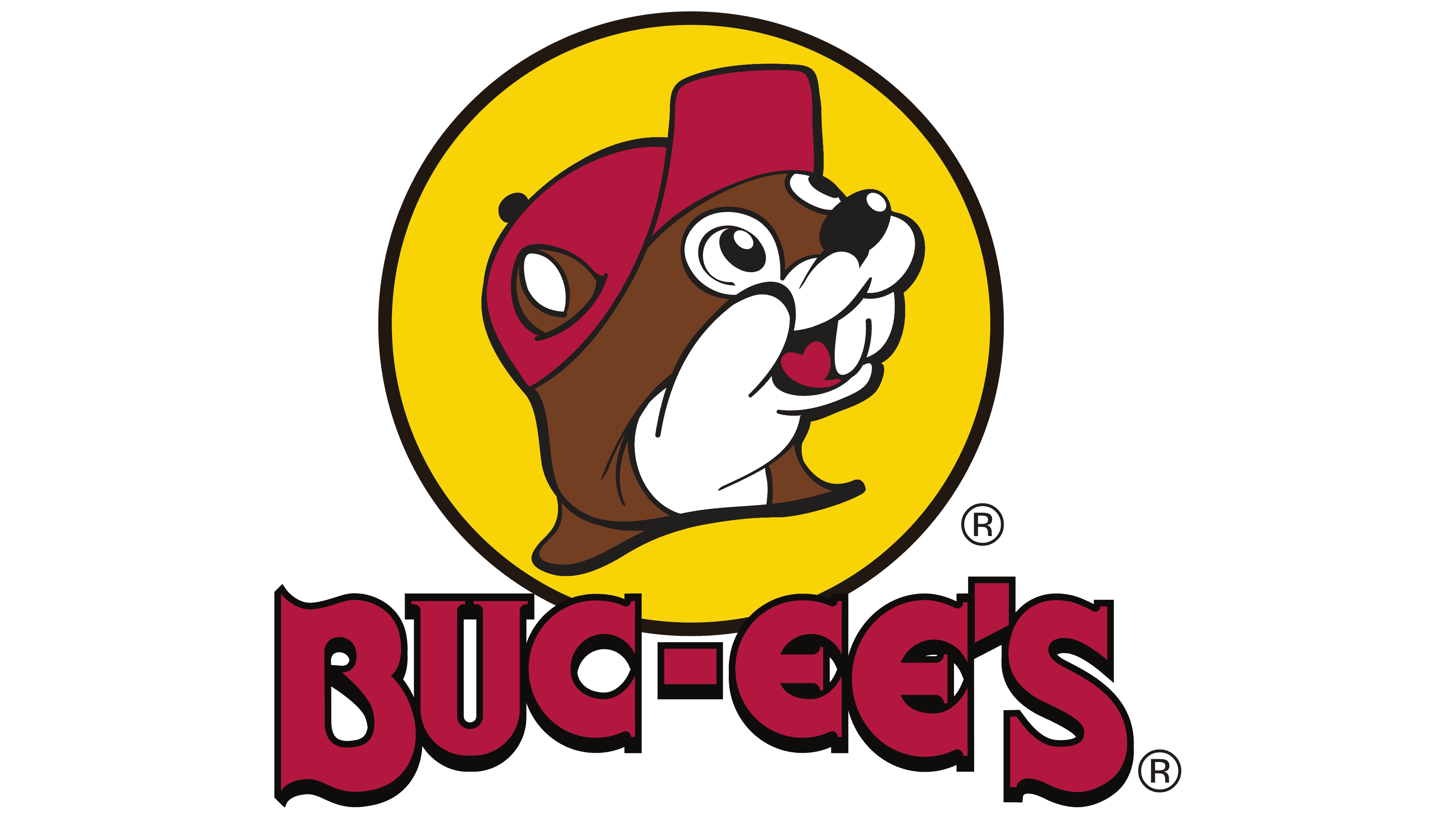
The original logo created in the 80s has been in use for over 40 years, creating recognizable and unique brand imagery.
The emblem is a yellow circle with a black rim that contains an image of the brand’s mascot in the middle. That image is the head of a cartoonish beaver wearing a red baseball cap with holes for ears. The beaver himself uses mostly the colors brown and white, with black employed for pupils, nose, rims and such. The color red is also used for the tongue.
His expression is that of interest and delight. He has a wide smile with protruding cheeks, an open mouth with big buck teeth and a generally soft appearance. It’s designed to create an idea of friendliness and familiarity.
Color

The emblem’s color palette is quite simple. Only 4 colors are really used: brown, white, black and yellow. All of them are bright, simple shades. The black is used to emphasize volume, texture and shape, although it’s not used extensively. There are only a few strokes in this soft image.
Font
The company also uses their trademark lettering fairly often with the main emblem. It’s also present on the exteriors of their stores in large white or red letters. The characters are large and inflated, creating a sense of volume in each letter. They are also peculiar: mostly with smooth strokes but also sharp serifs here and there.


