Bunnings Logo
Bunnings operates as a leading retailer of home improvement products in Australia and New Zealand. Brothers Arthur and Robert Bunning founded it in Perth, Western Australia. Initially, they launched it to supply building materials. Bunnings stands as a go-to destination for DIY enthusiasts and professional builders alike, offering a wide range of tools, materials, and gardening products.
Meaning and history
Bunnings began its journey in 1886, initially carving out its niche in sawmilling. The company transitioned into the retail sector, opening its first warehouse in the early 1990s. Significant growth milestones include its acquisition by Wesfarmers in 1994 and the expansion into the UK and Ireland market in 2016 through the purchase of Homebase. However, the venture into the UK was short-lived, with Bunnings exiting the market in 2018. Over the years, Bunnings has become synonymous with home improvement, significantly impacting local communities through job creation and sustainability initiatives.
What is Bunnings?
Bunnings is a powerhouse in the home improvement retail market, catering to DIY buffs and professionals. With its vast array of products, from gardening supplies to hardware tools, Bunnings empowers customers to tackle home projects confidently. It stands as a testament to Australian entrepreneurship and customer service excellence.
1886 – 1952
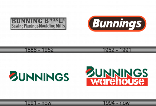
The logo presents itself with a vintage flair, featuring a monochromatic palette. It reads “BUNNING BROS LTD” prominently, connoting the company’s origins as a family-run business. “Sawing, Planing & Moulding Mills” is etched below in a finer type, suggesting their original wood-related services. The typography exhibits a classic, industrial era style, with bold, serif letters that relay a sense of solidity and reliability. This logo captures the essence of a bygone era of craftsmanship and industry.
1952 – 1991
This logo exudes a modern and streamlined look, a departure from its predecessor’s vintage feel. “Bunnings” is now boldly featured in white against a deep brown background, ensuring high visibility. A bright orange line caps the logo, adding a contemporary touch. The sans-serif font is clean and minimalistic, reflecting a modern brand identity. The oval encapsulation suggests approachability and completeness. This design marks a significant shift towards a more graphic and less text-heavy branding approach.
1991 – Today
The logo evolves again, adopting a fresher, more contemporary design. Bold green letters spell out “BUNNINGS”, conveying growth and vitality. The red chevron adds a dynamic touch, suggesting forward motion and innovation. This cleaner, sharper logo moves away from the oval frame, opting for a simple yet powerful presence. The new design reflects a modern and eco-friendly image, aligning with contemporary branding trends. It symbolizes a step towards a future-oriented, environmentally conscious brand identity.
1994 – Today
The new logo retains the green and red color scheme, symbolizing vitality and action, but now includes “warehouse” in bold red. This addition emphasizes the expansive nature of Bunnings’ retail spaces and their wide product range. The red chevron remains, maintaining the brand’s forward momentum. The font is uniform and robust, reinforcing the brand’s presence as a reliable destination for home improvement needs. The dual-color presentation highlights the brand name and its business scope effectively.


