Celtic Logo
Celtic FC, based in Glasgow, Scotland, competes in the Scottish Premiership, with a passionate fan base and a rich history of success. Owned by Celtic PLC, its main markets include Scotland, Europe, and North America. The team, managed by Ange Postecoglou, aims to dominate domestic competitions and make a significant impact in European tournaments, maintaining its status as a prominent football club globally.
Meaning and history
Celtic Football Club, a symbol of pride in Glasgow, Scotland, was founded in 1887 with the noble cause of alleviating poverty in the city’s East End. The club, rooted in its Irish and Catholic heritage, has grown into a Scottish football giant.
Celtic quickly made an impact, winning the Scottish League Championship in 1893. The early 20th century saw further success, with the club dominating Scottish football. The pinnacle of Celtic’s achievements came in 1967 when they became the first British club to win the European Cup, a feat achieved with a team known as the “Lisbon Lions,” all of whom were born within 30 miles of Celtic Park.
Over the decades, Celtic has maintained its stature, regularly competing in European competitions and enjoying a fierce rivalry with Rangers, known as the Old Firm. This rivalry extends beyond football, embodying Glasgow’s social, cultural, and religious tapestry.
Celtic’s fan base, known as the “Bhoys,” is one of the most passionate and dedicated in the world, with the club’s anthem, “You’ll Never Walk Alone,” echoing in Celtic Park, a stadium with a capacity of over 60,000.
Today, owned by Celtic PLC and managed by Ange Postecoglou, Celtic continues to strive for dominance in Scottish football and make a mark in Europe, never forgetting its roots and the charitable principles upon which it was founded. The club’s rich history, filled with triumphs and challenges, mirrors the resilience and passion of its fans, making Celtic a unique and iconic football club.
1888 – 1889
The initial emblem of Celtic showcased a vivid green Celtic cross, characterized by its broad shape and encompassing ring that intersected the two lines. This emblem was further embellished with delicate black rings, distributed evenly across its surface. The entirety of this intricate design was then meticulously placed upon a backdrop of a rich red vertical oval. This early symbol of Celtic was not just a mere representation of the team; it was a testament to the club’s cultural roots and heritage, a visual representation of its values and identity. The choice of colors – green, black, and red – were symbolic, each color holding a special significance that was intrinsically linked to the club’s history and ethos. The Celtic cross, a symbol steeped in history and tradition, was a nod to the club’s Irish roots and the strong cultural connection it has with its fan base. This emblem, therefore, was a powerful visual metaphor for the club’s identity, encapsulating the essence of what makes Celtic unique and iconic in the world of football.
1896 – 1897
The Celtic cross continued to be the focal point of the emblem, proudly residing within the central circle of a circular foundation, encased by a dual slim perimeter in a shade of rich green. Enveloping the central circle was an expansive border, upon which “Celtic Football Club” was meticulously inscribed. This emblem, steeped in tradition, was a harmonious blend of simplicity and elegance, eschewing any ostentatious embellishments or intricate detailing.
This design choice speaks to the essence of the club itself – rooted in tradition and history, with a focus on the core elements that define its identity. The emblem is a visual testament to the club’s rich heritage and the values it upholds. The simplicity of the design mirrors the club’s straightforward approach to the beautiful game, while the incorporation of the Celtic cross is a nod to the cultural roots that have shaped and continue to define the club. The green color is not just a shade; it is a symbol of the club’s Irish heritage and the strong bond it shares with its fan base. In essence, this emblem is a celebration of Celtic’s past, present, and future – a timeless symbol that encapsulates the spirit and ethos of this iconic football club.
1925 – 1965
For four decades, a verdant cloverleaf served as the emblematic symbol of the club, encapsulating its rich heritage and values. This was no ordinary clover, but a three-leaved shamrock, each leaf holding profound symbolism – representing love, hope, and faith. In a nod to the club’s historical emblem, the Celtic cross, the cloverleaf could be interpreted as a symbolic representation of the Holy Trinity – the Father, the Son, and the Holy Spirit.
In stark contrast to other contemporary logos, this emblem was a testament to simplicity and focus. It was devoid of any additional elements or inscriptions, standing unaccompanied in its elegance. This decision to eschew additional adornments or textual elements was a deliberate choice, allowing the powerful symbolism of the cloverleaf to stand at the forefront, serving as a visual metaphor for the club’s ethos and the values it holds dear. The green color of the cloverleaf was not just a choice of aesthetics; it was a homage to the club’s Irish roots, further solidifying its cultural and historical connections.
1928 – 1929
The emblem evolved to encompass not only the symbolic cloverleaf but also a decorative oval base, enhancing its visual appeal. Engraved around the perimeter were the words “The Celtic Football” on the left, paired with “And Athletic Coy. L” on the right, demarcating the club’s full title. The color palette selected for this version of the logo was a harmonious blend of beige and green, exuding a sense of tranquility and calmness.
This iteration of the logo, in keeping with its predecessors, embodied a simplicity and clarity that made it instantly recognizable and easily understood. The designers skillfully balanced tradition with aesthetic appeal, creating an emblem that was not only a visual representation of the club’s identity but also a testament to its rich history and heritage. The use of the cloverleaf continued to symbolize the club’s values and cultural roots, while the oval base added a touch of modernity and elegance. This emblem, therefore, was not just a logo; it was a visual narrative that encapsulated the essence of the club, telling the story of its past, present, and future.
1977 – 1995
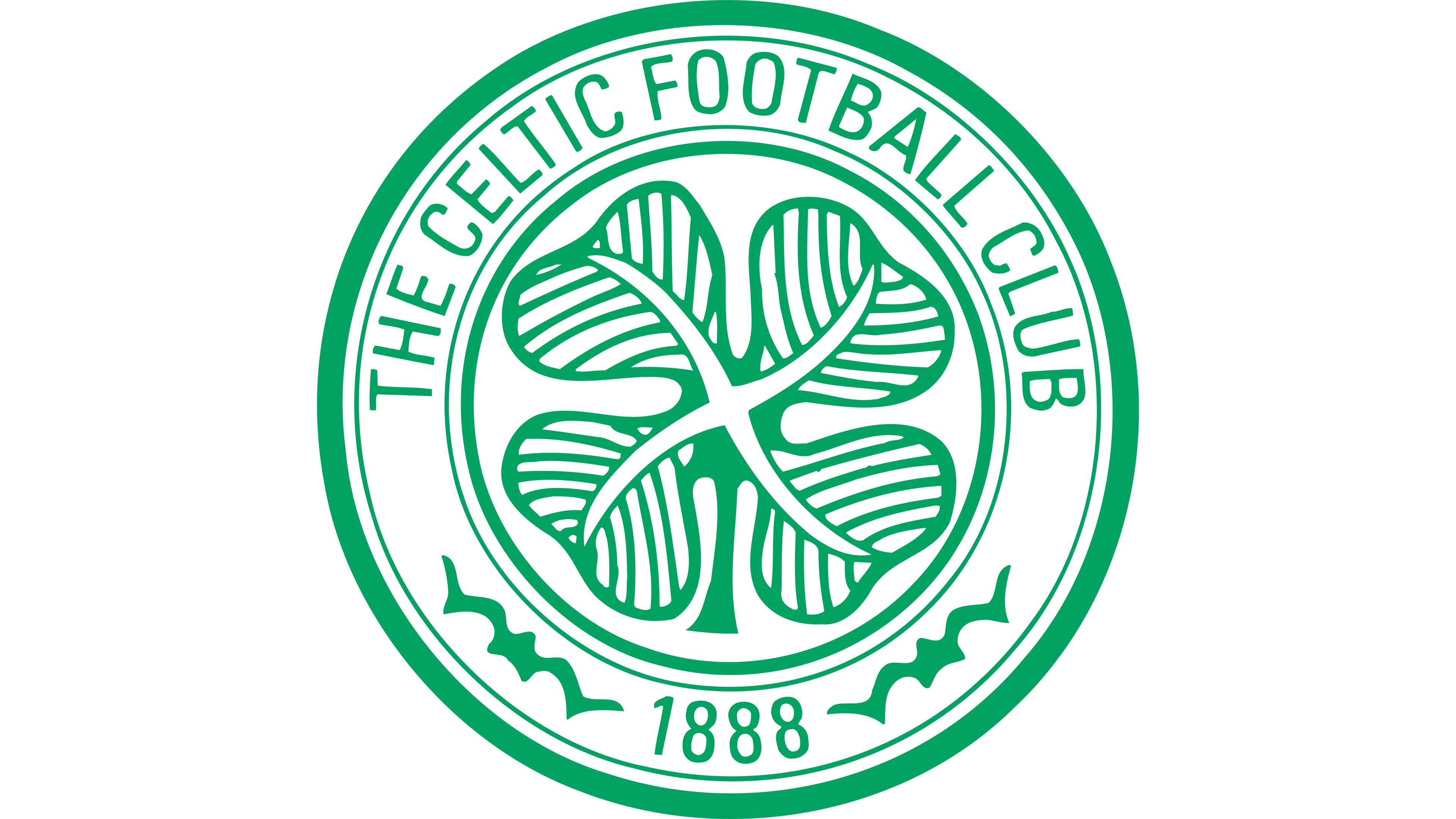
The emblem, a circular design featuring a quartet of clover leaves and inscribed with “THE CELTIC FOOTBALL & ATHLETIC COY. LTD.”, was conceptualized in the 1930s. It wasn’t until 1977, however, that this logo began adorning the team’s T-shirts. This transition to the team’s apparel coincided with a modification of the emblem’s design. The textual content was abbreviated to “THE CELTIC FOOTBALL CLUB”, and the color scheme underwent a transformation.
This resulted in the introduction of black outlines to delineate the emblem’s elements, a lush green hue enveloping the clover and its encompassing ring, with all textual content, including the year of the team’s inception, being rendered in a stark white. This redesign not only refreshed the emblem’s appearance, making it more vibrant and visually striking, but also enhanced its symbolic value, further solidifying the club’s rich history and cultural heritage. The choice of colors and the incorporation of the founding year served as a nod to the club’s past, present, and future, encapsulating the essence of Celtic Football Club in a single, powerful visual metaphor.
1987 – 1989
To commemorate the club’s centennial anniversary, the emblem underwent a significant transformation, reinstating the Celtic cross to its central position, a nod to the club’s historical roots and cultural identity. The four-leaf clover, a symbol synonymous with the club, was tactically repositioned to the bottom of the emblem, mirroring the geographical location of the club’s inception. Flanking the Celtic cross were the years “1888” on the left, marking the club’s founding year, and “1988” on the right, signifying the celebratory year.
In a conscious design choice, the color palette was carefully curated, with all the inscriptions, outlines, and the cross itself rendered in a vibrant green, set against a pristine white backdrop. This color selection not only harmonized with the club’s traditional hues but also encapsulated the essence of Celtic Football Club, blending historical significance with modern aesthetics. The emblem, thus, served as a visual testament to the club’s storied past, its triumphant present, and its promising future.
1995 – Today
During the initial months of 1995, the course of the sports club was significantly altered when Scottish businessman Fergus McCann acquired it. His first order of business was to replace the club’s traditional name, “The Celtic Football & Athletic Coy. Ltd.,” with the more emblematic “The Celtic Football Club.” Not stopping there, McCann chose to reintroduce the historic logo, albeit with some modern refinements. The updated emblem comprises a circular design, neatly partitioned into two distinct sections. The inner circle is a clean, white space that cradles the iconic four-leaf clover, while the outer ring is painted a rich green and adorned with inscriptions. This modernized version not only pays homage to the club’s storied past but also symbolizes its evolution and future aspirations.


