Domino’s Pizza Logo
Domino’s Pizza is a Michigan-headquartered chain of fast-food restaurants, serving a pizza-centered menu. The company appeared in 1960 and has since expanded to manage over 15k stores in 80+ countries. It sells more than 3 million freshly baked pizzas daily.
Meaning and history
Initially, the pizzeria was named “Dominick’s” after Tom Monaghan’s brother Dominick. However, they were forced to change the name due to a legal dispute with another restaurant chain named Dominick’s. That’s when Tom Monaghan decided to rename it to “Domino’s” to pay homage to the game of dominos and reflect the company’s focus on delivering fresh and high-quality pizzas quickly to customers.
Since its inception, Domino’s Pizza has grown to become a global pizza powerhouse, with over 15,000 stores operating in more than 85 countries worldwide. The company has achieved tremendous success over the years, largely due to its innovative business strategies, such as offering home delivery, online ordering, and tracking technology.
Domino’s has been recognized as one of the world’s most successful pizza chains, consistently ranking at the top in customer satisfaction and sales revenue. With its commitment to providing customers with delicious, freshly made pizza, the brand has become synonymous with quality and reliability in the fast-food industry.
What is Domino’s Pizza?
Founded in 1960, Domino’s Pizza is a fast-food eatery franchise with its headquarters based in Michigan. The menu is centered around pizza, and the label has rapidly expanded, managing over 15,000 stores worldwide. Domino’s Pizza is a popular choice for pizza lovers globally with an impressive daily sales record of over 3 million freshly baked pizzas.
1960 – 1965
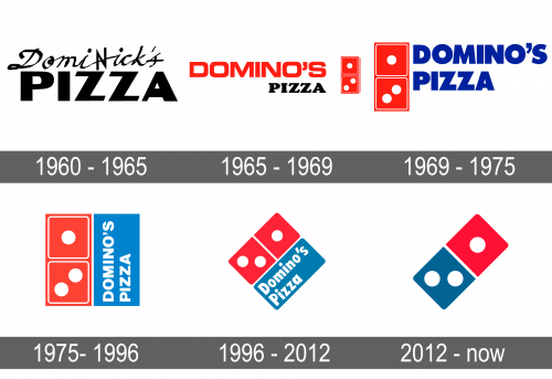
The initial banner of Domino’s Pizza had a simple yet distinctive design that set the tone for the company’s brand identity. The logo was composed of two parts: the cursive “DomiNick’s” situated upper the word “Pizza” in thick title case characters, written in a stylish script with no serifs. Both captions were painted in black, standing out against a white backdrop, and were framed by a thick black border with distinguished corners.
1965 – 1969
In 1969, Domino’s Pizza introduced a redesign that marked the addition of a new shade to its branding, light blue. It originally showed up as the hue of the words, performed in a fat typeface without serifs and followed by a red-white emblem showing two domino bones. This change departed from the previous logo design, which had a red nameplate and black “Pizza” inscription alongside the graphics. The introduction of the bright blue was a significant modification in the company’s identity and helped differentiate it from its competitors.
1969 – 1975
The year 1975 saw a revamp of Domino’s Pizza’s graphics. The firm introduced a softer hue of blue, giving the overall design a crisper appearance. The updated logo consisted of a quadrangle, with one half substituted by a red-and-white domino shape, and the other portion in blue. It was followed by the white vertical lettering located on it. The font of the caption was extended a bit, with neat and straight bars and corners. The new design brought a sense of sophistication to the brand, while still maintaining its playful and fun identity.
1975 – 1996
1996 – 2012
In 1996, the Domino’s emblem underwent another redesign, with the domino being tilted and made into a rhombic shape. The edges of all the components became smoothed out, and the letterforms were simplified. Although the coloring stayed untouched, the red used in that variant got more unlit and vivid than before.
2012 – today
The 2012 reinvention of the Domino’s Pizza symbol showed a further layout where the pale blue nameplate “Domino’s” was seated on the right of the picture. It was diagonally divided into red-blue pieces with two points on the lower and a third on the upper portion. The typeface of the name was modern and slightly italicized sans-serif with a bolder appearance than the earlier versions. The colors of the imagery and wordmark remained similar to the previous design, but the layout became more dynamic and visually appealing.
Color
The iconic color scheme of Domino’s Pizza has remained largely consistent since the company’s inception in 1960, albeit with slight variations in hues over time. The dynamic mix of red, white, and blue is inherently eye-catching, but the present iteration of the insignia opts for more muted shades.
Font
The brand’s wordmark shows a sans-serif that features a bold weight and clean, simple lines. The letters are elongated, giving them a modern and streamlined appearance. The script conveys a sense of confidence and trustworthiness, which reflects the label’s commitment to providing high-quality pizza and excellent client service. The letters are also slightly slanted to the right, which adds a dynamic and energetic feel to the overall composition.


