Continental Logo
Continental AG, a prominent player in the global automotive industry, primarily focuses on manufacturing tires, automotive parts, and technology. Renowned for its cutting-edge automotive solutions, the company caters to a diverse market, including passenger vehicles, commercial trucks, and two-wheelers. Continental’s market reach extends globally, with a significant presence in Europe, North America, and Asia. As a publicly traded entity, it’s owned by various shareholders, with no single dominant owner. The company’s commitment to innovation and sustainability shapes its products and services, maintaining its status as a key industry influencer.
Meaning and history
Founded in 1871 in Hanover, Germany, Continental AG initially emerged as a rubber specialist. Its journey through the decades is a tapestry of innovation and strategic evolution. Post-World War II, the company broadened its scope from tire production to a wider range of automotive components, marking the beginning of its diversification.
The 1970s were a transformative era for Continental. It embarked on a series of acquisitions, absorbing several prominent European tire brands, which cemented its position in the global market. The 1980s presented challenges, leading to a strategic overhaul focusing on high-performance tires and financial restructuring.
The 1990s heralded a new direction, with Continental venturing into automotive electronics and brake systems, signaling its expansion beyond traditional tire manufacturing. This era also saw its footprint extend across the Atlantic to North America and into the burgeoning markets of Asia.
The early 21st century was a period of significant acquisitions, notably in chassis and brake technology, diversifying Continental’s product portfolio and strengthening its position in the automotive parts sector. Despite the 2008 global financial crisis, Continental remained steadfast in innovation, delving into areas like driver assistance and connected mobility.
Ownership dynamics evolved over the years, particularly with Schaeffler AG’s significant investment in 2008. This didn’t lead to a monopolized ownership but indicated a shift in the company’s strategic trajectory.
In recent years, Continental has pivoted towards digitalization and sustainable mobility solutions. This shift is in response to the global trend towards electric and autonomous vehicles, illustrating Continental’s agility and foresight in navigating the automotive industry’s future. This ongoing evolution underscores Continental’s resilience and its ability to stay at the forefront of a rapidly changing industry.
What is Continental?
Continental AG stands as a beacon in the automotive industry, renowned for its innovative prowess in tire manufacturing and automotive technology. Originating from Germany in 1871, it has sculpted a global footprint, offering a diverse array of products ranging from high-performance tires to cutting-edge automotive parts and connected mobility solutions. This company symbolizes a blend of tradition and futuristic vision, continuously adapting to the evolving dynamics of the automotive world.
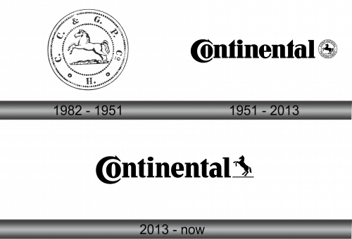
1982 – 1951
This emblem features a proud horse in mid-gallop, encapsulated within a double-ringed circle. The horse, poised and dynamic, suggests movement and strength. Surrounding the central figure are ornamental chains, punctuated by circular motifs, adding a classical elegance to the design. Above the horse, the initials “C & G. P.” are set, and below, the letter “H” anchors the composition, all contributing to a harmonious balance of elements that evoke a sense of heritage and timelessness. This logo conveys both legacy and the spirit of progress.
1951 – 2013
This logo showcases the word “Continental” in a bold, expansive font that dominates the space with confidence. To the right, a smaller emblem mirrors the original horse motif, now encased within a succinct circular border, marked by the brand’s name reversed out of the black. This streamlined design contrasts with the previous version’s more ornate styling, reflecting a modernized approach that focuses on clarity and impact. The horse, still a symbol of the company’s dynamism, is now a refined silhouette, signifying Continental’s evolution towards a more contemporary and globally recognized identity.
2013 – Today
The logo displays “Continental” in a bold, serif typeface, emphasizing solidity and reliability. The letter “C” curves back on itself, creating a visual loop, hinting at continuity and the cyclical nature of innovation. On the right, a stylized horse stands upright, poised on a baseline that underscores the wordmark. This horse is more abstract and geometric than previous iterations, reflecting a modernized vision. The reduction of the circular emblem signifies a shift towards minimalism and a focus on the core elements of the brand’s identity. This design is sleek, contemporary, and embodies the essence of a forward-thinking company rooted in tradition yet driving towards the future.


