Dave & Buster’s Logo
At Dave and Busters, visitors can find entertainment appropriate for kids’ birthday parties as well as a night out with friends. There are billiards, arcade games, air hockey tabletop, ping pong, and numerous other games to enjoy. Many also come to the establishment to watch sports while savoring tasty dishes. The food venue also has plenty of mouthwatering choices to satisfy all the different tastes. The primary target audience is adults aged 21 to 39, although Main Event stores focus on families. Even though the establishment is kid-friendly, individuals under 18 (or 21 in some locations) should be accompanied by an adult.
Meaning and history
In the late 1970s, Buster launched a restaurant noted for its delicious food and exceptional service. Down the street, Dave created an amazing entertainment and gaming venue. It soon became obvious that people enjoyed both and combining the two might prove to be a good idea. They launched the first Dave & Buster’s in December 1982. Dave won a coin toss, so his name was first in the establishment’s name. Each location boasts more cutting-edge games than ever before, delectable cuisine dishes, and the most creative drinks around.
What is Dave and Busters?
Daves & Buster’s Entertainment Inc. owns and runs adult and family-friendly event facilities throughout North America. The company owns and runs entertainment centers that serve a diverse menu of food and beverages as well as a variety of entertainment attractions such as slot machines.
1982 – 2014
From the very beginning, the partners chose to have a round logo. It was a symbol of getting together and enjoying time playing games and eating scrumptious meals along with tasty drinks. The vibrant orange color in the center with large initials in the front instantly attracted the attention and hinted at the cheerful and energizing atmosphere. The blue border created a balanced image and held the full name. The latter was printed in white using a stylish font with bracketed serifs. This added a classic touch to the overall look and made the logo appealing to a wider audience.
2013 – 2020
This version is surely more modern and full of the fun entertainment spirit present at the establishment. It was achieved by adding a gradient to the orange center and making it significantly larger. The logo now featured only the full name. The designers used all caps and added shadows behind the letters to create a feeling of volume. To add even more interest, they made it appear that the inscription was written on a sphere. The logo still had a blue border but also acquired a nice gradient to give the overall image more dynamics.
2020 – Today
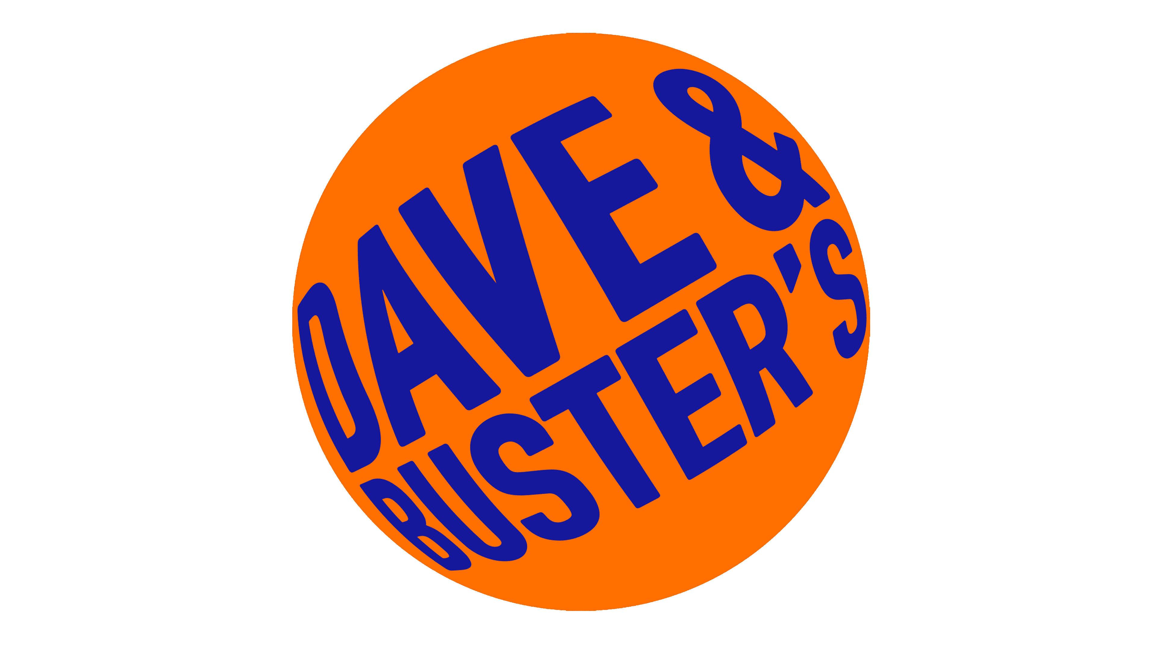
The most major update was the removal of the blue border. The blue was now used for the name. The orange color got more daring, making the company look bold and loud. It is very much in line with the mood at the establishment. The sphere effect was enhanced with the movement of the inscription further back around the sphere. The shadow and color gradient were removed to make the logo look more minimalistic and modern. The designers aimed to remove all the limits and reflect numerous entertainment possibilities at Dave and Buster’s.
Font and Color
The orange and blue have always been the main colors of the Dave and Buster’s. throughout the years, they simply changed the shade of these colors. The latest logo, for instance, features a tiger shade of orange that is full of energy, excitement, and happiness. The blue color is associated with freedom and slightly calms down and balances out the daring orange.
Until 2013, the company used a logo with a stylish font that featured thin strokes and bracketed serifs. Then, it moved to a bold, sans-serif font that was a perfect match for the bright color palette. The letters were adjusted to create a spherical effect, which makes it a custom font. The clean, straight lines gave the logo a modern appearance.
