Didi Logo
Didi is a Chinese conglomerate, founded in 2012 and located in Beijing. This is one of the largest companies related with vehicles. They provide a list of services including food and package delivery, private car sharing, public bicycle sharing scheme, taxi car hailing. This is one of the largest companies, providing its services in many countries of the world and having more than half a billion people as customers and millions of drivers.
Meaning and history
![]()
The Didi name has quite a specific meaning and reflects the company operations. ‘Didi’ from Mandarin Chinese literally means ‘Beep-beep’. Coupled with the initial logotype of a smiling taxi car, the corporate name reflected a bright and safe mood, which the company showed to its customers in advertisements and social media.+
What is Didi?
Didi is a company locating in Chinese city of Beijing. The company itemizes in transportation services and all of their related directions: car hiring and sharing, helping you to arrive in your place with a taxi, distribution of the packages and food across the cities, as well as electrical and mechanical bicycles and scooters rental. This is one of the largest and successful Chinese-originated companies which specialize in this sphere, with their services and branches spread worldwide.
2012 – 2013
![]()
The very first logotype developed by the corporate design team of Didi depicted an icon with a yellow and blue car with a taxi plate on its roof. In place of its headlamps, we can see two eyes with wide pupils. Below the eyes, they’ve drawn a long smile. Due to the game of shadow and highlights, the car itself looked volumetric, and its shades were deeper and darker. The background for the car was a gradient orange square.
2013 – 2015
![]()
The next icon featured a taxi car too, but in a different view. There weren’t any shadow and catchlights, so the car image was flat. The car itself obtained a way brighter coloring, though it was still a combination of blue and yellow. The eyes were replaced with headlamps. Also, the smile became wide open. The background changed its gradient to yellow and orange.
2015 – 2018
![]()
The 2015 logo brought us a large redesign in the corporate identity. Now the company mark featured the ‘D’ character turned aside. Its upper edge was displaced from the symbol. To the right side from the symbol, we can see the name of the brand, featured in a tilted inscription. Below it, they wrote a company slogan – ‘More than a journey’.
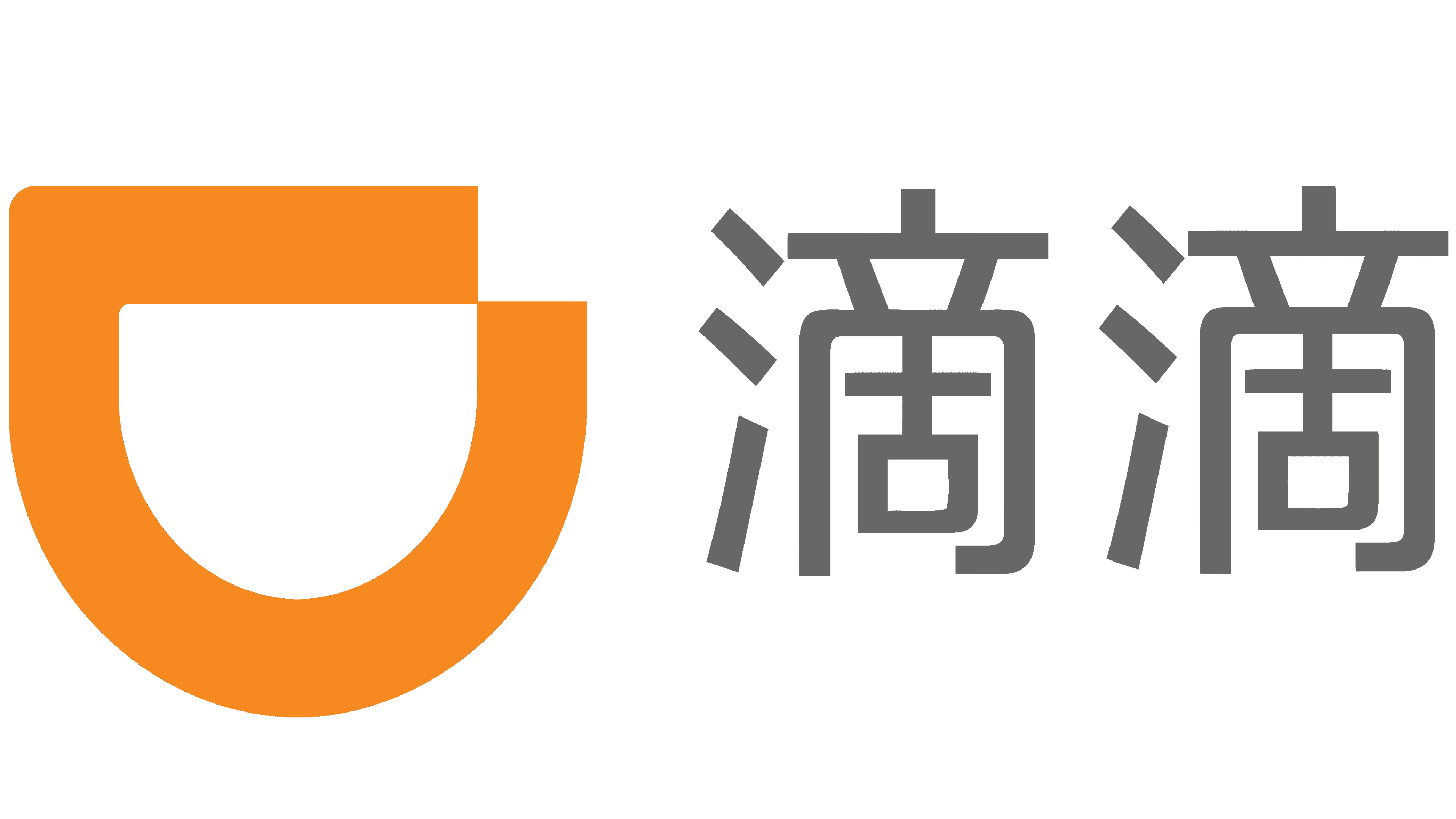
2018 – today
![]()
Then, they made the ‘D’ symbol paler, and removed the company slogan. The name tilting also disappeared.
Font
The font used to write the name in two of the last logotypes has a slim sans-serif style with rounded edges of the letters and prominent gap between two halves of the nameplate. In the 2018 version of the name, the font was slightly renovated: the letters became more angular, and their rounded corners were gone. Also, below the name in the 2015 logotype, they wrote a paler wording with the company slogan. It received a sans-serif script with soft and straight lines.
Color

The color scheme of the brand consists of two shades. The ‘D’ symbol uses an orange shade. Throughout two logotypes, the characters style changed: if in 2015 it was bright orange, so in 2018 it became pale. The name, though, didn’t have any large modifications enveloping the letters: the inscription was dark gray all the time.


