Dove Logo
Dove is a brand that produces cosmetics designed for skin and hair care. Initially, the products were considered a luxury cosmetics brand. Nowadays, its products belong to the average price category. The brand promotes natural beauty by inviting ordinary women instead of professional models to take part in the shooting of advertising. All cosmetics of this brand are created on the basis of a formula that was developed in the last century but has not lost its relevance.
Meaning and History
![]()
It was created in 1956 by the British-Dutch corporation Unilever. Originally, Dove soap was developed for cleansing skin after burns. It acted so effectively and gently that it soon moved from a medical product to a cosmetic one. Since 1995, the brand has expanded its product range and began to produce shower gels and other cosmetics. The symbol and name of the company, a dove, suggests an analogy with the symbol of peace. This confirms the theory about the origin of the famous soap, originally used for soldiers injured during the war. In fact, the owners of Unilever bought the soap factory De Duif (dove) in the Netherlands, after which the company was named.
What is Dove?
Dove is a leading brand in the self-care industry. The Dove brand has become a true ambassador of self-love. This can be easily seen in advertising campaigns, in which there is a clear call to accept your body as it is.
1955 – 1969
![]()
The name of the company was written in white against a blue background. The latter had a wavy top that merged with a golden background and a white dove in the upper right corner. The dove was flying to the left. The company used a custom cursive font with smooth, curvy lines for its name.
1969 – 2004
![]()
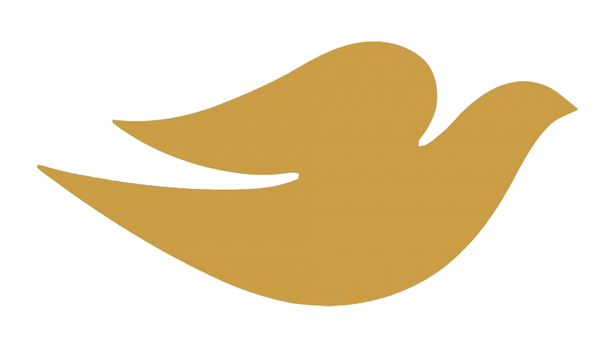
The company flipped the colors in its logo, so the name was now blue and the dove gold. The whole emblem was set on a white background. The font has undergone minimal adjustments, which included a thicker first letter. The dove now has a different wing shape and is facing right. It was still positioned in the upper right corner.
2004 – 2011
![]()
The dove was moved under the name and had a shiny look to it with a white highlight. Its shape was smoother and less curved. The blue color looked darker and deeper, while the lines looked thinner and more elegant.
2012
![]()
In 2012, this emblem was utilized across diverse nations worldwide. It found its place in various global markets, representing the brand in numerous international arenas, and allowing the logo to be recognized in diverse cultures and economies. This symbol, embodying the corporate identity, was displayed across multiple platforms, spanning both digital and physical spaces in different countries, illustrating a universal presence and connecting a wide array of global consumers under its brand umbrella. It silently narrated the company’s story in distinct languages, becoming a common visual denominator in varied geographical landscapes. Thus, it played a pivotal role in intertwining the brand’s presence amidst varied cultural backdrops.
2011 – Today
![]()
The brand name looked even more refined, with the letter “D” having fewer curves. The other letters look more delicate thanks to more contrast between thinner and thicker parts of the letter. The bird has barely changed its shape. The golden color has a different shade.
Font and Color
The brand uses a custom font designed by Ian Brignell. Throughout the years, it has made the lines thicker/thinner and slightly modified them, but otherwise, it stays almost exactly the same as it looked almost 70 years ago. When it comes to the color palette, the brand also stayed true to its origins. The original color palette was blue, white, and golden. It was not changed throughout the years, only the shades of these colors have been slightly modified.


