East Carolina Pirates Logo
East Carolina Pirates, currently engaged in collegiate athletics, primarily competes in the American Athletic Conference. With a diverse range of sports teams, they focus on football, basketball, and baseball among others, showcasing talent across the U.S. The university itself, a public institution, owns the teams, emphasizing student-athlete development and sports excellence. Their market revolves around collegiate sports, attracting fans, students, and alumni nationwide.
Meaning and history
The East Carolina Pirates hail from Greenville, North Carolina. Founded in 1907, they’ve grown into a formidable sports entity. Initially, they had modest beginnings. Over time, their athletic programs expanded significantly. Football became a highlight, with their first game in 1932. They joined the NCAA in the mid-20th century. The Pirates have celebrated numerous conference championships since then. Their rivalry with NC State is particularly fierce, drawing large crowds. The basketball team also made headlines, especially with their CIT championship in 2013. Baseball has seen consistent success, making several NCAA tournament appearances. The Pirates’ colors, purple and gold, symbolize pride and tradition. Alumni include NFL stars and MLB players. They’re part of the American Athletic Conference now, competing at a high level. Their mascot, PeeDee the Pirate, boosts team spirit. The university’s commitment to athletics ensures the Pirates’ legacy continues to grow.
What is East Carolina Pirates?
The East Carolina Pirates represent East Carolina University in intercollegiate athletics, competing primarily in the American Athletic Conference. Known for their spirited games and strong sense of community, the Pirates boast a diverse array of sports, including football, basketball, and baseball, among others.
1971 – 1980
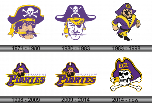
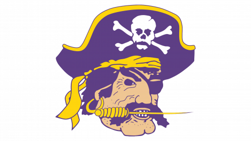
The logo features a stern pirate with a tricorn hat, the image exuding a mix of intimidation and confidence. A saber clenches between his teeth, hinting at readiness for battle. The hat is adorned with a skull and crossbones, emphasizing a fierce pirate tradition. Employing the university’s colors, purple and gold, the logo communicates a bold, adventurous spirit associated with the East Carolina Pirates. This emblem symbolizes both the athletic prowess and the historical allure of piracy.
1980 – 1983
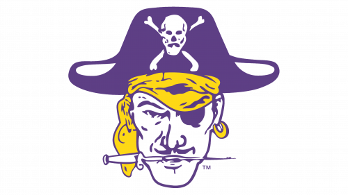
This iteration of the logo presents a more detailed pirate visage, with a visibly weathered look. The skull atop the hat includes crossed bones, amplifying the pirate motif. The color scheme remains true to the iconic purple and gold, but the pirate’s features are more pronounced, with deeper lines and a rugged beard, suggesting a storied sea-faring life. The emblem retains its boldness but adds a layer of grit and character.
1983 – 1998
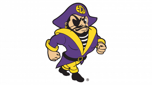
Transitioning from a headshot to a full-bodied figure, the logo now shows a dynamic pirate in stride. Clad in a striped shirt and a purple coat with an “ECU” insignia on the hat, he exudes determination and energy. His muscular arms are bent, fists clenched, ready for action, while his eye-patch and earring maintain the classic pirate image. The change to an action pose reflects a more animated and engaging team spirit, suggesting movement and vitality. The overall feel is less menacing, more approachable, yet still formidable.
1998 – 2009
The logo evolves into a more stylized and modern design, with a clean, bold look. The pirate, now just a head with a determined gaze, sports a flowing purple bandana. The facial features are less menacing and more heroic. The text “East Carolina University Pirates” encircles the pirate, adding a pronounced academic identity to the athletic emblem. The design shifts to a sleeker aesthetic, using sharp angles and bright contrast, emphasizing forward momentum and strength. The graphic simplification reflects a contemporary rebranding, aimed at broader appeal and stronger recognition.
2009 – 2014
The logo appears to be identical to the previous one submitted, showing no discernible changes in its design. It retains the stylized pirate head, the bold “East Carolina University Pirates” text, and the striking purple and gold color scheme. If there are subtle modifications, they are not evident in this image. The branding remains consistent, continuing to promote a strong and unified image for the athletic teams of East Carolina University.
2014 – Today
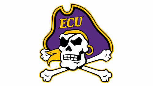
The latest logo presents a striking departure from the previous humanoid pirate motif, opting for a bold skull and crossbones. The iconic purple and gold colors remain, with “ECU” prominently featured within the pirate’s hat, streamlining the university’s identity with its athletic symbolism. The graphic is clean, with a simplified yet impactful design that emphasizes the skull, traditionally associated with piracy. This evolution marks a shift towards a more emblematic and universally recognizable pirate symbol, suited for diverse applications and merchandise.
