Everton Logo
Everton FC, a prominent football club founded in 1878 in Liverpool, boasts a rich history and is one of the founding members of the Football League in 1888. The team, nicknamed “The Toffees,” plays its home games at Goodison Park. Everton has secured nine English League Championships and has a vibrant fan base. Known for its robust playing style and significant contributions to English football, the club has produced many football legends and continues to be a formidable force in the sport.
Meaning and history
Everton has won the English League Championship nine times and has marked its presence with five FA Cups and one European Cup Winners’ Cup.
Playing home games at Goodison Park since 1892, the club has been home to many football legends like Dixie Dean and Wayne Rooney. Everton is renowned for its strong community ethos and extensive youth academy, fostering local talents like the aforementioned Rooney.
Everton’s enduring rivalry with Liverpool FC, their Merseyside neighbors, is the stuff of legends, with their matches termed as the ‘Merseyside Derby,’ creating a thrilling environment in English football. The team’s deep-rooted history, combined with its commitment to community and youth development, makes Everton a symbol of tradition and innovation in football. The club’s rich legacy and steadfast spirit make it a perennial contender in English football, captivating fans worldwide.
1920 – 1931
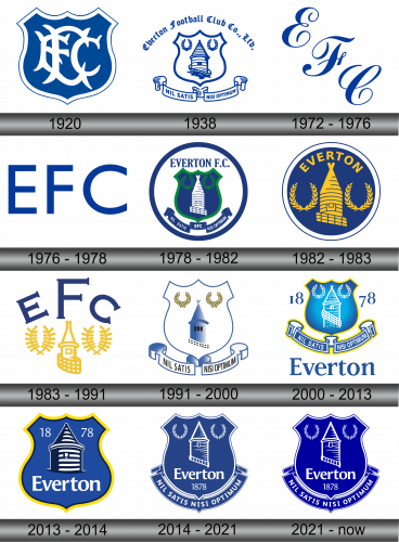
The inaugural emblem emerged in 1920, featuring a blue shield encased in a dual outline. At its heart, a white intertwined initialism “EFC” sits prominently, representing the concise form of the team’s full designation – Everton Football Club. This emblem symbolized the club’s identity, showcasing a distinct blend of tradition and simplicity. The blue hue and the white acronym stand as significant elements, emphasizing the club’s historical essence and enduring legacy in the football realm. The monogram intertwined within the shield not only manifests the club’s name but also its foundational ethos and enduring spirit in the competitive world of football.
1938
Concluding the 1938 season, Theo Kelly, the club secretary, crafted a distinct emblem intended to adorn the neckties of Everton’s personnel. The conception of this design spanned a four-month period. It predominantly features the circular Prince Rupert’s Tower, a historic structure that formerly detained lawbreakers and the inebriated. Adjacent to this are dual laurel wreaths, emblematic of triumph.
These principal components are ensconced within a protective shield. Inscribed in a Gothic font is the entity’s denomination: “Everton Football Club Co., Ltd.” Subsisting below is the Latin maxim “Nil Satis Nisi Optimum,” translating to “Only the best is good enough,” which conveys the club’s perpetual pursuit of excellence and commitment to superior performance, emphasizing its foundational values and aspirations within the competitive sphere of football. The incorporation of these various elements serves to enrich the emblem’s symbolic significance, linking it intimately with the club’s history and its enduring ethos.
1972 – 1976
In 1972, the squad introduced a streamlined emblem for the first time, featuring the acronym EFC set against a pristine white backdrop. The characters are crafted in a vibrant shade of blue and exhibit a fluid, script handwriting style. This iteration of the logo sought to emphasize simplicity and readability while maintaining a connection to the team’s identity through the use of characteristic colors and recognizable initials. The minimalist approach was reflective of design trends of the time, focusing on essential elements and eliminating any unnecessary embellishments or additional decorative components, thus creating a clean and modern visual representation for the team.
1976 – 1978
In 1976, a refreshed rendition of the three-letter emblem emerged. The script is crafted utilizing a blocky sans-serif typeface. This novel adaptation signifies a shift in design perspective, leaning towards geometrical precision and typographical clarity. The sans-serif font showcases modernism, offering a crisp, unadorned look, focusing on straightforwardness and readability. The choice of a square, structured font can be interpreted as a reflection of stability and solidity, essential qualities for a sports team, symbolizing both unity and strength. It marks a continued evolution in the visual identity of the team, emphasizing contemporary aesthetics while maintaining the essence of its original symbolism.
1978 – 1982
Design experts reinstated the 1938 emblem but modified the artistic rendition. Situated at the core of the circle is a blue shield, hosting a tower and a pair of laurel wreaths. The club’s designation, “Everton F. C.,” is inscribed above it, while beneath it, the abbreviation EFC is coupled with the Latin maxim “Nil Satis Nisi Optimum.” Green is employed for the wreaths and the shield’s contour.
This renewed design subtly intertwines historical richness with modern elegance, creating a dynamic yet respectful representation of the club’s heritage. The use of green accentuates the details, infusing vitality and contrast into the overall aesthetic. The positioning of elements ensures a harmonious balance, fostering a sense of unity and integrity. The integration of the Latin slogan adds a classical touch, embodying the club’s enduring pursuit of excellence, a subtle reminder of the values and standards the team strives to uphold. The refined artistic approach makes the emblem not just a symbol but a powerful visual narrative of the club’s journey and aspirations.
1982 – 1983
In 1982, a rendition of the emblem was introduced, omitting the shield and the motto. The fundamental elements persisted: Prince Rupert’s Tower, the wreaths, and the “Everton” inscription. These components are illustrated in yellow and are prominent against the backdrop of a blue circle, accentuated with a white border.
This adaptation conveys a streamlined yet vibrant aesthetic, emphasizing essential elements to evoke the club’s spirit and heritage. The vivid yellow interplays with the tranquil blue, adding luminosity and distinction to the emblem’s visual appeal. The choice to maintain the central figures while discarding the shield and motto illustrates a focus on core values and traditions of Everton, offering a concise yet powerful representation. The blue circle encapsulated in white encapsulates the essence of the club while ensuring clarity and recognizability. The nuanced approach to color and design in this version serves as a beacon of the club’s identity and ongoing legacy in the football world.
1983 – 1991
Designers streamlined the preceding emblem, distilling it to depictions of the tower and wreaths. The circle has been omitted; the letters EFC now dominate half of the available space.
This redesign exemplifies a minimalist approach, focusing on elemental components to represent the club’s essence. The prominence of the EFC letters underlines the club’s identity, allowing it to resonate succinctly with observers. The strategic use of space highlights the intertwining of the club’s initials with its foundational symbols, presenting a harmonious integration of tradition and identity. The absence of the enclosing circle offers a more open and accessible feel, portraying the club’s openness and its anchoring in its foundational symbols. This modern reinterpretation encapsulates the essence and enduring spirit of the club in a refined and uncluttered manner.
1991 – 2000
In the 1990s, designers revived the initial emblem, initially introduced in 1938, with subtle modifications in its artistic rendition. The club’s name was omitted from this adaptation.
This reimagined version carried nuanced alterations in the depiction style, reflecting a contemporary aesthetic while maintaining its inherent elements. The ribbon, originally presented in white, underwent a transformation to adopt a blue hue, aligning more cohesively with the overall color scheme and emphasizing the club’s traditional colors. These alterations exemplify a blend of historical reverence and modern design principles, offering a refreshed visual identity while preserving the emblem’s foundational elements. The exclusion of the club’s name manifests a focus on visual essence, leaning on the emblem’s iconic components to convey identity and legacy. This adaptation highlights a balanced interplay between tradition and modernity, encapsulating the enduring spirit and evolving face of the club in its visual representation.
2000 – 2013
In 2000, creative experts revamped the color palette of the emblem, infusing it with yellow accents and a multifaceted blue gradient. The shield intricately flaunts the numerals “18” and “78” on its flanks, illuminating the inception year of the esteemed team. Positioned at the emblem’s nadir is the inscription “Everton.”
This subtle yet impactful transformation not only reinforced the emblem’s visual appeal but also deepened its connection to the club’s rich heritage. The introduced yellow outlines and refined gradient amplified the visual depth, offering a dynamic and modern aesthetic, while the prominently displayed founding year serves as a constant reminder of the club’s longstanding legacy and enduring values. The strategically placed name “Everton” augments the overall composition, providing a clear identification and adding a final touch to the redesigned and enriched emblem, resonating with both history and modernity.
2013 – 2014
In 2013, the logo underwent a significant overhaul. A rendition of the emblem surfaced, devoid of both the motto and the laurel wreaths, much to the displeasure of the fans. An online appeal aimed at retracting the alterations garnered 22,000 signatures. Consequently, this revamped symbol had a fleeting existence and was retired after just one season.
This episode underscored the profound connection and sense of ownership the fans feel towards the emblem, symbolizing their passion and commitment to the club. The swift, unified response from the fanbase ultimately underscored the pivotal role of tradition and symbols in maintaining the identity and continuity of the club, highlighting the delicate balance between modernization and heritage. The collective voice of the supporters ensured the preservation of iconic elements, reaffirming the emblem’s role as a visual anchor to the club’s storied past.
2014 – 2021
On the 3rd of October, 2014, Everton unveiled three potential logos for selection. A substantial 80% of the club’s registered members participated in the election process. The selected version was one enriched with iconic wreaths, a tower, a shield, a motto, and the marking “Everton 1878”. Blue overwhelmingly prevailed in the design’s color scheme.
This democratic approach in selecting the logo illustrates the inclusive ethos of the club, acknowledging the significance of fan engagement and their attachment to the emblem’s historical elements. This design, laden with symbols reflecting the club’s rich heritage, strengthened the bond between Everton and its global fan base, fostering a sense of unity and shared pride in the club’s illustrious history. The predominant use of blue not only maintains the visual identity of the club but also resonates with the profound emotional connections the supporters associate with the color.
2021 – Today
The football club’s refreshed logo flaunted a more vibrant shade of blue, injecting vitality and a modern feel into the well-known emblem. While maintaining all the original elements intact, the adjustments endowed the symbol with an entirely rejuvenated appearance. The enhanced vibrancy resonates with dynamic energy, reflecting a forward-moving spirit while paying homage to the club’s storied past. This subtle transformation is a harmonious blend of tradition and contemporary aesthetics, symbolizing a progressive vision without losing the essence of the club’s rich heritage. The revitalized logo stands as a testament to the club’s enduring legacy and its continuous evolution in the football world.
