Howard Bison Logo
The Howard Bison represents Howard University’s mascot. The symbol was conceived to embody the school’s spirit and resilience. The creator selected the bison as it exemplifies strength and native endurance, qualities the university fosters. The mascot first appeared associated with Howard University, located in Washington D.C. It was introduced to rally and unify the student body during athletic competitions and university events.
Meaning and history
The Howard Bison became the official mascot of Howard University in 1926. This selection honors the American bison, an animal symbolic of the Great Plains and known for its toughness and indomitable spirit. Over the decades, the bison emblem has evolved but continues to stand as a beacon of pride and determination for the Howard community. Key updates to its representation occurred in the 1980s and again in the early 2000s, each time modernizing its look to maintain relevance and inspiration among students and alumni.
What is Howard Bison?
The Howard Bison is the official mascot of Howard University, symbolizing strength and endurance. Chosen in 1926, the bison reflects qualities admired by the university community. It is prominently featured in sports and other significant school events.
1948 – 1974
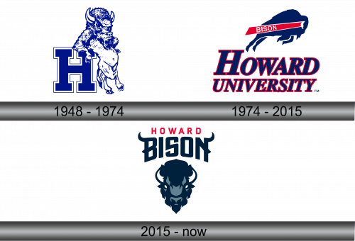
The logo features a bison in profile, with a fierce expression, encapsulating vigor. Behind it stands a bold letter ‘H’, solid, denoting Howard University. The color scheme is a monochromatic blue, projecting simplicity and elegance. The bison’s muscular form suggests strength and the forward movement symbolizes progress. Together, the elements celebrate the institution’s ethos and legacy.
1974 – 2015
This updated logo trades detail for boldness, featuring a stylized bison silhouette in blue. The word “BISON” rides in a red streak across the bison’s back, adding dynamism. “HOWARD UNIVERSITY” arches below in red and blue, asserting the school’s identity with a more pronounced font. The overall design leans into modern simplicity, capturing the university’s forward momentum while retaining the emblematic bison, which stands as a timeless symbol of the university’s spirit.
2015 – Today
The latest rendition presents a fierce bison head-on, creating an imposing presence. “HOWARD BISON” sits above, the letters in deep navy, save for “HOWARD” in assertive red. The text design is sharper, more commanding. Darker tones dominate, hinting at sophistication. This design pivot suggests a fresh, modern identity while maintaining the historic link to the university’s heritage. The graphic is simpler, yet the bison’s stare is more intense, capturing a look that’s both contemporary and timeless.
