Huddersfield Town Logo
Huddersfield Town is a professional football club in England. The club was established in the town of Huddersfield by local football enthusiasts. They created it to provide a structured outlet for football competition. Its formation aimed at promoting local talent and engaging the community through sports.
Meaning and History
Huddersfield Town was officially founded in 1908. Initially, it provided a platform for local football players to showcase their skills. The club quickly grew in prominence, joining the English Football League in 1910. A notable achievement came in the 1920s when Huddersfield Town won the First Division title three times consecutively from 1924 to 1926. This early success helped establish its reputation as a formidable force in English football. The club’s history reflects a journey marked by periods of both remarkable triumphs and challenging times.
What is Huddersfield Town?
Huddersfield Town is a historic football club based in Huddersfield, England. Known for its rich history, the club competes in the English football leagues. It has a dedicated fan base and a significant impact on local sports culture.
1920 – 1966
This emblem presents a regal and stately essence, featuring a traditional shield crest as its focal point. It is adorned with a trio of rampant dogs, each intricately detailed and exuding nobility, set against a golden backdrop. The crest is encapsulated within an elaborate scrollwork of blue, creating an air of aristocracy. Atop the shield, a helmet rests, signifying strength and protection. The motto, “JUVENTUS PRUDENTIA FIDES”, is prominently displayed on a ribbon below, advocating for youth, wisdom, and faith. The entire design evokes a rich heritage, suggesting a storied past and a proud identity.
1966 – 1969
This logo simplifies to a bold blue rectangle, emphasizing minimalism. The initials “HTFC” in sweeping white script signify Huddersfield Town Football Club. The design strips away earlier complexity for stark, modern impact. There’s no lion, no shield, just pure typographic play. The choice of a singular background color and white letters ensures visibility and memorability. This iteration speaks to a more contemporary era, prioritizing clarity over ornate detail, a nod to modernist sensibilities.
1969 – 1971
Gone is the stark blue backdrop, replaced by a textured beige. A red, stylized terrier now dominates, exuding dynamism and strength. The phrase “THE TERRIERS”, Huddersfield’s nickname, is boldly stated below in red, complementing the canine motif. This badge opts for a circular form, a classic shape in heraldry, suggesting unity and continuity. The design’s simplicity and the warm color palette give it a friendly, approachable vibe. It’s a clear departure from minimalist lettering, choosing instead to celebrate the club’s mascot.
1971 – 1975
Transitioning from the previous design, the terrier is replaced with a shield and three dogs, heralding a classic motif. The circular badge is outlined in blue, featuring the full club name, “HUDDERSFIELD TOWN A.F.C.” in capitalized letters. The colors, a vibrant blue and yellow, pop against the white background, infusing the logo with energy. This change signifies a return to traditional football symbolism, honoring regal strength and a fighting spirit. The overall effect combines historic dignity with modern clarity, echoing the club’s enduring legacy and ambition.
1975 – 1977
This design pivots back to minimalism, a stark contrast to the preceding crest. The shield and dogs are gone, leaving only the initials “HTFC” in an elegant, flowing script. The blue rectangular background conveys a sense of solidity and depth. White letters stand out, ensuring legibility and simplicity. This logo eschews imagery for typography, relying on the strength of the club’s acronym. It’s a blend of modern design principles with a nod to tradition through the font’s classic curves. This approach strips away ornamentation for a direct, no-nonsense representation of the club’s identity.
1977 – 1980
The emblem evolves from minimalistic letters to a detailed terrier holding a football. It’s encased in a red oval, bordered by blue stripes and the club’s name. This reintroduction of a mascot pays homage to the team’s nickname, “The Terriers”. Striped blue and white in the background mirror the club’s jersey pattern, reinforcing team identity. The design radiates a personal touch, showcasing the club’s unique character. This is a shift from abstraction to a literal and affectionate representation of the club’s spirit.
1980 – 2000
This iteration of the logo returns to a more complex heraldic crest. The terrier from before sits atop, now guarding a shield. The shield itself is divided, featuring blue and white stripes, a soccer ball, and a castle, reflecting the club’s history and sport. “HUDDERSFIELD TOWN A.F.C.” is inscribed on a ribbon below. This design merges past icons with new elements, creating a layered and rich emblem. The introduction of the castle grounds the logo in a sense of place, while the soccer ball marks its athletic mission. The combination of these symbols within the ornate blue flourishes captures a balance between tradition and dynamism.
2000 – 2002
The new badge streamlines the previous crest, focusing on a circular design. The terrier remains, now within a golden base, symbolizing the club’s foundation. Above, a soccer ball rests between bold blue and white stripes, the club’s traditional colors. The team name circles the edge, uniting all elements within a cohesive border. This logo favors balance and symmetry, reinforcing a solid identity. It removes the castle and the ornate flourishes, opting for straightforwardness and clarity. The design’s simplification reflects a modern aesthetic, yet it retains a touch of heritage with the terrier’s continued presence.
2002 – 2005
This emblem revisits the complexity of previous designs, with a detailed crest replacing the circle. The terrier, once at the base, now crowns the shield. Blue and white stripes, representing the team’s colors, divide the shield, sharing space with a soccer ball motif. The castle returns, reasserting the club’s historic ties to Huddersfield. “HUDDERSFIELD TOWN” is prominently displayed on a ribbon, reaffirming the club’s identity. The crest is framed by bold blue flourishes, symbolizing movement and vigor. This badge blends traditional elements with a sense of renewed energy and pride.
2005 – 2019
The crest is now shield-shaped, bordered in blue, suggesting protection and strength. Above it, three stars shine, symbolizing past glories or aspirations. Within, the previous elements remain: the terrier, the castle, the soccer balls, and the blue and white stripes. The club’s name is still prominent on the banner, a constant through redesigns. These stars add a new layer of meaning, perhaps denoting historical achievements. This emblem carries forward the blend of heritage and ambition, now with an added touch of prestige.
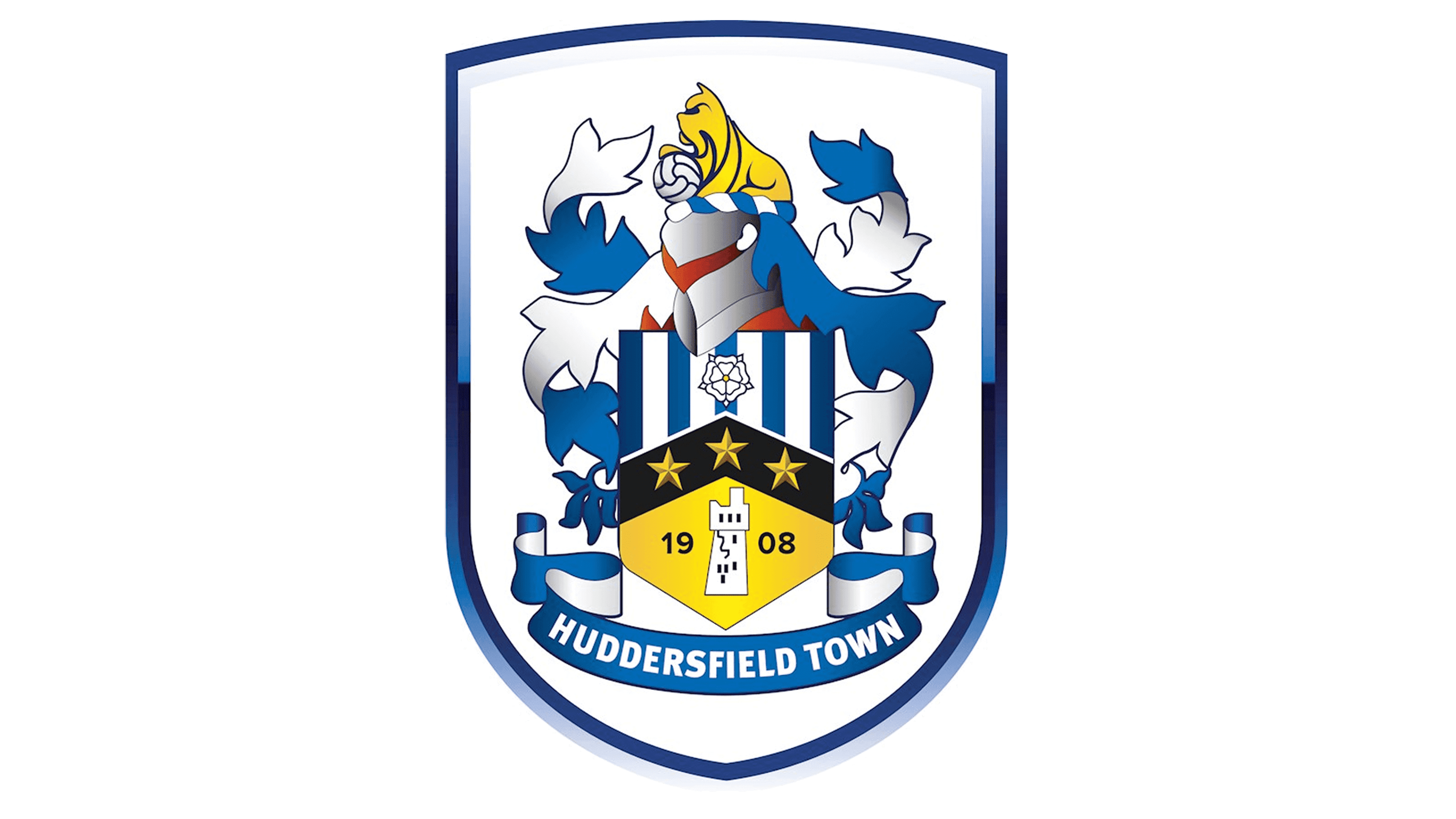
2019 – Today
This is a modern shield-shaped logo, predominantly white with a striking blue border. A knight’s helmet with a plume of yellow and blue crowns the top, symbolizing chivalry and valour. Below, intricate blue flourishes resemble feathers, adding a touch of elegance. The central motif is a striped shield with a stylized white rose of Yorkshire, reflecting local pride. A black and white tower, standing for resilience and history, is flanked by three stars and the founding year 1908, hinting at a storied legacy. The bold text “HUDDERSFIELD TOWN” anchors the design, conveying a strong community identity.


