Iowa Hawkeyes Logo
The Iowa Hawkeyes represent the athletic teams of the University of Iowa, located in Iowa City. These teams compete in Division I of the NCAA and are members of the Big Ten Conference. The University of Iowa’s athletics department is overseen by its athletic director.
Meaning and history
Founded in 1880, the Hawkeyes have a storied history in collegiate athletics, primarily as members of the Big Ten Conference. The University of Iowa, a public institution, oversees the Hawkeyes, making the concept of ‘ownership’ inapplicable in the traditional business sense.
Throughout their history, the Hawkeyes have seen significant transformations in their athletic programs. Early years focused on establishing competitive teams, with the 20th century bringing advancements in training, facilities, and recruitment. Key moments include the dominance of the wrestling team, which has captured numerous national titles, and the football team’s rise to prominence, particularly in the mid-20th century.
Changes in the athletic department leadership, typically through athletic directors, have influenced the Hawkeyes’ direction. Each director’s tenure brought different focuses and successes across various sports. The evolution of the Hawkeyes is also marked by expanded facilities and improved training regimes, adapting to the evolving landscape of collegiate athletics.
The current era sees the Hawkeyes continuing to compete at high levels, with consistent performances in major sports like football and basketball. Their focus remains on fostering athletic excellence, student-athlete development, and community engagement, staying true to their roots while embracing the future of collegiate sports.
What is Iowa Hawkeyes ?
The Iowa Hawkeyes are not a company but an integral part of the University of Iowa’s athletic program. They encompass various sports teams, including football, basketball, wrestling, and more, representing the university in collegiate competitions and fostering school spirit and community involvement.
1956 – 1979
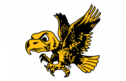
The image displays a stylized representation of a hawk, portrayed in mid-flight with wings and talons extended. The hawk exudes a sense of motion and aggression, indicative of its role as a mascot symbolizing competitive spirit. The color palette is simple yet striking, featuring bold black outlines that define the bird’s form against a vibrant yellow that fills its body and wings. The hawk’s eye is rendered with an intense glare, adding to the overall fierceness of the image. The design encapsulates both the power and focus associated with a team mascot, aiming to inspire and represent athletic prowess.
1979 – Today
This logo is a minimalist and abstract representation of a hawk, using bold black shapes outlined in yellow, creating a stark contrast. It features a sleek, modern design, focusing on the hawk’s head with a pointed beak and a suggestion of an eye, alluding to the creature’s sharp vision and focus. Compared to the previous logo, which depicted a full-bodied hawk in flight, this design is more simplified and stylized, emphasizing sleekness over aggression. It carries an air of sophistication and contemporary design while maintaining the team colors and the essence of the hawk as a symbol of the Iowa Hawkeyes.


