Jumia Logo
Jumia is among the most popular e-commerce sites focused on Africa. This makes it unusual among tech companies, which tend to operate primarily in North America, Europe, and Asia. Africa is considered to lag far behind other regions in terms of technology, and internet access, which is critical for an e-commerce company. At the same time, this also gives Jumia a unique potential when it comes to long-term growth. Jumia’s logistics department manages a variety of warehouses and related services so that customers may pick up their purchases or have them delivered by outside logistics companies.
Meaning and History
In 2012, the Jumia service was established in Lagos, the capital of Nigeria. Later, it expanded into a conglomerate called the Africa Internet Group before changing its name to Jumia Technologies. Just a year later, Jumia was already working outside of Nigeria – in Egypt and Morocco. By 2018, it was present in fourteen African countries. Jeremy Hodara and Sacha Poignonnec are in charge of the corporation. Berlin serves as the location of the African company’s office.
What is Jumia?
Jumia offers a wide range of products, including clothing and electronics, as well as food delivery and hotel booking services. The company provides a paid logistics service to over 80 retailers. The company also runs JumiaPay, its own payment solution, including in Egypt and Nigeria.
2012 – 2020
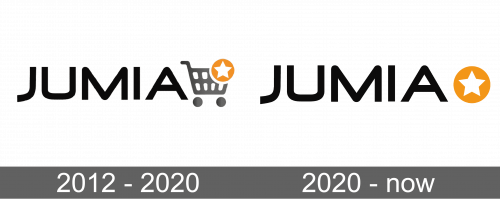
The first logo looked simple, which made it quite universal when it comes to using it on different backgrounds. It featured the name of the company done in all black, uppercase letters. The font chosen for the name did not have serifs and contained smooth curves combined with straight lines. It was accompanied by a gray shopping cart image on the right with a small star placed on an orange circle. The star was covering the upper right corner of the cart and was meant to symbolize the excellent shopping experience at Jumia.
2020 – Today
The Jumia logo was modernized and looked even more minimalistic than it did before. The designers decided to not include the shopping cart. Instead, they enlarged the orange circle with a star, so it was almost the same height as the wordmark itself. The latter looked bolder as it was now bigger than the decorative element on the right.
Font and Color
The font used for the name of the company features rounded corners and square ends. The lines are quite smooth and the letters have a nice symmetry to them. The company used black, gray, and orange. Black is a classic, formal color. The orange color adds some excitement and stimulates the customers to shop at Jumia.
