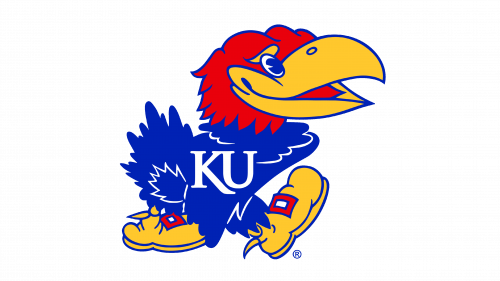
Kansas Jayhawks Logo
The United States has an amazing Kansas basketball program. Actually, ESPN ranked Kansas as the second most prestigious college program in the modern era when it comes to basketball. Representing Kansas University, the players have a number of unique achievements. Legendary sports representatives Wilt Chamberlain, Joe White, Clyde Lovelett, Paul Pierce, and others played for the Jayhawks.
Meaning and History
The Kansas Jayhawks men’s basketball team has played for the university since 1890. After publishing the rules of this now well-known game, James Naismith who brought a new game to life worked at Kansas University. Initially, he was not a team coach and instead worked as a physical development instructor. Since 1955, the home games were played at Allen Fieldhouse, where they have won about 700 games and lost just a little over 100, which shows just how great they are.
What is Kansas Jayhawks?
This is one of the most prestigious teams in the NCAA college league. The Kansas Jayhawks are also members of the Big 12 Conference.
1912 – 1919
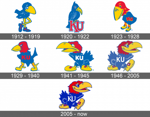
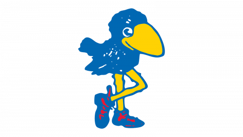
A fun, cartoon drawing of a blue bird was representing the Jayhawks. It had blue shoes on and its beak and legs were outlined with blue as well. The shoes had red lacing for an interesting accent. One of the legs was crossing the other. The oversized legs, head, and beak along with bright colors made the whole image look cheerful and energetic.
1920 – 1922
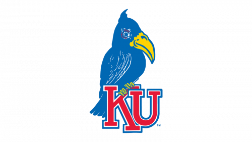
The bird looked much more realistic now. Moreover, it was sitting on top of an abbreviation. The capital letters “KU” were done in red with blue and white border using a classic typeface with the “K” as if framing the “U”. Although the same color palette has been applied, it had a completely different feel. There was more confidence and professionalism.
1923 – 1928
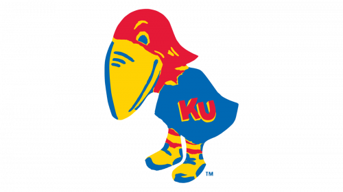
The new bird had the same caricature and entertaining look, but with a little more calmness and seriousness. It had a big yellow beak with blue accents that was pointing down, a red head, and a blue jersey with red “KU on it. The shoes were now predominantly yellow with accents being done in blue and red. The bird was now standing on its two feet.
1929 – 1940
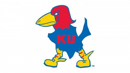
The bird character looked more like a hawk than it ever did before. There was a determination and even some aggressiveness. The beak got smaller and instead of facing down, the bird was looking forward with boldness. Moreover, the bird was not just standing. It was walking with a definite goal in front of it.
1941 – 1945
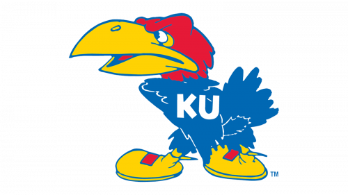
The bird featured a large open beak and large yellow shoes with red lacing that went well with the red head. The blue body had more defined feathers. The bird still had a more serious look with determination, but there was no more aggressiveness about it. The “KU” monogram was done in white this time.
1946 – 2005
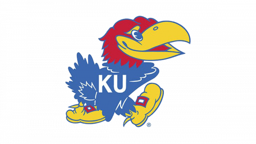
The character was even happier in the new emblem and was happily walking forward with its right foot up. The bird was now facing the other way. It had bigger eyes and its beak was opened wider, which made it look much friendlier. The monogram was done in exactly the same font and color.
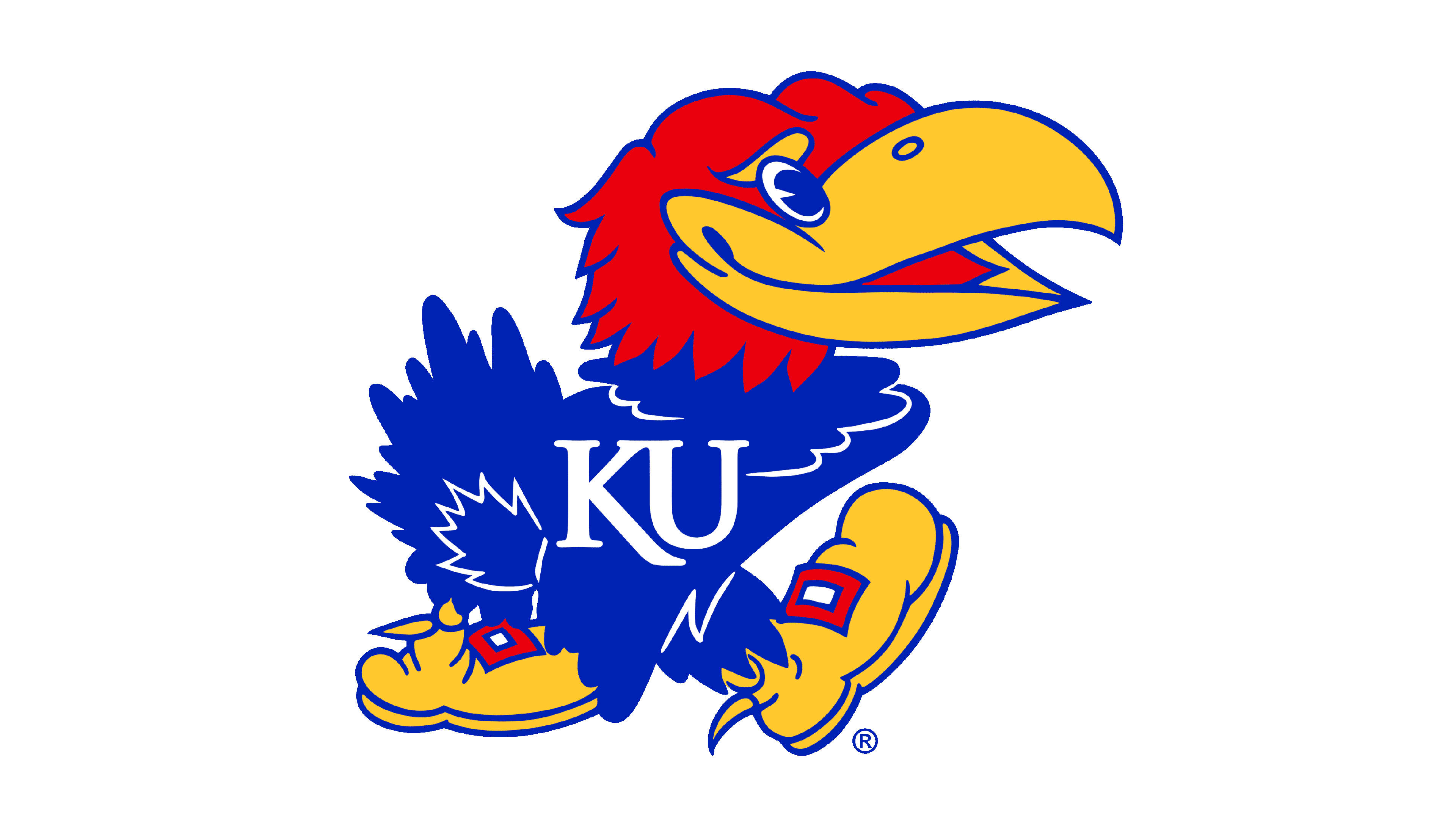
2005 – Today
The new logo did not look much different from what was used for over 50 years before. It had all the same shapes and colors. In fact, only the font used for the letters on the emblem was new. Similar to what the team had a long time ago, the letter “K” was wrapping the “U”, only this time it had only the bottom end elongated. The font looked a lot more elegant and the letters were not as thick anymore.
