Lazada Logo
Founded back in 2012, Lazada is one of the best online e-commerce platforms in Southeast Asia. It connects sellers and buyers in six countries (Indonesia, Malaysia, Philippines, Singapore, Thailand, and Vietnam) through technology, logistics, and multiple convenient payment options. On Lazada, you can find anything from electronics and sports equipment to home goods, clothing, beauty products, toys, and much more. Lazada surely knows what the audience demands, so its customer base is growing and projected to reach the 300 million mark by 2030.
Meaning and History
Lazada platform first appeared in 2012 and was mainly owned by Rocket Internet. By 2016, this online shopping marketplace attracted the attention of Alibaba Group, one of the world leaders in online and mobile commerce. It invested enough funds to have a decisive role in this company. This gave Lazada an additional source of funding and access to advance technology for further growth.
2012 – 2014
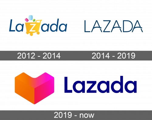
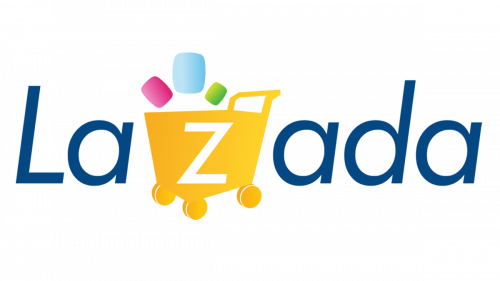
Lazada’s original logo was represented by the word Lazada, with the first letter being capitalized. The letters were written sans-serif font, which is associated with modern typefaces and gives additional meaning to the brand that was created to meet the needs of a modern buyer.
It was simple, yet memorable and easily recognizable thanks to a bright detail that was part of the logo. It was a bold yellow shopping cart with a white letter “Z” right in the center. Above the shopping cart, we see colorful rectangular figures of different sizes with rounded corners. These three pink, green, and blue figures are meant to represent the variety of goods a buyer can find in this online marketplace, making shopping even more attractive.
2014 – 2019
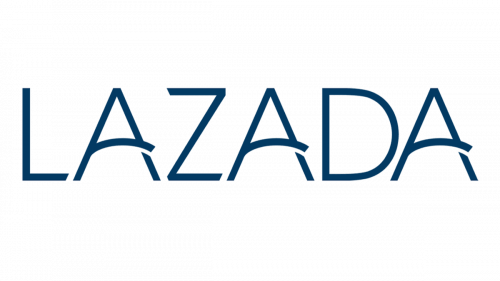
Although the new logo Lazada presented in 2014 looks a lot different from the original one, it still preserved the name of the company as the key element of the brand’s identity. Now, there were no more bright colors or any graphical illustrations. Written in all capital letters, it was easy to read the word Lazada.
The logo had deep-blue neat lettering with an artistic touch, where the horizontal line in the letter “A” was slightly arched and crossed the right vertical line. The ends of letters were cut diagonally and there is just the right balance of curves and straight lines, giving the redesigned logo a more professional and modern spin. The logo acquired a polished and more sophisticated look. The tagline “Effortless Shopping” accurately described the shopping experience Lazada strived to deliver to every buyer.
2019 – 2022
As the company developed, it was more than appropriate to change its logo, so it would reflect the new identity of this popular online shopping platform. The redesigned Lazada logo, courtesy of Superunion Singapore, acquired a bold look with bright colors coming back. Now, it featured a heart logo mark. The heart is positioned to the left of the capitalized word Lazada written once again using the sans-serif dark blue font.
If you look at the heart at a slightly different angle, you can easily see a three-dimensional letter “L”. Thus, the heart not only stands for the first letter of the brand’s name but also goes well along with the new tagline “Go Where Your Heart Beats”. The orange and pink hues of the heart reflect the vibrant shopping experience people have at Lazada.
This heart illustrates how the company has and continues to evolve and the energy it radiates. A combination of a playful, interesting element in the form of heart and professional lettering makes the Lazada online shopping marketplace look attractive to a wide variety of shoppers.
