Arsenal Logo
Arsenal Football Club has a rich history and many titles won. The game of the team made many fans fall in love with it all over the world. Bright combination football leaves no one indifferent. The club’s emblem has a history no less attractive than the club itself.
Meaning and history
Arsenal was founded in 1886 in London by the workers of the local armaments factory, hence the name. They’ve soon become an established professional club, winning their first domestic cup in 1930. On the international stage, they’ve entered prominence at the turn of the century.
It’s during this period that they got to the finals in the UEFA of 2006. That was their most successful move on the international stage. It’s also then that they won several FA Cups and the Premier Leagues back in England. On the home front, they are currently the best club in the country.
What is Arsenal?
Arsenal is a major English football club, founded in 1886. They are regarded as one of the strongest teams in England at the moment, although they never quite made a name for themselves internationally. Arsenal is part of the London’s triad of greats, beside Tottenham Hotspur and Chelsea.
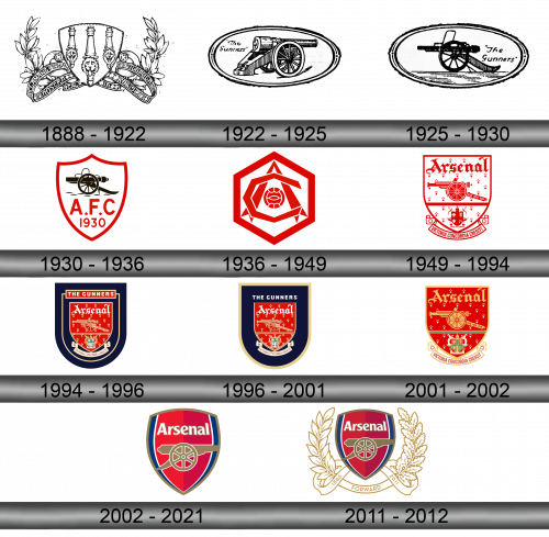
1888 – 1922
The club was founded in 1888 under the name “Royal Arsenal”. He represented the London borough of Woolwich, whose coat of arms became the club’s logo. The very name of the team was taken from the name of the factory that produces weapons.
1922 – 1925
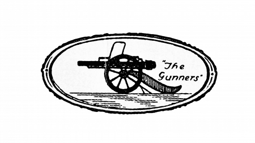
The change of the coat of arms in 1922 has a background. In 1913, the club moved from Woolwich, became known simply as “Arsenal”. The connection with the historical past was lost; a realistically drawn cannon placed in a horizontal oval was used as a logo. Above the cannon was the inscription “The Gunners”.
1925 – 1930
The 1925 logo is a mirror image of the previous log, with the cannon facing the other way. Also, the cannon is no longer drawn in a realistic, but in a schematic style.
1930 – 1936
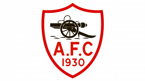
The cannon from the previous logo is placed on a white shield with red edges. The large letters A.F.C. are inscribed under the cannon, and even lower is the year 1930.
1936 -1949
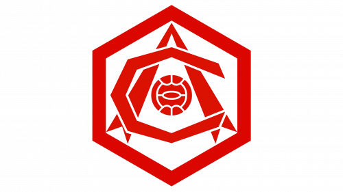
This logo has nothing to do with the past and the future, it is a hexagon. There is a red soccer ball in the center, the letters A and C intersect in the emblem.
1949 – 1994
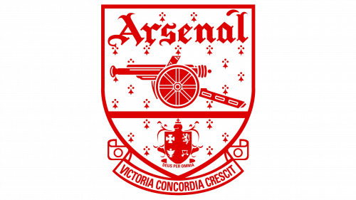
The shield became the basis of the coat of arms, but with a straight upper border. In the lower part, under the shield, the club’s motto appeared for the first time – the Latin expression “Victoria Concordia Crescit”, which means “Victory comes from harmony.” The name of the Arsenal team is written at the top of the shield, the cannon is in the center. The club was now located in the Islington area, so its coat of arms adorned the bottom of the logo.
1994 – 1996
If the previous logo was red and white, then in 1994 it was issued in red and blue colors. The background of the shield has become red (it was previously white), the shield has a double structure, inside the shield there is another outline of the shield, which will introduce the inscription Gunners above the shield.
1996 – 2001
In 1996, a simplification was made to get rid of the clutter of the logo. The second outline of the shield is removed, leaving the inscription Gunners in white letters on a blue background.
2001 – 2002
In 2001, they decided to abandon the outer blue shield, leaving only the inner red one. The design of the cannon was slightly changed, the Arsenal inscription is written in gold.
2002 – 2021
In 2002, Arsenal received a stylish coat of arms, from which unnecessary details were removed. A dark yellow cannon symbol is inscribed in the common shield. Inside this shield there is a red shield, in the upper part there is an Arsenal inscription in white letters. There are blue edges from the general shield.
2011 – 2012
In the 2011-2012 season, additional decorations were used in honor of the 125th anniversary of the club – 15 laurel leaves, 15 oak leaves, the inscription FORWARD (the first team motto).
Color and font
The Arsenal lettering is made in a recognizable font. The logo has a laconic design, using red, blue, white and dark yellow colors.
