Leicester City Logo
Leicester City is a professional football club based in Leicester, England. A group of local businessmen established it at the Fosse Road Wesleyan Chapel. They formed the club to provide a structured sporting activity for local players. The team originally played matches on a nearby field.
Meaning and history
Leicester City Football Club, based in Leicester, England, was founded in 1884 as Leicester Fosse. The team initially played on a field near Fosse Road. They joined the Football League in 1894. Rebranded as Leicester City in 1919, they moved to Filbert Street, their home ground for 111 years.
Success varied, with Leicester often fluctuating between divisions. They reached their first FA Cup final in 1949 but lost. The 1960s saw moderate success; Leicester won the League Cup in 1964.
However, the club faced challenges, including relegations. The 2000s were turbulent, with financial crises and administration in 2002. Leicester moved to the King Power Stadium in 2002, marking a new era.
Miraculously, under manager Claudio Ranieri, Leicester won the Premier League in 2016, defying 5000-1 odds. This victory is one of the most remarkable in sports history.
What is Leicester City?
Leicester City is an English football club competing in the Premier League. Known as the Foxes, they play at the King Power Stadium. Their historic 2016 Premier League win marked a significant chapter in football history.
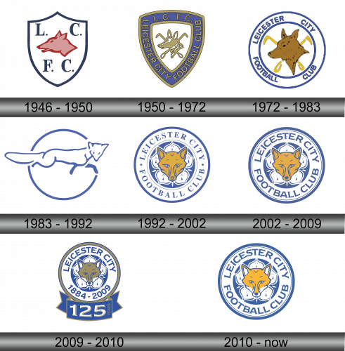
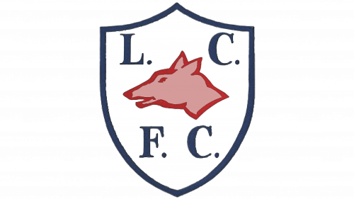
1946 – 1950
The emblem presents a classic shield shape, bordered in navy blue. A bold, red fox head dominates the white background, symbolizing cunning and agility. Navy blue initials “L.C.F.C.” flank the fox, denoting Leicester City Football Club. The design encapsulates tradition with a nod to the team’s nickname, the Foxes. It’s a simple yet striking visual identity for the storied club.
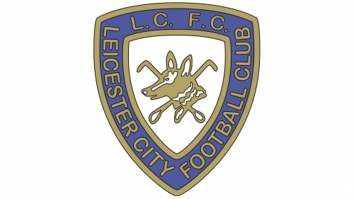
1950 – 1972
In this updated crest, the shield’s contour remains, enveloped by a royal blue rim. Bold letters spell “LEICESTER CITY FOOTBALL CLUB” in a circular formation, framing a more detailed fox. The animal, now in a dynamic gold, carries a symbolic air, central within the shield. The design reflects a more modern look, balancing heritage with evolution.
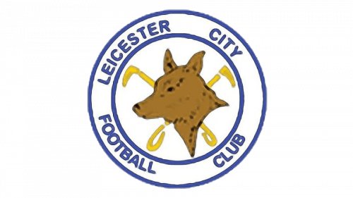
1972 – 1983
Transitioning from the shield, this logo embraces a circular form. “LEICESTER CITY FOOTBALL CLUB” encircles the design, embracing a golden fox head at the center. Blue and white remain the dominant colors, preserving the club’s palette. This design simplifies yet energizes, reflecting a sleek, contemporary aesthetic.
1983 – 1992
This logo makes a bold leap, opting for minimalist elegance. The fox has transformed into a sleek, stylized line drawing, exuding speed and grace. Encased within a single continuous blue line that forms a circle, the fox appears mid-leap, embodying dynamism. It’s a leap from tradition to a streamlined, almost abstract representation. The design exudes motion and a forward-thinking spirit, aligning with modern graphic trends.
1992 – 2002
This iteration returns to intricate detailing, featuring a realistic fox face at its heart. Surrounded by a circle, the club’s name curves above and below in navy. Symbolic fleur-de-lis patterns flank the fox, referencing the city’s historic coat of arms. The design, reverting to a more classic look, balances modernity with tradition. The rich golden hue of the fox against the navy background strikes a proud, timeless posture.
2002 – 2009
Within a circular crest, a bold fox’s head, the club’s emblematic animal, is centered, tinted a vivid amber hue. Encircling the fox, a deep royal blue field carries the club’s name, “Leicester City Football Club”, presented in a contemporary, clean font that denotes modernity. Surrounding the core imagery, a lighter blue ring adds contrast and depth. This logo exemplifies a blend of tradition with a fresh, crisp aesthetic.
2009 – 2010
This logo marks a milestone, celebrating the club’s 125th anniversary with commemorative additions. The familiar circular crest and fox remain, yet now framed by “1884-2009,” acknowledging the club’s inception and the anniversary year. Below, a bold ribbon proclaims “125 YEARS,” cementing the club’s longstanding history. This special edition emblem, with its additional elements, honors tradition and longevity in the sporting world. The overall aesthetic speaks to both the past and present of Leicester City.
2010 – Today
The logo reverts to its standard form, discarding the anniversary elements. Gone are the commemorative dates and the “125 YEARS” banner. What remains is the familiar emblem: the fox, symbolically central, set against a white and navy backdrop. The club’s name encircles the fox in bold lettering, unifying the design. This classic version reaffirms the club’s continuous identity, focused on tradition and a clear, recognizable brand.

