Liverpool Logo
The fame of the Liverpool club is beyond doubt. Repeated victories in the Champions League have helped to gain fans from every corner of the globe. Football fans are always attracted by the flamboyant attacking play that is part of Liverpool’s club ideology.
Meaning and history
Liverpool Football Club was founded on March 15, 1892, by John Houlding, a local businessman and then mayor of Liverpool, after a dispute with Everton FC over the lease of Anfield stadium. Since its inception, Liverpool has become one of the most successful clubs in England and the world. Its history is laden with significant achievements including multiple English league titles, numerous FA Cup wins, and a prestigious record in European competition, with several UEFA Champions League trophies. The club’s anthem “You’ll Never Walk Alone” has become an emblem of unity and resilience, echoing through Anfield at every match. In recent years, under the management of Jürgen Klopp, Liverpool has reasserted itself as a dominant force in both English and European football, maintaining a strong competitive edge and an innovative approach to the game.
What is Liverpool FC?
It is an iconic football club from Liverpool, England, celebrated for its rich history, distinctive red kit, and the anthem “You’ll Never Walk Alone.” The club competes in the Premier League and is revered for its storied past and vibrant supporter culture.
1892 – 1953
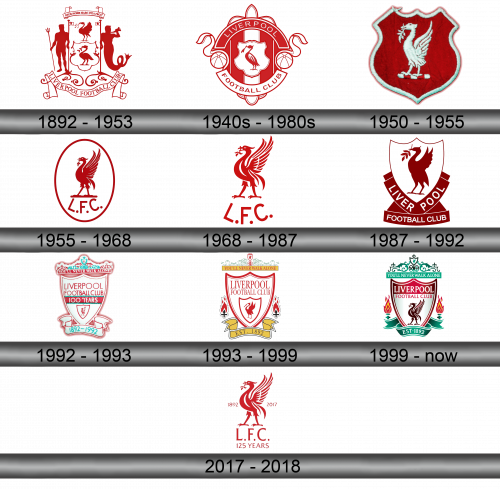
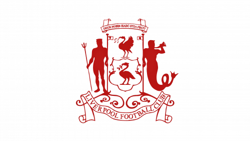
Liverpool’s first logo featured several mythical creatures. Undine and Poseidon then disappeared, and the legendary Liverbird became the symbol of the club forever. The logo was black and white, it had a lot of interesting elements, and at the bottom in the banner there was an inscription LIVERPOOL FOOTBALL CLUB.
1940s – 1980s
During these years, a simplified version of the first logo was used. The bird remained on the shield, but the shield itself is surrounded by two stretch marks, forming a circle, the name of the club is inscribed in them. There are soccer balls between the guy wires.
1950 – 1955
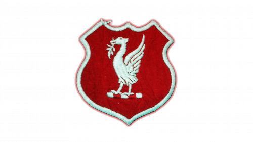
During these years, the logo was quite simple. On the red shield was a white liverbird.
1955 – 1968
In 1955, the lifebird was inscribed in a white circle with red edges. The bird itself is also painted in red. At the bottom of the circle are large L. F. C.
1968 – 1987
The 1968 logo largely repeats the previous one, the bird and letters remained, but the circle disappeared.
1987 – 1992
During these years, the mythical bird liverbird is not inside the circle, but inside the shield. On the edges of the shield there is an inscription LIVER POOL, divided into 2 parts. Slightly lower in a separate stretch FOOTBALL CLUB.
1992 – 1993
In honor of the centenary, a special logo has been developed. The basis was a shield in it with the inscription LIVERPOOL FOOTBALL CLUB in red on white, just below 100 YEARS in white on red, even below a lifebird in another small shield. Below, under the shield, the years 1892-1992 are indicated. Above the shield is the legendary slogan of YOU’LL NEVER WALK ALONE fans.
1993 – 1999
In 1993, the inscription about the 100th anniversary was removed, instead of the years 1892-1992, the inscription EST 1892. Torches are painted on both sides of the shield.
1999 – Today
The design of the torches has been changed, more laconic colors have been chosen. The shield with the bird is decorated in red and white, the rest of the elements are in turquoise and white.
2017 – 2018
In the 2017-2018 season, a special emblem was used, created in honor of the 125th anniversary of the club. On it there is a huge bird, on the sides the years of the team’s existence, below the abbreviation, just below the inscription 125 YEARS.
Color and font
The main colors of the team are red and white, which is reflected in the club’s logo. Certain parts of the logo use a turquoise color. There are additional variants of the logo, where everything is done in red and white, additional elements have been added. All inscriptions are made in a specially designed font.
